A newsletter box with a grey "Your email" placeholder looks tidy. To a screen reader user it is announced as "edit text", with nothing to say what goes in it, and once someone starts typing the placeholder is gone for everyone. Missing labels are one of the findings accessibility checks rate critical, and they are among the quickest to fix: one element or one attribute per field, usually with no visible change. This guide explains what a label actually does, the four ways to add one, and where the setting hides in the common form plugins.
Quick answer
- Every
<input>,<select>and<textarea>needs an accessible name, the words a screen reader announces for it. - Best: a visible
<label for="id">that matches the field'sid, or a<label>wrapped around the field. - No room in the design (search box, one-field newsletter)? Keep the
<label>and hide it visually with a.visually-hiddenclass, or usearia-label. - A placeholder is not a label. A
titleattribute is a weak one. - Groups of radio buttons and checkboxes need a
<fieldset>with a<legend>for the question. - Run the accessibility checker and re-run it after each change.
Why form labels matter
A label does three jobs. It tells screen reader users what a field is for: "Email address, edit text, required" instead of "edit text". It gives voice control users something to say ("click email address"). And it makes the field easier to hit: clicking or tapping a connected label focuses the field, which turns a 20-pixel checkbox into a target the size of its text.
Without labels, forms fail at the moment that matters. A screen reader user on a checkout with six unlabelled fields has to guess which one is the postcode. A visitor with a memory impairment who starts typing into a placeholder-only field loses the instruction the moment the first letter appears. Browser autofill also leans on labels and autocomplete values to decide what to fill where, so unlabelled forms get filled wrong for everyone.
What an accessible name is
Every interactive element has an accessible name that the browser computes and passes to assistive technology. For a form field, the browser looks at these sources, in this order, and uses the first one it finds:
aria-labelledby: the text of other elements, referenced by id.aria-label: a text string on the field itself.- A
<label>: connected withfor/id, or wrapped around the field. - The
titleattribute. - The
placeholderattribute, as a last resort.
The first three are real labels (the form labels learn page has the one-screen summary). title shows only as a mouse tooltip, never on touch screens or to keyboard users, so it helps screen readers and nobody else. A placeholder is read by some screen readers and not others, disappears as soon as someone types, and is usually too pale to meet the contrast ratio.
How getReport checks it
The report renders the page in Chromium and runs axe-core. The form labels finding gathers the rules about field names: fields with no name at all (label), selects without a name (select-name), fields whose only name is a title or a description (label-title-only), and custom ARIA inputs and toggles without a name. It appears only on pages that have form fields. For the other critical findings that tend to sit next to this one, see fixing the top accessibility checker findings.
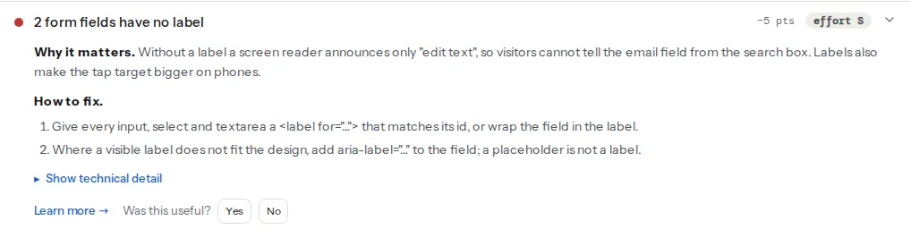
What the card does not say:
- Axe accepts a placeholder as a name. A field whose only label is
placeholder="Email"passes axe's rule because the browser falls back to it. It still fails people for the reasons above, so check for placeholder-only fields by eye: any field with grey text inside and no words above or beside it. - Missing labels also count as critical violations. Axe rates an unnamed input or select as critical, so the same fields show up in the critical count. Fixing the labels clears both.
- The submit button is a separate check. An icon-only search button (a magnifying glass) with no text is a button without a name, reported under link and button names.
Step by step
1. Find the fields on the page
Open the finding and look at the selectors, for example #mc-embedded-subscribe-form input[type="email"] or .search-form > input. Most sites have three kinds of form: a search box in the header, a newsletter field in the footer, and one real form (contact, checkout, booking). The header and footer ones repeat on every page, so they are worth fixing first.
2. Add a visible label where there is room
The strongest pattern is a visible label connected by for and id. The id must be unique on the page.
<label for="contact-email">Email address</label>
<input type="email" id="contact-email" name="email" autocomplete="email" required>
Wrapping the field in the label works too, and needs no ids, which helps when the same form appears twice on a page:
<label>
  Email address
  <input type="email" name="email" autocomplete="email" required>
</label>
3. Where there is no room, hide the label visually, not from everyone
A search box with a magnifying-glass button, or a one-field newsletter sign-up under a heading that already says "Get our newsletter", does not need visible label text. It still needs a label. Keep the <label> in the HTML and hide it with a class that removes it from the screen but not from the accessibility tree:
/* global stylesheet */
.visually-hidden {
  position: absolute !important;
  width: 1px;
  height: 1px;
  padding: 0;
  margin: -1px;
  overflow: hidden;
  clip: rect(0, 0, 0, 0);
  white-space: nowrap;
  border: 0;
}<form role="search" action="/search" method="get">
<label for="site-search" class="visually-hidden">Search the shop</label>
<input type="search" id="site-search" name="q" placeholder="Search products">
<button type="submit">
<svg aria-hidden="true" focusable="false" width="20" height="20"><use href="#icon-search"></use></svg>
<span class="visually-hidden">Search</span>
</button>
</form>Do not hide labels with display: none or visibility: hidden: those remove the text for screen readers too, and when the field has no other name, axe reports the hidden label. WordPress themes already ship this class as .screen-reader-text; Shopify's Dawn-based themes as .visually-hidden. Use the one your theme has.
4. Or use aria-label or aria-labelledby
When you cannot add an element (a field generated by a script you can only configure, say), aria-label names the field directly:
<input type="email" name="email" aria-label="Email address for the newsletter" placeholder="[email protected]">When the label text is already on the page, aria-labelledby points at it by id, which keeps visible and spoken text identical. A quantity field in a cart row can be named by the product name and the column heading together:
<th id="col-qty">Quantity</th>
…
<td>
  <span id="item-42">Alpina Pro trekking shoe, size 42</span>
  <input type="number" name="qty[42]" value="1" min="0" aria-labelledby="col-qty item-42">
</td>
The field is announced as "Quantity Alpina Pro trekking shoe, size 42". Prefer a visible <label> when you can: aria-label is invisible to sighted users, and voice control users cannot say words they cannot see.
5. Group radio buttons and checkboxes with fieldset and legend
Each radio button gets its own label, and the question they answer goes in a <legend>. Screen readers announce the legend when focus enters the group, so "Standard" becomes something like "Delivery method, Standard, 3–5 working days, €4.90, radio button, 1 of 2".
<fieldset>
  <legend>Delivery method</legend>
  <input type="radio" id="ship-standard" name="shipping" value="standard" checked>
  <label for="ship-standard">Standard, 3–5 working days, €4.90</label>
  <input type="radio" id="ship-express" name="shipping" value="express">
  <label for="ship-express">Express, next working day, €9.90</label>
</fieldset>
A single checkbox ("I agree to the terms") does not need a fieldset, just its label.
6. Connect hints and error messages with aria-describedby
The label says what the field is; the description says how to fill it or what went wrong. Connect both with aria-describedby, which accepts several ids separated by spaces, and mark a field with an error as aria-invalid="true":
<label for="password">Password</label>
<input type="password" id="password" name="password" autocomplete="new-password"
       aria-describedby="password-hint password-error" aria-invalid="true">
<p id="password-hint">At least 12 characters.</p>
<p id="password-error" class="field-error">This password has 8 characters. Add 4 more.</p>
Error text should say what to do, not only what is wrong, and should not rely on a red border alone: colour-only errors fail people who cannot tell red from grey.
7. Add autocomplete to personal-data fields
WCAG 2.2 AA (criterion 1.3.5) asks for autocomplete on fields that collect information about the user. It lets browsers and password managers fill the form, which saves everyone typing and helps people with motor or memory impairments most. The common values:
name  given-name  family-name  email  tel  organization
street-address  address-line1  address-line2  postal-code  address-level2 (city)  country-name
username  current-password  new-password  one-time-code
cc-name  cc-number  cc-exp  cc-csc
Axe checks that the values you use are valid (autocomplete="e-mail" is not); an invalid one appears under serious violations.
8. Re-run the checker
Run the page again. The finding should read "Every form field has a label". Then try the form yourself with the keyboard only: Tab into each field, and check that the label is visible or announced and that the error messages appear next to the field.
Platform notes
WordPress
- Contact Form 7: labels are part of the form template you edit under Contact → Contact Forms. The default template wraps each field tag in a
<label>; forms built from scratch often drop it. The pattern, with CF7'sautocompleteoption:
<label> Your email
    [email* your-email autocomplete:email] </label>
For checkboxes and radio buttons, add the use_label_element option to the tag so each choice gets its own label: [checkbox your-topics use_label_element "Orders" "Returns"].
- Gravity Forms and WPForms: every field has a label setting, and both let you hide it in the field's appearance or advanced options. Keep labels visible where the layout allows; if you hide one, re-run the checker to confirm the field still has a name.
- The theme's search form: WordPress core's search form already contains a visually hidden "Search for:" label. Themes that ship their own
searchform.phpsometimes remove it. In block themes, the Search block has a label toggle; with the label hidden, core still outputs it with thescreen-reader-textclass. - Newsletter embeds (Mailchimp, MailerLite, Brevo) are often trimmed down to a single field to fit a footer, and the label goes with the trimming. In the embed code, add a
<label>with the input'sid, oraria-labelon the input if the code is regenerated by the plugin.
Shopify
Search, newsletter and contact forms live in the theme: Online Store → Themes → … → Edit code, in the sections and snippets folders (the footer section holds the newsletter form built with {% form 'customer' %}). Current themes from the Theme Store label their fields; the unlabelled ones usually come from pop-up and newsletter apps, which have their own settings for field labels, or from custom sections copied in by hand.
Static sites and custom builds
If you use a component library, fix the input component once so it always renders a label (a required label prop is a good guard). Search the templates for placeholder= without a matching <label nearby; that finds most cases quickly.
Verify
- The form labels finding reads "Every form field has a label", and the critical violations count dropped by the same number of fields.
- Clicking a label text focuses its field (for
for/idand wrapping labels). - With a screen reader, each field is announced by its label; the 20-minute test in testing your site with a screen reader includes a form pass.
- Browser autofill puts the right values in name, email and address fields.
Common mistakes
- Placeholder as the only label. Axe lets it pass, people do not. Add a label above the field and keep the placeholder for an example value, if at all.
- A
forthat points nowhere. A label withfor="email"next to an input withid="email-1"names nothing. The two must match exactly, and eachidmust be unique; a form that appears twice on one page needs different ids. - Hiding the label with
display: none. It disappears for screen readers too. Use the visually hidden class. aria-labelthat differs from the visible text. A field labelled "Email" on screen andaria-label="Subscribe"in code confuses voice control users. Keep them the same, or start thearia-labelwith the visible words.- One label for a group of fields. A "Date of birth" label above three selects (day, month, year) names only one of them. Use a fieldset with the legend "Date of birth" and a label for each select.