Automated accessibility checks are honest about their limits: they find roughly a third of the barriers on a page, the ones a machine can detect from the DOM. The good news is that the same ten findings account for most of that third on most sites, and each has a mechanical fix. This guide goes through them in order of how often they appear, explains who is affected and why, and shows the fix with the WCAG 2.2 criterion behind it, so the change can be justified in a ticket.
Quick answer
The ten, most frequent first:
- Low contrast text: 4.5:1 for normal text, 3:1 for large text and UI parts.
- Images without alt: describe or mark decorative with
alt="". - Form fields without labels: a
<label for>per input; placeholder is not a label. - Links and buttons without a name: icon buttons need
aria-label; "read more" needs context. - Missing page language:
<html lang="en">. - No landmarks:
<header>,<nav>,<main>,<footer>. - Zoom disabled: remove
user-scalable=noandmaximum-scale=1. - Small touch targets: 24 × 24 CSS px minimum (WCAG 2.2), 44 recommended.
- Skipped heading levels: H2 → H4.
- Keyboard traps and focus order: everything reachable and escapable with Tab and Esc.
The accessibility checker runs axe-core on the rendered page and reports each with the elements involved.
Why it matters
About one person in six has a disability that affects how they use the web: low vision, colour blindness, motor impairments that make a mouse hard to use, screen-reader users, and everyone temporarily (a bright screen outdoors, a broken arm, a phone in one hand). The fixes below make the site work for them and improve it for everyone: contrast helps in sunlight, labels help autofill, keyboard access helps power users.
There is also the legal side. The European Accessibility Act applies to most online shops and services from June 2025, and WCAG 2.1/2.2 AA is the standard it points to. An automated check is the first step of proving diligence, not the last.
How getReport checks it
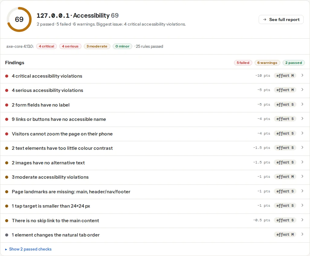
The report renders the page in Chromium and runs axe-core (the engine behind most browser accessibility tools) with the WCAG 2.0/2.1/2.2 A and AA rules plus best practices. Violations are grouped by impact (critical, serious, moderate, minor), and the findings below single out the frequent ones with their elements.
The findings, one by one
1. Colour contrast (WCAG 1.4.3)
Grey text on white at #999 is 2.8:1; the minimum is 4.5:1 for normal text and 3:1 for text over 24 px (or 19 px bold). Placeholder text, footer links and "muted" captions are the usual offenders. Darken the text (#767676 on white is the lightest grey that passes) or lighten the background. Logos and disabled controls are exempt. Details in Colour contrast: fixing the most common finding.
2. Image alt text (WCAG 1.1.1)
A screen reader reads the alt text; without it, it reads the file name ("IMG_4412.jpg"). Meaningful images get a short description of what matters in them; decorative images get alt="" so they are skipped; images that are links get the link's purpose as alt ("Open the size chart").
<img src="/img/runner-x.webp" alt="Blue running shoe, side view, white sole">
<img src="/img/divider.svg" alt="">
<a href="/size-chart/"><img src="/img/ruler.svg" alt="Open the size chart"></a>
3. Form labels (WCAG 1.3.1, 4.1.2)
Every input needs a visible label connected with for/id, or an aria-label when the design truly has no room. A placeholder disappears when the field is filled and is not announced as a label by most screen readers.
<label for="email">Email address</label>
<input id="email" name="email" type="email" autocomplete="email">
Details in Form labels: every input needs one.
4. Link and button names (WCAG 2.4.4, 4.1.2)
An icon-only button (the hamburger, the cart, the search magnifier) has no text, so it needs aria-label="Open menu". A link whose text is "Read more" is announced as "link, read more" twenty times on a listing page; add the target in visually hidden text or aria-label="Read more: how to waterproof boots".
<button type="button" aria-label="Open menu" aria-expanded="false">
  <svg aria-hidden="true">…</svg>
</button>
5. Page language (WCAG 3.1.1)
<html lang="hr"> tells screen readers which pronunciation rules to use; without it, Croatian text is read with English rules and is unintelligible. One attribute. WordPress sets it from Settings → General → Site Language; static sites set it in the layout.
6. Landmarks (WCAG 1.3.1, best practice)
<header>, <nav>, <main> and <footer> let screen-reader users jump to the content instead of tabbing through the menu on every page. One <main> per page; label multiple <nav> elements (aria-label="Main", aria-label="Footer").
7. Zoom (WCAG 1.4.4)
<meta name="viewport" content="width=device-width, initial-scale=1, maximum-scale=1, user-scalable=no"> stops pinch-zoom on phones, which blocks low-vision users. Remove maximum-scale and user-scalable; the page still lays out correctly.
8. Target size (WCAG 2.5.8)
WCAG 2.2 requires interactive targets to be at least 24 × 24 CSS pixels, with exceptions for inline links in text and targets with enough spacing. Icon buttons of 16 px, pagination numbers and social icons are the usual misses; padding fixes them without changing the icon.
.icon-button { min-width: 44px; min-height: 44px; display: inline-grid; place-items: center; }9. Heading order (best practice, WCAG 1.3.1)
Screen-reader users navigate by headings. A jump from H2 to H4 suggests a missing section. Use levels for structure and CSS for size; a "small heading" styled with H4 is a styling choice that costs structure.
10. Keyboard access and focus (WCAG 2.1.1, 2.1.2, 2.4.7)
Everything a mouse can do, a keyboard must do: Tab reaches every control in a sensible order, Enter/Space activate, Esc closes dialogs, and focus is visible (never outline: none without a replacement). A modal that traps focus without an escape, a carousel that swallows Tab, and custom dropdowns built from <div>s are the classic failures. Prefer native elements (<button>, <a href>, <select>, <dialog>); they get keyboard behaviour for free.
Step by step
- Run the checker on one page per template; the same findings across templates are theme-level.
- Fix critical and serious first (they block tasks: unlabelled forms, unnamed buttons, missing alt on functional images).
- Fix contrast in the design tokens, not per element: two colour changes usually clear dozens of findings.
- Re-run. Then do the part no tool can: tab through the page, use it with a screen reader for five minutes (Testing with a screen reader in 20 minutes), and check that every form can be completed by keyboard.
Platform notes
WordPress: most findings come from the theme (contrast, landmarks, icon buttons) and from page builders (Elementor buttons without names, sliders without controls). Alt text is set per image in the media library and reused. Shopify: themes from the store review pass the basics; custom sections often lose labels. Static: the layout and the components; fix once.
Verify
- The checker reports zero critical and zero serious violations; moderate and minor are next.
- Tab through the page: every control reachable, focus visible, no trap.
- Zoom to 200 %: nothing overlaps or disappears.
Common mistakes
aria-labelon everything. It overrides visible text and confuses voice-control users who say what they see. Use it only where there is no visible text.- Alt text that describes the file ("image", "photo1") or repeats the caption.
- Fixing contrast by adding a text shadow. The ratio is computed on the colours, not the shadow.
tabindexon non-interactive elements to "make them accessible". It adds tab stops to things that do nothing.- Treating a clean automated check as compliance. It is a third of the work; the rest needs a person.