Light grey text on white looks calm in a design file and disappears on a phone in the sun. That is why colour contrast is the finding almost every accessibility check reports first, on almost every site. The good news: it is usually caused by three or four colours, and fixing those colours in one place clears dozens of elements at once. This guide explains the ratios, where they come from, the usual offenders and how to fix them without redesigning the site. Budget an hour for the first pass.
Quick answer
| What | Minimum ratio (WCAG 2.2 AA) |
|---|---|
| Normal text (body copy, captions, labels, placeholders) | 4.5:1 |
| Large text: 24 px and up, or 18.66 px (14 pt) and up when bold | 3:1 |
| Buttons, input borders, icons that carry meaning, focus indicators | 3:1 against what is next to them |
| Logos, disabled controls, pure decoration | No requirement |
- Run the accessibility checker and open the contrast finding: it lists the elements below the ratio.
- Fix the colour in your theme's palette or CSS variables, not on each element.
- Mid-grey text on white (#999999) is 2.85:1 and fails. #767676 is the lightest grey that passes on white (4.54:1).
- Text over photos needs a dark overlay (a scrim); no tool can measure it reliably, so check it by eye.
Why colour contrast matters
About 1 in 12 men and 1 in 200 women have reduced colour vision, and many more people have low vision from age or cataracts. For them, text at 2.5:1 is not "a bit faint", it is unreadable. Then there is everyone else: a phone at half brightness on a train, a laptop by a window, a cheap monitor with washed-out greys. Contrast is the accessibility fix that helps the most people most visibly.
It also costs money when it fails. The grey "Free delivery over €50" line, the pale "Add to cart" button text and the light placeholder that tells people the password needs 8 characters are exactly the text that makes a sale. When nobody reads it, the shop gets support emails and abandoned carts instead.
And it is a legal baseline. The European Accessibility Act points, through the EN 301 549 standard, to WCAG AA, and criterion 1.4.3 (contrast minimum) is one of the easiest for anyone to test: a browser extension does it in seconds.
How the ratio is computed, in words
Each colour gets a relative luminance: how bright it looks to the human eye, from 0 (black) to 1 (white). Green counts the most, red less, blue very little, which is why pure blue text on black is much harder to read than pure green. The ratio is the lighter colour's luminance plus 0.05, divided by the darker colour's luminance plus 0.05. It runs from 1:1 (the same colour twice) to 21:1 (black on white).
Two practical consequences:
- No rounding. 4.49:1 fails. If a tool shows 4.5 and another shows 4.48, trust the one with more decimals.
- Hue does not help. A red and a green of the same brightness have a ratio near 1:1 even though they look different to most people. Contrast is about light and dark, not about colour.
Transparency is blended first: text at opacity: 0.6, or an rgb(0 0 0 / 0.5) colour, is measured as the colour that actually appears on screen.
The full definition, with the exceptions, is in the W3C's Understanding Contrast (Minimum); the 3:1 rule for buttons, borders and focus rings is Understanding Non-text Contrast.
How getReport checks it
The report opens the page in Chromium and runs axe-core, which computes the foreground and background colour of every visible text element and compares the ratio with 4.5:1 or 3:1 depending on the font size and weight. The contrast finding collects every element that fails:
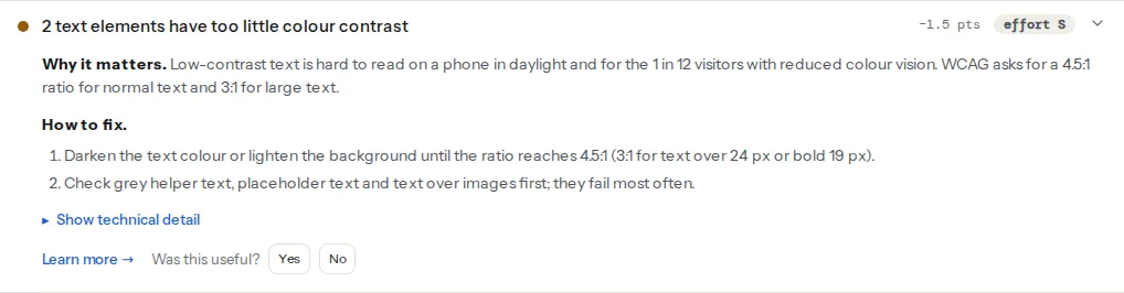
Three things the card does not tell you:
- The same elements are also counted in the serious violations. axe rates colour contrast as a serious issue, so a page with contrast problems also shows them under the serious violations finding. Fixing the colours clears both.
- Links that differ from body text only by colour are a separate axe rule (
link-in-text-block, WCAG 1.4.1). They appear under serious violations, not under contrast. - "Needs review" elements are not listed. When axe cannot work out the background (text over a background image, a gradient, a video, or an element partly covered by another), it marks the element as needing a human check rather than as a failure. getReport lists only confirmed failures, so a clean contrast finding says nothing about your hero banner. Check text over images by eye.
Contrast is one of the ten findings in fixing the top accessibility checker findings, and the colour contrast learn page has the short reference version. It has a sibling in WCAG 2.2 that the same tool checks: tap targets. Pale icon buttons are often also tiny ones, and the fix happens in the same CSS file.
Step by step
1. Group the failures by colour, not by element
Open the finding and look at the selectors. A list like .product-card__meta, .product-card__meta, .footer a, .footer a, input::placeholder is not five problems; it is two or three colours. Inspect one element of each kind in the browser to see its colours.
In Chrome or Edge: right-click the text → Inspect → in the Styles pane, click the small colour square next to color. The picker shows the contrast ratio with a tick for AA and AAA, and a curved line across the colour field: anything on the safe side of the line passes. Firefox shows the same in its Accessibility panel ("Check for issues" → Contrast).
2. Pick passing colours from a known-safe list
On white or near-white backgrounds, these pairs are measured with the WCAG formula:
| Text | Background | Ratio | Result |
|---|---|---|---|
| #999999 grey | #ffffff white | 2.85:1 | Fails, even for large text |
| #767676 grey | #ffffff white | 4.54:1 | Passes for all text, barely |
| #767676 grey | #f5f5f5 light grey | 4.17:1 | Fails for normal text |
| #595959 grey | #ffffff white | 7.0:1 | Passes with room (AAA) |
| #ffffff white | #0066cc blue | 5.57:1 | Passes |
| #ffffff white | #1a73e8 blue | 4.51:1 | Passes, barely |
| #ffffff white | #e53935 red | 4.23:1 | Large text only |
| #ffffff white | #d32f2f red | 4.98:1 | Passes |
| #ffffff white | #28a745 green | 3.13:1 | Large text only |
| #ffffff white | #1e7e34 green | 5.14:1 | Passes |
| #ffffff white | #ff9800 orange | 2.16:1 | Fails |
| #000000 black | #ff9800 orange | 9.74:1 | Passes |
Two patterns worth remembering. A grey that passes on white can fail on the light grey of a card or footer, so check each background you use. And bright orange, yellow and light green buttons need dark text, not white.
3. Fix it once, in your colour tokens
If your CSS has colours written out in dozens of places, the fix will not stick. Put them in CSS custom properties on :root (in the theme's main stylesheet) and use the variables everywhere:
/* theme stylesheet, e.g. assets/css/main.css */
:root {
  --color-text: #1f1f1f;        /* 16.5:1 on white */
  --color-text-muted: #595959;  /* 7.0:1 on white, 6.4:1 on #f5f5f5 */
  --color-link: #0066cc;        /* 5.6:1 on white */
  --color-surface: #ffffff;
  --color-surface-alt: #f5f5f5;
  --color-button-bg: #0066cc;
  --color-button-text: #ffffff; /* 5.6:1 on the button */
}

body { color: var(--color-text); background: var(--color-surface); }
.meta, .caption, .help-text { color: var(--color-text-muted); }
a { color: var(--color-link); }

/* Placeholders are styled separately, and some browsers dim them */
::placeholder { color: var(--color-text-muted); opacity: 1; }
A brand colour that fails does not have to go. Keep it for large headings, borders and backgrounds with dark text, and use a darker shade of the same hue for small text and links. Designers call this a "text-safe" variant; it usually differs by one step on the palette.
4. Put a scrim behind text on images
Text on photos passes or fails depending on which part of the photo is behind each letter, and the photo changes when marketing swaps the banner. Do not rely on the photo; put a semi-transparent dark layer between the image and the text:
/* hero banner with a background image and white text */
.hero { position: relative; }
.hero::before {
  content: "";
  position: absolute;
  inset: 0;
  background: rgb(0 0 0 / 0.6); /* white text stays at 5.7:1 or more, whatever the photo */
}
.hero__content { position: relative; color: #ffffff; }
A 60 % black layer over the brightest possible pixel (pure white) gives #666666, and white text on #666666 is 5.74:1. At 50 % it drops to 3.95:1, enough only for large text. If the design needs more of the photo, use a gradient that is dark only where the text sits.
5. Check the states nobody screenshots
Hover and focus colours, error messages, "sold out" and "sale" badges, cookie banners, and the text inside form fields after someone types all need the same ratios. Axe checks the page as it loads, so hover and focus states are yours to check by hand.
Focus indicators fall under the 3:1 rule for interface components: the focus ring must stand out 3:1 against the colours next to it. A thin light-blue glow on a white page usually does not. A solid two-pixel outline in a dark colour with a small offset works on almost any background:
:focus-visible {
  outline: 2px solid #1f1f1f;
  outline-offset: 2px;
}
6. Fix links that differ only by colour
A link in a paragraph that is blue while the text around it is dark grey is invisible as a link to someone who cannot tell those colours apart. Underline links inside body text. Navigation menus and buttons, where the position already says "this is a link", can do without.
main p a, main li a { text-decoration: underline; text-underline-offset: 0.15em; }7. Re-run the check
Run the checker again on the same page. The contrast finding should now read "Text has enough colour contrast", and the serious violations should drop by the same count. Then check two or three other templates (a product page, a blog post, the checkout) because each can have its own colours.
Platform notes
WordPress
- Block themes (the default themes from Twenty Twenty-Two on): colours live in the global styles. Appearance → Editor → Styles → Colors edits the palette, which is stored in the theme's
theme.jsonundersettings.color.palette. Blocks refer to palette entries by name, so darkening one entry fixes every block that uses it. - Classic themes: Appearance → Customize → Colors, or the theme's own options panel. Some themes hard-code greys in their stylesheet; then a few lines in Appearance → Customize → Additional CSS override them.
- The block editor warns you. When you pick a text and background colour for a block, the colour panel shows "This color combination may be hard for people to read" when the ratio is too low. Take the hint rather than dismissing it.
- Page builders (Elementor, Divi, Beaver Builder) let every button and heading widget set its own colours, which overrides the global palette. Set global colours in the builder's site settings, then look for widgets with local colours, especially button text and button hover states.
Shopify
Online Store → Themes → Customize → Theme settings → Colors. Newer themes use colour schemes: one scheme (text, background, button, button label) per section type. A scheme with white text on a light accent colour fails in every section that uses it, so fix the scheme, not the section.
Static sites and custom builds
Search the stylesheet for hard-coded colours (grep -rnE "#[0-9a-fA-F]{3,6}" src/styles) and replace them with the tokens from step 3. If you use Tailwind's default palette, gray-400 and lighter fail as text on white; gray-500 (#6b7280 in Tailwind 3, 4.83:1) is the lightest grey that passes.
Verify
- The contrast finding reads "Text has enough colour contrast" on each template you checked.
- The serious violations count dropped by the number of contrast elements you fixed.
- Text over images reads clearly on the brightest photo you have, because no automated check covers it.
- Tab through the page: every focused element has a visible ring you can spot without searching.
- For what no contrast tool can judge (reading order, labels, announcements), do a short manual pass: testing your site with a screen reader in 20 minutes.
Common mistakes
- Fixing each element instead of the colour. The next page or the next blog post brings the problem back. Change the palette or the CSS variable, then re-run.
- A grey tested on white, used on grey. #767676 passes on white and fails on #f5f5f5. Check the actual background of cards, footers and sidebars.
- "Disabled" buttons that are not disabled. Inactive controls are exempt, but only if they really are inactive (
disabledattribute). A pale "Continue" button that still works is a normal button and must pass. - Adding a text shadow to rescue low contrast. The ratio is measured on the text and background colours; the shadow does not count, and on photos it rarely helps enough.
- Trusting a clean result for hero banners. Text over images and gradients is "needs review" in axe, not a pass. Look at it, or use a scrim so it passes by construction.