Put the mouse down, press Tab, and watch where the page takes you. For a lot of people that is the only way the page works: screen reader users, people with tremors or repetitive strain injuries, switch users, and anyone whose trackpad just died. This guide describes what should happen when you tab through a page, the six things that usually go wrong, and the fix for each, in about the time it takes to read it.
Quick answer
- Every link, button and form field must be reachable with Tab and Shift+Tab, in the order it appears on screen.
- The focused element must be visible: never
outline: nonewithout a replacement. - Enter activates links and buttons, Space activates buttons and checkboxes, arrows move inside menus, sliders and tabs.
- Overlays (modals, menus, cookie banners) keep focus inside while open, close on Escape, and return focus to the element that opened them.
- No
tabindexabove 0 anywhere; usetabindex="0"for custom controls andtabindex="-1"for programmatic focus targets. - Run the accessibility checker for the automated part, then tab through the page yourself. A trap cannot be detected from the DOM.
Why keyboard access matters
A page that works with a keyboard works for every input method there is. Screen readers drive the page through the keyboard. Voice control software ("click Sign in") relies on the same focusable elements and accessible names. Switch access, sip-and-puff devices and eye trackers all end up sending key presses. When a custom dropdown is a pile of <div>s with click handlers, all of those people are locked out of it at once, and the page might as well have no checkout.
It also matters for people who simply prefer keys: power users filling in forms, anyone on a laptop without a mouse, developers testing on a train. And the fixes are cheap, because the browser does most of the work when you use its own elements: a <button> is focusable, has a focus ring, activates on Enter and Space and reports itself as a button, all for free.
Three WCAG 2.2 criteria cover this, all at level A or AA: 2.1.1 Keyboard (everything works with a keyboard), 2.1.2 No Keyboard Trap (focus can always leave), 2.4.3 Focus Order (the order makes sense) and 2.4.7 Focus Visible (you can see where you are). Automated tools check a small slice of them; the rest is ten minutes with the Tab key.
How getReport checks it
The checker renders the page in Chromium and runs axe-core with the WCAG 2.0, 2.1 and 2.2 A/AA rule sets plus best practices. Keyboard problems show up in three places in the accessibility panel:
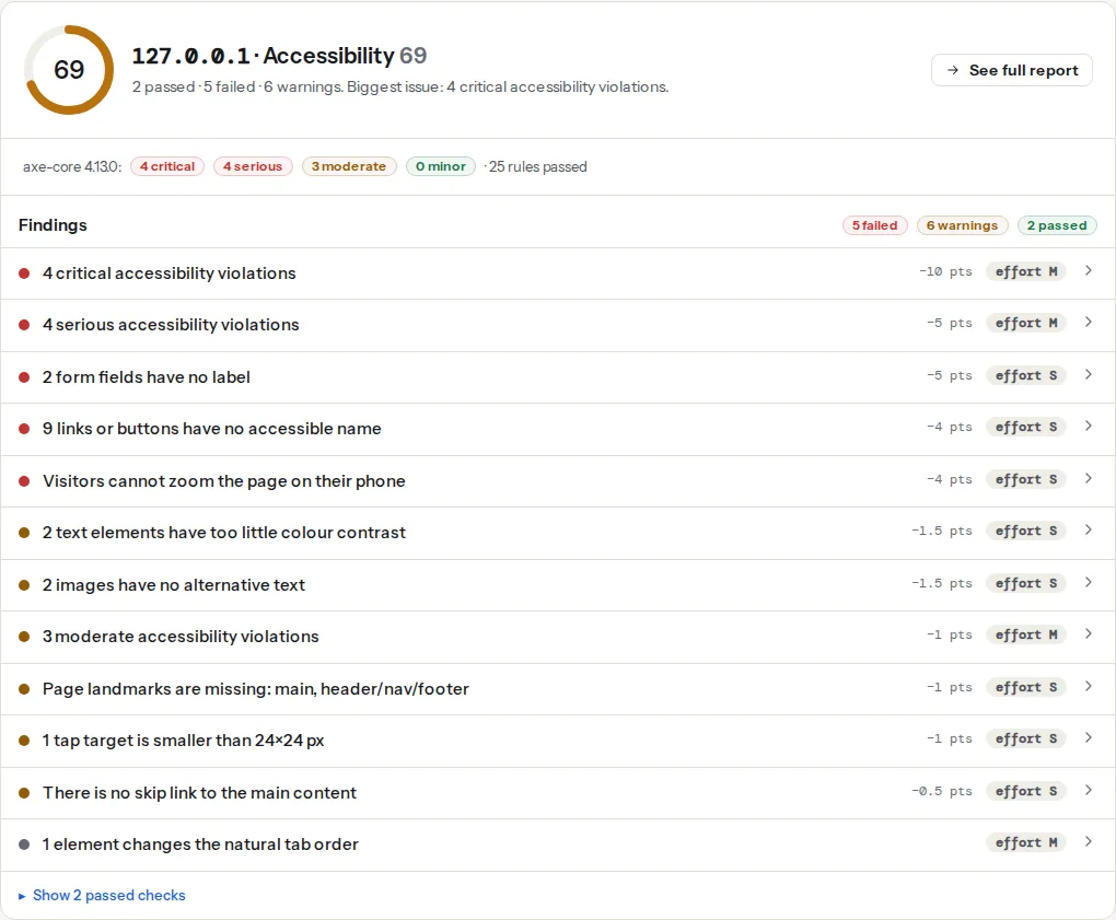
This finding is driven by the axe tabindex rule, so it fires on elements with tabindex="1" or higher. It carries no weight in the score (it is informational) and is hidden entirely when nothing on the page changes the order. What it cannot see: a modal that never lets focus out, a menu that only opens on hover, a <div> that looks like a button but is not focusable. Those need a person at a keyboard, which is why step 1 below is manual.
The serious group is where the keyboard-related axe rules land: scrollable-region-focusable (a scrolling box with no way to reach its content by keyboard), button-name and link-name (a control you can reach but cannot identify), aria-hidden-focus (a focusable element hidden from assistive technology, which is a trap for screen reader users). Open the technical detail to see the rule ids and the CSS selectors of the affected elements.
Small targets are a pointer problem more than a keyboard one, but they usually share a cause with keyboard problems: icon-only controls built from spans and images instead of buttons. Fixing the element type fixes both.
Step by step
1. Tab through the page and write down what breaks
Open the page, click in the address bar so focus starts at the top, then press Tab repeatedly. On a Mac, Safari and Firefox need "Press Tab to highlight each item" turned on in their settings (or use Option+Tab); Chrome tabs through links by default. For each press, ask:
- Can I see where focus is? If the ring disappears on some elements, note them.
- Does focus go where I expect? Left to right, top to bottom, header before content, content before footer.
- Did I skip something clickable? A card, an icon, a "×" on a banner, a slider handle.
- When I open something (a menu, a modal, a search overlay), can I close it with Escape, and does focus come back to where I was?
- Can I get out? If Tab cycles inside a widget forever, or focus vanishes behind an overlay, that is a trap.
Ten minutes on the home page, the main product or article page, and one form is enough to find most of it. The screen reader testing guide extends this into a full manual pass.
2. Put the focus ring back
The most common failure is one line of CSS, usually added years ago because a designer disliked the blue outline on click:
/* The line that removes focus for everyone: remove it */
*:focus { outline: none; }
Modern browsers already do what that line wanted: :focus-visible matches only when the browser decides the ring should show (keyboard navigation), not on mouse clicks. Replace the removal with a visible style on :focus-visible, in your main stylesheet:
/* Keep the ring for keyboard users, hide it for mouse clicks */
:focus:not(:focus-visible) { outline: none; }

:focus-visible {
  outline: 3px solid #1d5fd1;
  outline-offset: 2px;
}

/* Dark backgrounds: keep at least 3:1 contrast against the surroundings */
.site-footer :focus-visible { outline-color: #ffffff; }
WCAG 2.2 adds 2.4.11 Focus Not Obscured: a sticky header or cookie bar must not cover the focused element. If your header is fixed, add scroll-padding-top to html equal to its height so focused elements scroll into view below it.
3. Remove positive tabindex
tabindex="1", "2", "5" force those elements to come first, before everything with tabindex="0" or none, in numeric order. Nobody maintains that numbering; the third redesign leaves a "Subscribe" button that steals focus before the logo. The fix is to delete every positive value and put elements in the HTML in the order they appear on screen. Where CSS reorders (a flex-direction: row-reverse or order: on a grid), reorder the HTML instead, because the tab order follows the HTML, not the picture.
Two values remain useful: tabindex="0" makes a custom element focusable in its natural place, and tabindex="-1" makes an element focusable by script (element.focus()) but not by Tab, which is what a modal container or a "skip to content" target needs.
4. Use native elements for controls
A <div onclick> is not a button. It is not focusable, has no role, does not respond to Enter or Space, and reads as plain text to a screen reader. Making it behave takes tabindex="0", role="button", a keydown handler for both keys and an accessible name; a <button> needs none of that. The same applies to <a href> for anything that navigates, <select> for a simple dropdown, <input type="range"> for a slider, <details> for an accordion.
When a design really needs a custom widget, follow the ARIA Authoring Practices patterns: one Tab stop per widget, arrow keys move inside it. A menubar with roving tabindex looks like this:
// Roving tabindex: one Tab stop for the whole menu, arrows move inside it
const items = [...document.querySelectorAll('[role="menubar"] [role="menuitem"]')];
items.forEach((item, i) => item.tabIndex = i === 0 ? 0 : -1);

document.querySelector('[role="menubar"]').addEventListener('keydown', (e) => {
  const i = items.indexOf(document.activeElement);
  if (i === -1) return;
  const next = e.key === 'ArrowRight' ? (i + 1) % items.length
             : e.key === 'ArrowLeft'  ? (i - 1 + items.length) % items.length
             : null;
  if (next === null) return;
  items[i].tabIndex = -1;
  items[next].tabIndex = 0;
  items[next].focus();
  e.preventDefault();
});
5. Build modals with <dialog> and inert
A modal has three keyboard duties: keep focus inside while open, close on Escape, and put focus back where it came from. The <dialog> element does the first two when opened with showModal(); Escape closes it and the rest of the page is made inert automatically. Restoring focus is one line:
<button id="open-terms" type="button">Read the terms</button>

<dialog id="terms" aria-labelledby="terms-title">
  <h2 id="terms-title">Terms of sale</h2>
  <p>…</p>
  <form method="dialog"><button>Close</button></form>
</dialog>

<script>
  const opener = document.getElementById('open-terms');
  const dialog = document.getElementById('terms');
  opener.addEventListener('click', () => dialog.showModal());
  // Escape and the Close button both fire 'close'; return focus to the opener
  dialog.addEventListener('close', () => opener.focus());
</script>
If you cannot use <dialog> (an older component library), set the inert attribute on everything outside the overlay while it is open. Inert content is unreachable by Tab and by screen readers, which is exactly the effect a modal needs, and removing the attribute brings it back. Both <dialog> and inert work in every current browser.
6. Check the widgets you did not write
Carousels, chat bubbles, cookie banners and video players come from third parties and bring their own keyboard behaviour. Tab into each one:
- Carousel: can you reach the previous/next controls and the slides' links? Does autoplay stop when focus enters? If slides are hidden with
opacity: 0instead ofdisplay: noneorinert, their links are still in the tab order and focus vanishes into invisible content. - Cookie banner: Reject and Accept must be buttons you can reach and press; the banner should not steal focus on load, and if it blocks the page it needs to behave like a modal.
- Chat widget: many inject a launcher with
tabindex="1"or trap focus once open. Test it, then check the vendor's accessibility settings; most have a "keyboard accessible" toggle or an alternative launcher. - Embedded maps and videos: an iframe is one Tab stop into a whole new page. Give it a
titleso the user knows what they are entering, and make sure Tab eventually exits on the other side.
Platform notes
WordPress
Classic and block themes print menus as real <a> elements, so the main navigation is usually fine; the problem is dropdowns that open on hover only. Test with Tab: a submenu that never appears for keyboard users needs the theme's "focus-within" support (most themes since 2018 include it) or a small script that opens the submenu on focus. Twenty Twenty-Four and later block themes handle this out of the box.
Page builders are where custom controls appear. Elementor, Divi and WPBakery build popups, accordions and tabs from divs with their own scripts; keyboard support varies by widget and by version, and third-party add-ons are often worse than the builder itself. Check each add-on's widget with Tab before shipping a page with it. For popups, choose the builder's own popup module over a "modal" add-on, and enable its "close on Esc" option.
Focus outlines are frequently removed by the theme's CSS. Search the theme (Appearance → Theme File Editor, or the child theme's style.css) for outline: none and outline: 0 and apply the :focus-visible rules from step 2 in the Customizer's Additional CSS.
Shopify
Themes from the Shopify Theme Store are reviewed for keyboard support, so the base theme is normally fine. Apps that add pop-ups, spin-to-win wheels and chat are not reviewed the same way; test each one with Tab after installing it, and remove the ones that trap focus.
Static sites and custom builds
The fixes above are plain HTML, CSS and JavaScript and apply directly. If a component library provides a Modal or Menu component, check that it uses <dialog> or inert (or a focus trap with an Escape handler) rather than only hiding the background visually.
Verify
- Re-run the accessibility checker: the tab-order finding is gone from the panel (it only appears when a positive
tabindexexists) and the serious group no longer listsscrollable-region-focusable,button-nameorlink-name. - Tab through the same three pages again: every control gets a visible ring, the order matches the screen, every overlay closes on Escape and returns focus, and nothing traps you.
- Open a modal, press Escape, press Tab once: focus should move to the element after the button that opened it.
- On a phone with an external keyboard or a screen reader (VoiceOver swipes, TalkBack), the same order holds; mobile screen readers follow the DOM too.
Common mistakes
- A ring that only shows on click.
:focus { outline: none }with a custom:activestyle. Keyboard users never see either. Style:focus-visibleinstead. tabindex="1"on the "important" button. It becomes the first Tab stop on the page, before the skip link and the logo. Delete it; move the button earlier in the HTML if it must come first.- A modal that hides the page with CSS only. Focus tabs straight through the modal into the blurred page behind it, and Escape does nothing. Use
<dialog>withshowModal()orinerton the background. - Hover-only menus. A submenu that appears on
:hoverand never on focus is invisible to keyboard users. Add:focus-withinto the same rule, or open on click. aria-hidden="true"on something focusable. The element is in the tab order but does not exist for a screen reader: focus lands on silence. Either remove it from the tab order (tabindex="-1"orinert) or drop thearia-hidden.- Off-screen content that is still focusable. Slide-in menus and carousel slides parked at
left: -9999pxare still tabbable. Usedisplay: none,visibility: hiddenorinertwhile they are closed.