One photo uploaded straight from a phone weighs more than the rest of the page together, and it is often the largest thing on screen, so it alone decides the Largest Contentful Paint. The fixes are mechanical once you can see the numbers: file size, real pixel size, displayed size, format, and whether the layout reserved space. This guide shows how to get those numbers for every image on a page and what to do with each row.
Quick answer
- Export images at the width they are displayed, times two for high-density screens. A 400-pixel thumbnail needs an 800-pixel file at most.
- Save as WebP (or AVIF) at about 80 % quality; keep PNG only for screenshots with text and for transparency.
- Aim for under 100 KB for photos, under 300 KB for a full-width hero; a single image above 300 KB is the first thing to fix.
- Add
widthandheightto every<img>. CSS can still scale it; the attributes let the browser reserve space. - Add
loading="lazy"to everything below the fold, and never to the hero. - Run the image size checker to see all of it per image.
Why image sizes matter
Bytes cost time, and on a phone on a 4G connection a 1.8 MB hero image takes two to four seconds on its own. Google's Largest Contentful Paint threshold is 2.5 s, so that one file can fail the page by itself. Multiply by a gallery of six and the page is unusable on mobile data.
The second problem is layout. When an <img> has no width and height, the browser does not know how tall it will be until the file arrives, so it lays the text out, then pushes it down when the image loads. That jump is what Cumulative Layout Shift measures, and images without dimensions are its most common cause.
The third is waste: a 1600-pixel photo shown in a 300-pixel slot downloads 28 times more pixels than the screen can show. The browser throws them away after decoding them, which costs CPU too.
How getReport checks it
The report reads every <img> on the page (including data-src and the first srcset candidate that lazy-load plugins use), requests the first 64 KB of each file to read its format and real pixel dimensions, and takes the file size from the Content-Length header, so nothing large is downloaded twice. Together with the width, height, loading and srcset attributes from the HTML, that is enough for four findings:
The table lists each image sorted by size with format, real pixels, displayed size (from the attributes), loading attribute and status:
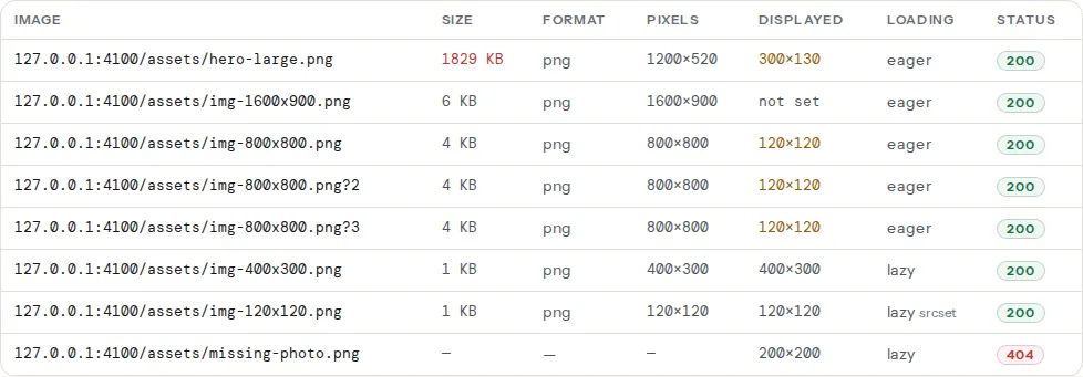
The Chromium run adds the total image weight including CSS backgrounds (image-count-and-weight), and the speed module adds Lighthouse's format and sizing estimates, which count the bytes you would save.
Step by step
1. Sort by size and fix the top three
The table is sorted by file size. The top three rows are usually 80 % of the image bytes. Fix those before anything else; the long tail of 20 KB icons does not matter.
2. Compare "Pixels" with "Displayed"
A row that says 1600×900 pixels, displayed 300×169, is serving five times too wide. Export at 600 pixels wide (twice the display width) and the file drops by about 85 %. If the displayed column says "not set", the page has no width/height attributes; measure the slot in the browser's dev tools (right-click → Inspect, hover the image) and export for that.
3. Choose the format
| Content | Format | Why |
|---|---|---|
| Photos | WebP (AVIF if your pipeline supports it) | 25–50 % smaller than JPEG at the same quality; universal browser support |
| Screenshots, UI, text | PNG or WebP lossless | JPEG blurs text; WebP lossless is smaller than PNG |
| Logos, icons | SVG | Any size, tiny file, sharp on every screen |
| Animations | Video (<video muted autoplay loop>) | A GIF of a few seconds is often 5–20 MB; the same as MP4 is 200 KB |
Quality 80 in WebP is indistinguishable from the original for photos at normal viewing sizes; quality 90+ is rarely worth the bytes.
4. Add width and height
The attributes say the image's proportions, not necessarily the display size; CSS width: 100%; height: auto still scales it. What matters is the ratio, because the browser uses it to reserve the space.
<!-- Reserve space: the ratio 3:2 comes from the attributes, CSS sets the display size -->
<img src="/img/runner-x-800.webp" alt="Blue running shoe, side view"
width="800" height="533" loading="lazy" decoding="async">img { max-width: 100%; height: auto; }5. Serve several sizes with srcset
One file for every screen means phones download the desktop size. srcset lists the candidates and sizes tells the browser how wide the slot is at each breakpoint:
<img src="/img/runner-x-800.webp"
     srcset="/img/runner-x-400.webp 400w,
             /img/runner-x-800.webp 800w,
             /img/runner-x-1200.webp 1200w"
     sizes="(max-width: 640px) 100vw, 400px"
     width="800" height="533" alt="Blue running shoe, side view" loading="lazy">
The browser picks the smallest file that covers the slot at its pixel density. Most CMSs generate the sizes on upload; the theme has to print the attributes.
6. Lazy-load below the fold only
loading="lazy" delays the download until the image is near the viewport. Put it on everything below the first screen. Do not put it on the hero or the first product image: a lazy hero waits for the layout before it even starts downloading, which is the single most common self-inflicted LCP problem. See Lazy loading done right.
7. Fix broken images
A 404 in the table means the file moved or was deleted. Every visitor sees a broken icon, and Google Images has nothing to index. Re-upload it, fix the path (a common one after a migration is the uploads folder or a CDN rewrite rule), or remove the tag.
Platform notes
WordPress. Media → uploads are resized on upload into the sizes registered by the theme; use the size that matches the slot (Add media → Image size) rather than "Full". Recent versions add width, height and loading="lazy" automatically for images inserted through the editor; theme images and page-builder widgets often do not. For conversion, a plugin such as ShortPixel, EWWW or Smush converts existing uploads to WebP and serves them through <picture> or rewrite rules; Performance Lab (from the WordPress team) converts on upload. Keep one such plugin, not three.
Shopify. The image_url filter with width: and the image_tag filter print srcset, width and height correctly in Liquid:
{{ product.featured_image | image_url: width: 800 | image_tag: widths: '400, 800, 1200', sizes: '(max-width: 640px) 100vw, 400px', loading: 'lazy' }}Shopify's CDN serves WebP automatically when the browser accepts it.
Static sites and frameworks. Next.js <Image>, Astro <Image> and Hugo's image processing resize and convert at build; the remaining job is the sizes attribute, which none of them can guess.
Image CDNs. Cloudinary, imgix, Cloudflare Images and Bunny Optimizer resize and convert on request from one original; a URL parameter picks the width. Good for sites with many images and no build step.
Verify
- The table shows no file above 300 KB, no "not set" in the displayed column, and no 404.
- The heavy, oversized and missing-dimensions findings pass.
- The speed module's image findings (
image-formats,image-sizing) show near-zero savings. - LCP in the speed module drops; if the hero is the LCP element, it should now load within 2.5 s on mobile.
Common mistakes
- Uploading originals. A 4000×3000 camera file scaled with CSS. Export at display size.
- Lazy-loading the hero. Adds hundreds of milliseconds to LCP for no gain.
height: autowithout attributes. CSS alone does not reserve space; the ratio has to come from the attributes oraspect-ratio.- Converting screenshots to JPEG. Text becomes fuzzy; use PNG or lossless WebP.
- Three optimisation plugins. Each rewrites the same tags; pick one.
- Serving the 2× file to every screen.
srcsetexists so that a 375-pixel phone gets the 750-pixel file, not the 1600-pixel one.