Every image finding in a report comes down to the same two facts: the file is bigger than the slot it fills, and it is in a format from 1992. Fixing that by hand means exporting four sizes in two formats for every image, and doing it again when the design changes. An image CDN does the same work from a URL: append ?w=800&f=auto, and a service resizes the master image, converts it for the requesting browser, compresses it and caches the result near the visitor. This guide explains what that buys, what it costs, the URL patterns for the common services, and the cases where a build step or your CMS already does enough. Allow an hour to decide and an afternoon to switch.
Quick answer
- An image CDN turns one master image into every size and format on request, from URL parameters (
w=,q=,f=auto) or the browser'sAcceptheader. The result is cached at the edge, so the transformation runs once. - It fixes the three image findings at once: oversized dimensions, old formats, and missing
srcsetvariants, becausesrcsetbecomes a loop over widths instead of a folder of files. - Free tiers (Cloudinary credits, ImageKit bandwidth, Jetpack Site Accelerator on WordPress) cover a brochure site or blog. A shop with 20,000 products pays for bandwidth wherever it goes.
- Keep the CDN on the same host as the page, or preconnect to it, so the hero image does not pay an extra DNS and TLS round trip.
- A build step (Sharp, Astro, Next.js at build) is enough when the image set is small and changes with deploys. WordPress generates its sizes on upload but does not convert JPEG to WebP by itself.
- Never let two things compress the same image; the second pass only adds artefacts.
Why image delivery matters
Images are most of the bytes on most pages, and the largest one is usually the Largest Contentful Paint element. The size of that file is set by three multiplications: pixels wide × pixels high × bytes per pixel for the format. A 4000 × 3000 camera JPEG shown in an 800-pixel column ships 25 times the pixels the screen can use; the same image at 1600 pixels wide (twice the slot, for high-density screens) in WebP is about a twentieth of the bytes.
Doing that arithmetic once per image is easy. Doing it for every image, four breakpoints, three formats, and again after every redesign that changes column widths, is the part that does not get done; the sizes were right for the old theme.
On-the-fly resizing moves the arithmetic to request time. The master image stays as uploaded; the URL says what the page needs; the service computes it once and caches it. When the design changes, the URLs change and the cache fills again. Nobody re-exports anything.
How getReport checks it
The image size checker requests up to 100 images from the page, reads the first 64 KB of each for its format and real pixel size, and takes the file size from the Content-Length header. The table it produces has the columns you will compare before and after the switch: Size (bytes on the wire), Format, Pixels (what was served), Displayed (from the width and height attributes) and Loading.
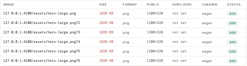
Three findings read that data. From the fetch itself:
The rule is exact: an image counts when its real width is more than twice the width attribute on the <img> (images without a width attribute, or under 16 px, and SVGs are skipped). Twice is the allowance for high-density screens, so a 1600-pixel file for an 800-pixel slot passes. From the Lighthouse run in the speed module:
Lighthouse computes the savings for the viewport it tested (a phone by default), so the same page can show image-sizing savings on mobile and none on desktop.
The fourth finding is easy to misread in this context:
It looks at the headers of the page response (Cloudflare's cf-ray, Fastly's x-served-by, Akamai's x-akamai-*, CloudFront's x-amz-cf-id). An image CDN on its own hostname (res.cloudinary.com, ik.imagekit.io, i0.wp.com) does not change the page's headers, so this finding can read "no CDN" on a site whose images are all served from one; step 5 covers that trade-off.
Step by step
1. Understand the two ways a service picks the format
Every image CDN converts formats; they differ in who decides. With an explicit parameter (f=webp, format=avif), the URL names the format, and you need <picture> with a <source> per format plus a JPEG fallback, exactly as with static files. With content negotiation (f=auto, format=auto), the service reads the browser's Accept header, which lists image/avif and image/webp when the browser supports them, and returns the best one under the same URL. The response carries Vary: Accept so caches keep one copy per format.
Negotiation is the simpler one: one <img>, one srcset, and the format problem disappears. Use explicit formats only when a specific one is required (a PNG that must stay PNG).
2. Pick a service, honestly
General image CDNs. Cloudinary has a free tier measured in monthly credits (a credit is a bundle of transformations, storage and bandwidth) and a full media library on top. imgix bills on usage and reads originals from your own S3 or GCS bucket. ImageKit has a free tier with a monthly bandwidth allowance and stores originals or proxies an existing folder. Bunny Optimizer is a flat monthly fee per zone with no per-transformation count, on top of Bunny's CDN; Fastly Image Optimizer is an add-on for sites that already pay Fastly. All of them resize, crop, convert, compress and cache; the differences are storage (do they hold the master, or fetch it from your server), the free tier's shape, and the URL syntax.
Cloudflare. The free plan caches images like any other file and does not resize or convert them. Polish (automatic compression and WebP) is a feature of the paid plans. URL-based transformations under /cdn-cgi/image/ are a separate product, Cloudflare Images, enabled per zone and metered per unique transformation. Check the plan before assuming Cloudflare optimises your images; the report's Format column tells you within a minute.
Platform-native. Shopify's CDN resizes every image through the image_url filter and serves WebP to browsers that accept it; you cannot add another CDN and do not need to. Squarespace and Wix resize and convert automatically.
Framework-native. Next.js next/image resizes on the server by default and can hand the work to a service with a custom loader; Astro's image service resizes at build and can be pointed at a CDN; Nuxt Image ships providers for a dozen services. You write the <Image> component once and change the provider in config.
WordPress. Jetpack Site Accelerator (the feature formerly called Photon) is free with Jetpack and serves every image through i0.wp.com with ?w= and ?resize= parameters and WebP for browsers that accept it. Optimole and ShortPixel Adaptive Images do the same through their own CDNs with free tiers, and both rewrite <img> tags to serve the displayed size. Autoptimize's Images tab routes through ShortPixel's CDN as well. Image optimisation plugins compared honestly weighs these against the plugins that convert files in place.
3. Learn the URL pattern for your service
The parameters differ in spelling, not in meaning. Width, quality, format and fit are the four you will use:
Cloudinary   https://res.cloudinary.com/demo/image/upload/w_800,q_auto,f_auto,c_fill/sample.jpg
imgix        https://example.imgix.net/hero.jpg?w=800&auto=format,compress&fit=crop
ImageKit     https://ik.imagekit.io/demo/hero.jpg?tr=w-800,q-80,f-auto
Bunny        https://example.b-cdn.net/hero.jpg?width=800&quality=80
Cloudflare   https://example.com/cdn-cgi/image/width=800,quality=80,format=auto/uploads/hero.jpg
Jetpack      https://i0.wp.com/example.com/wp-content/uploads/hero.jpg?w=800
q_auto / auto=compress lets the service pick a quality per image (roughly 75–85 for photos); f_auto / format=auto is content negotiation; c_fill / fit=crop crops to the requested width and height instead of letterboxing. Nothing else is needed for Core Web Vitals.
4. Generate srcset from one master with a loop
Instead of a folder of hero-400.jpg, hero-800.jpg, hero-1200.jpg, the template asks for each width in turn. The sizes attribute is still yours to write, because only the layout knows how wide the slot is; responsive images: srcset and sizes covers that arithmetic.
Shopify (Liquid), in a section or snippet, using the built-in helpers:
{{ product.featured_image
   | image_url: width: 1600
   | image_tag:
       widths: '400, 800, 1200, 1600',
       sizes: '(min-width: 990px) 50vw, 100vw',
       loading: 'lazy' }}
image_tag writes the <img> with srcset for every width in widths, plus width and height attributes from the image's real proportions.
WordPress (PHP), in a theme template, for a service that takes w=:
<?php
// theme: template-parts/hero.php
$master = 'https://ik.imagekit.io/demo/uploads/hero.jpg';
$widths = [400, 800, 1200, 1600];
$srcset = implode(', ', array_map(
    fn ($w) => sprintf('%s?tr=w-%d,f-auto %dw', $master, $w, $w),
    $widths
));
?>
<img src="<?php echo esc_url($master . '?tr=w-800,f-auto'); ?>"
     srcset="<?php echo esc_attr($srcset); ?>"
     sizes="(min-width: 900px) 800px, 100vw"
     width="1600" height="900" alt="Studio interior with the spring collection">
JavaScript (Node, Next.js loader or a static site generator):
// lib/images.js — one master URL, every width the layout might need
const WIDTHS = [400, 800, 1200, 1600];

export function imgixSrcset(path) {
  return WIDTHS
    .map((w) => `https://example.imgix.net${path}?w=${w}&auto=format,compress ${w}w`)
    .join(', ');
}

// next.config.js: hand next/image the same service
// module.exports = { images: { loader: 'custom', loaderFile: './lib/imgix-loader.js' } };
// lib/imgix-loader.js:
export default function imgixLoader({ src, width, quality }) {
  return `https://example.imgix.net${src}?w=${width}&q=${quality ?? 75}&auto=format`;
}
In every version the master is the largest size you will ever show (1600 px here), never the camera original, so a request for a width above the master does not upscale.
5. Put the CDN on the same host, or preconnect
An image served from res.cloudinary.com costs a DNS lookup, a TCP connection and a TLS handshake before the first byte, and the browser only discovers the hostname when it parses the <img>. For images below the fold that is invisible. For the hero, it is 100–300 ms added straight to LCP.
The better fix: serve images through the same hostname as the page, which every service supports as a custom domain (images.example.com as a CNAME) or, with Cloudflare and Bunny, by fronting the whole site. The quick fix: tell the browser early.
<!-- in <head>, before any stylesheet -->
<link rel="preconnect" href="https://res.cloudinary.com" crossorigin>
<link rel="preload" as="image"
      href="https://res.cloudinary.com/demo/image/upload/w_1200,f_auto/hero.jpg"
      imagesrcset="https://res.cloudinary.com/demo/image/upload/w_800,f_auto/hero.jpg 800w,
                   https://res.cloudinary.com/demo/image/upload/w_1200,f_auto/hero.jpg 1200w"
      imagesizes="100vw">
The preload, preconnect, prefetch guide explains when each hint helps and when it competes with the CSS.
6. Avoid the pitfalls
- Double compression. A plugin that compresses on upload plus a CDN that compresses on delivery gives you two rounds of JPEG artefacts and no extra saving. Pick one place. If the CDN does it, upload originals at high quality.
- Cache busting on the master. The CDN caches by URL. Replace
hero.jpgwith a new file under the same name and visitors keep the old one until the edge TTL expires. Change the file name, or use the service's purge API on upload. - Art direction still needs
<picture>. A URL parameter can crop, but only a<source media="…">can choose a different crop per breakpoint. A portrait hero on phones and a landscape one on desktop is still a<picture>with two masters. - Hotlink protection. Refusing requests without a
Refererfrom your domain breaks link previews, RSS readers and the report's own fetch. Allow empty referrers. - EXIF and colour profiles. Most services strip metadata by default (good for bytes, bad for copyright fields; check the "keep metadata" option) and convert colour profiles to sRGB, so export sRGB to begin with.
- Animated GIFs. A 3 MB GIF does not get smaller by resizing. Every major service converts GIF to MP4 or WebM; use a muted looping
<video>element for the result.
7. Estimate the cost before you commit
Image CDNs charge for transformations (each unique URL computed once), storage of masters, and bandwidth. Two sizes of site:
- A 200-page brochure site with 1,000 images, 4 widths, 2 formats: about 8,000 unique transformations, computed once and then served from cache. Bandwidth of a few gigabytes a month. This fits every free tier listed above, and Jetpack Site Accelerator does it for nothing on WordPress.
- A 20,000-product shop with 5 images per product, 4 widths, 2 formats: 800,000 unique variants, and bandwidth that scales with traffic (a busy shop moves hundreds of gigabytes of images a month). No free tier covers that, and the bill follows bandwidth wherever you host the images. A flat-fee service (Bunny) or your existing CDN with image features is usually cheaper than a per-credit one at that scale.
8. Know when a build step is enough
If the image set is small and changes only with deploys, a build step produces the same output as a CDN, once, for free. With Sharp in a Node build:
// scripts/images.mjs — run at build: node scripts/images.mjs
import sharp from 'sharp';
import { readdir } from 'node:fs/promises';

const WIDTHS = [400, 800, 1200, 1600];
for (const file of await readdir('src/images')) {
  const base = file.replace(/\.(jpe?g|png)$/i, '');
  for (const w of WIDTHS) {
    const img = sharp(`src/images/${file}`).resize({ width: w, withoutEnlargement: true });
    await img.clone().avif({ quality: 50 }).toFile(`public/img/${base}-${w}.avif`);
    await img.clone().webp({ quality: 80 }).toFile(`public/img/${base}-${w}.webp`);
    await img.clone().jpeg({ quality: 80, mozjpeg: true }).toFile(`public/img/${base}-${w}.jpg`);
  }
}
Astro's <Image> and Next.js at build do the same without the script. WordPress sits in between: it generates its registered sizes on upload (and srcset for content images), which handles dimensions; it accepts WebP uploads since 5.8 and AVIF since 6.5, but it does not convert an uploaded JPEG to either. So on WordPress the format half needs a plugin or a CDN, and the dimension half is already done as long as the theme uses the generated sizes.
Decision table
| Situation | Choose |
|---|---|
| Shopify, Squarespace, Wix | Nothing; use the platform's filters and check the table is green |
| WordPress, small site, no budget | Jetpack Site Accelerator or Optimole's free tier, plus dimensions from WordPress itself |
| WordPress, shop with thousands of products | A flat-fee or bandwidth-priced CDN fronting the whole site, with f=auto |
| Static site, images change with deploys | Sharp or the framework's image service at build |
| Next.js / Nuxt / Astro with user-uploaded images | Framework component with a loader pointing at an image CDN |
| Images on a separate hostname already | Add preconnect today, move to a custom domain when you can |
Verify
- Re-run the image size checker. The Format column reads
webporaviffor photos, and Pixels is within 2× of Displayed on every row that has a width. - The three findings (
images-oversized-dimensions,image-sizing,image-formats) pass, or list only third-party images you do not control. - In DevTools → Network, filter by Img: the
Content-Typeisimage/webporimage/avifand the response carriesVary: Acceptwhen you usef=auto. - LCP did not get worse. If it did, the hero now comes from a new hostname without a preconnect; fix step 5.
Common mistakes
- The master is the camera original. Symptom: the first request for each size takes seconds, and storage bills grow. Resize masters to the largest displayed size before upload; the CDN scales down, it does not need 6000 pixels.
srcsetwithoutsizes. Symptom: phones download the 1600-pixel variant. Withoutsizesthe browser assumes the image is full-width. Write it per slot.- A plugin and the CDN both rewriting
<img>. Symptom: URLs with two sets of parameters, or images that stop loading. Two rewriters fight; disable one.