A data table is one of the few things on a page that a screen reader handles better than a sighted reader, provided it is marked up as one. With proper headers, a blind visitor can jump to a cell and hear "Price, March, 240 euros" without reading the whole grid. Without them, the same table is a stream of numbers with no idea what any of them mean. This guide covers the markup that makes tables work, the responsive patterns that keep working on a phone, sorting and pagination, and the three cases where a table is the wrong element altogether.
Quick answer
- Every data table gets a
<caption>(oraria-labelledby), a<thead>with<th scope="col">cells, and<th scope="row">for the first column when rows have names. - Units and currencies go in the header ("Price (€)"), not in every cell.
- No merged cells unless you use
headersattributes; simpler to split the table. - On small screens, wrap the table in a scroll container with
tabindex="0"and anaria-label; do not split one table into two. - Sortable columns: a
<button>inside the<th>,aria-sorton the<th>, and a visible sort indicator. - Layout with CSS grid, not tables. Key–value pairs are a
<dl>; a set of cards is a<ul>. - Run the accessibility checker, then a two-minute screen reader pass with the table navigation keys.
Why table markup matters
Screen readers have a table mode. When the virtual cursor enters a <table>, the user can move cell by cell with the arrow keys, and at each cell the software reads the column header and, if present, the row header before the cell content. That only works when the headers are <th> elements the browser can associate with the cell. A table built from <div>s, or a <table> whose header row uses <td> in bold, gives the software nothing to associate, so every cell is announced bare: "240", "310", "195".
The same association powers other things: the accessibility tree that voice control uses ("click Price"), browser reader modes, and the structured extraction that search engines do on comparison tables. And for sighted readers, a <caption> is the one place the table's purpose is stated before the numbers start.
How getReport checks it
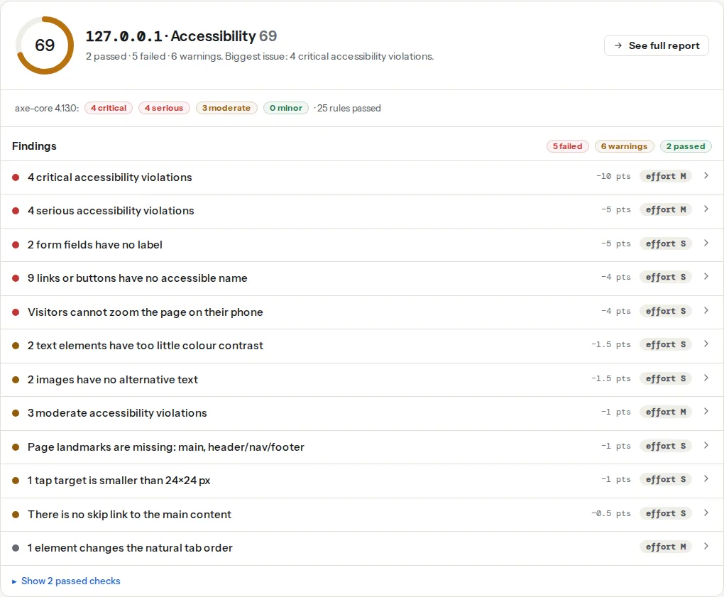
The checker renders the page in Chromium and runs axe-core against the WCAG 2.2 A and AA rules plus axe's best-practice rules. Violations are grouped by axe's impact rating into four findings: critical and serious count as failures, moderate and minor as warnings. Each finding lists the rules that fired, the number of elements per rule, and the first ten CSS selectors, so you can find the table in the source.
The table rules that run in this configuration:
| axe rule | What it catches | Level |
|---|---|---|
th-has-data-cells | A <th> (or role="columnheader") with no data cells under it | WCAG 1.3.1 (A) |
td-headers-attr | A headers attribute pointing at cells that are not in the same table | WCAG 1.3.1 (A) |
scope-attr-valid | scope with a value other than row, col, rowgroup or colgroup, or on a <td> | best practice |
empty-table-header | A <th> with no text | best practice |
table-duplicate-name | A <caption> that repeats the summary attribute | best practice |
Two rules people expect are not in the list. td-has-header (a data cell with no header at all) is an experimental axe rule and does not run in a standard WCAG configuration, and the old layout-table rule was removed from axe-core in version 4. So a table with a <td> header row passes axe, and the checker will not tell you. That is the biggest gap in automated table testing and the reason the manual pass at the end of this guide matters; what automated accessibility checks cover is about a third of WCAG.
A table also needs to be inside a landmark. The region rule (moderate) fires when content sits outside <main>, <nav> and friends, which on many themes is exactly where a big pricing table ends up:
Step by step
1. Start from a complete, plain data table
This is the whole pattern. Everything else in the guide is a variation on it.
<table>
  <caption>Monthly plan prices, billed yearly</caption>
  <thead>
    <tr>
      <th scope="col">Plan</th>
      <th scope="col">Price (€ / month)</th>
      <th scope="col">Storage (GB)</th>
      <th scope="col">Users</th>
    </tr>
  </thead>
  <tbody>
    <tr>
      <th scope="row">Starter</th>
      <td>9</td>
      <td>50</td>
      <td>1</td>
    </tr>
    <tr>
      <th scope="row">Team</th>
      <td>29</td>
      <td>500</td>
      <td>10</td>
    </tr>
  </tbody>
</table>
What each part does:
<caption>is the table's name. Screen readers announce it on entering the table and list it in the table navigation dialog. If a visible heading already names the table, usearia-labelledby="heading-id"on the<table>instead of a second caption.<thead>with<th scope="col">makes the column headers.scopeis technically optional for a simple one-row header, but it costs nothing and removes any guessing.<th scope="row">on the first cell of each row means "Team" is read before "29", so a cell is announced as "Price, Team, 29".- Units in the header. "Price (€ / month)" once is shorter, sortable, and read once per cell instead of "9 euros per month" forty times.
- A sentence before the table ("Prices for the three plans; all include support") helps everyone, and it is where you put anything a
<caption>is too short for.
2. Avoid merged cells; if you cannot, use headers attributes
colspan and rowspan break the simple header association. A cell that spans two columns has two column headers, and a screen reader will read one, both or neither depending on the software. If a table needs a two-level header (a "2025" group over "Q1" and "Q2"), the reliable way is to give each header an id and each data cell a headers attribute listing every header that applies:
<th id="y25" colspan="2" scope="colgroup">2025</th>
…
<th id="q1" scope="col">Q1</th>
<th id="q2" scope="col">Q2</th>
…
<td headers="y25 q1">1,240</td>
That is the case td-headers-attr polices: every id in headers must be a cell in the same table. In practice the simpler answer is usually two tables, one per group, each with its own caption.
3. Make it responsive without breaking it
A six-column table does not fit a 390 px phone. Two patterns keep the table markup intact.
Horizontal scroll container. The table keeps its structure; the wrapper scrolls. The wrapper needs tabindex="0" so keyboard users can scroll it, and a label so they know what they are scrolling:
<div class="table-scroll" role="region" aria-labelledby="plans-caption" tabindex="0">
  <table>
    <caption id="plans-caption">Monthly plan prices, billed yearly</caption>
    …
  </table>
</div>.table-scroll {
overflow-x: auto;
-webkit-overflow-scrolling: touch;
}
.table-scroll:focus-visible {
outline: 2px solid #1d5fd1;
outline-offset: 2px;
}Without the tabindex, axe reports scrollable-region-focusable (serious): a scrollable area that keyboard users cannot reach.
Stacked rows. Each row becomes a block, and each cell gets its header printed before it with CSS:
@media (max-width: 640px) {
  .stack thead { position: absolute; left: -9999px; }
  .stack tr { display: block; margin-bottom: 1rem; }
  .stack td, .stack th[scope="row"] { display: block; text-align: left; }
  .stack td::before {
    content: attr(data-label) ": ";
    font-weight: 600;
  }
}<td data-label="Price (€ / month)">9</td>The header row is moved off-screen rather than hidden with display: none, because display: none removes it from the accessibility tree and breaks header association. The cost of this pattern: the ::before text is announced by most screen readers as well as the header, so a cell is read as "Price, Price: 9". It is tolerable; the scroll container is cleaner when the table is wide but short.
Never split into two tables. Showing columns 1–3 on one table and 4–6 on another looks fine and destroys the relationship between a row's cells.
4. Sortable columns: a button in the header
A clickable <th> is not keyboard reachable and has no role. Put a real button inside it, and tell assistive technology which column is sorted with aria-sort:
<th scope="col" aria-sort="ascending">
  <button type="button" class="sort" data-column="price">
    Price (€ / month)
    <span class="sort-icon" aria-hidden="true">▲</span>
  </button>
</th>document.querySelectorAll('th button.sort').forEach((button) => {
button.addEventListener('click', () => {
const th = button.closest('th');
const next = th.getAttribute('aria-sort') === 'ascending' ? 'descending' : 'ascending';
// Only the sorted column carries aria-sort
th.closest('tr').querySelectorAll('th').forEach((h) => h.removeAttribute('aria-sort'));
th.setAttribute('aria-sort', next);
sortRows(button.dataset.column, next); // your sort
document.getElementById('sort-status').textContent =
`Sorted by ${button.textContent.trim()}, ${next}`;
});
});<p id="sort-status" class="visually-hidden" aria-live="polite"></p>aria-sort goes on the <th>, never on the button, and only on the currently sorted column. The live region announces the result for screen reader users, since re-ordering rows makes no sound on its own. Keep a visible sort indicator too; aria-sort does nothing for sighted keyboard users.
For filters and "showing 1–20 of 300" pagination, the same live region announces the new count ("20 of 300 results shown"). Pagination links are a <nav aria-label="Pagination"> with the current page marked aria-current="page".
5. Long tables: sticky headers and column count
A header row that scrolls out of view is a problem for everyone. position: sticky on the <th> elements keeps it on screen without changing the markup:
thead th {
  position: sticky;
  top: 0;
  background: #fff;
  z-index: 1;
}
Beyond about eight columns, ask whether the table is doing two jobs. Two tables with clear captions beat one wide one with a scroll bar; a "details" link per row beats twelve columns nobody reads.
6. Use something else when it is not data
- Layout tables. A table used to position a form or a page section confuses table mode: the user hears "table with 3 columns and 40 rows" and starts navigating a layout. Use CSS grid or flexbox. If the table cannot be replaced right now,
role="presentation"on the<table>removes it from the accessibility tree and is an honest stopgap. - Key–value pairs. "Weight: 2.4 kg, Colour: black, Warranty: 2 years" is a description list,
<dl>with<dt>and<dd>, not a two-column table. - A list of cards. Products, team members, blog posts: a
<ul>of<li>with a heading each. A screen reader announces "list, 12 items" and the user can jump between them.
7. Test with a screen reader
Automated checks confirm the markup is valid; only table mode confirms it makes sense. With the free NVDA on Windows or VoiceOver on macOS, put the cursor in the table and use the table navigation keys (Ctrl+Alt+arrows in NVDA and VoiceOver) to move across a row. You should hear the column header before each value; moving down a column you should hear the row header. If you hear only numbers, a header is missing or a <td> is where a <th> should be. Testing with a screen reader has the full setup.
Platform notes
WordPress
The core Table block emits real <table> markup. Turn on Header section in the block's settings sidebar to get a <thead> with <th> cells; without it every row is <td>. The block also has a caption field under the table; use it. The block does not add scope attributes; that is harmless for a single header row. TablePress renders <th> for the first row when its "table head row" option is on, and its DataTables sorting adds keyboard-operable headers. Elementor's core widgets do not include a data table, so tables come from add-on widgets or pasted HTML; inspect the output rather than trusting the widget name.
An embedded Google Sheet is an <iframe> running the Sheets web app. The checker cannot audit inside another origin's frame, and a screen reader user gets an application, not a table. Publish the data as an HTML table on the page and link to the sheet for download.
Shopify
Product descriptions accept HTML, so a size chart pasted from a spreadsheet arrives as <td>-only rows. Edit the description's HTML and change the first row to <th scope="col">. Theme size-chart sections vary; check the rendered source.
Static sites and custom
Markdown tables (GitHub-flavoured) render with a <thead> and <th> cells in every common generator, but no caption; add one with a small shortcode or a preceding heading and aria-labelledby. Component libraries usually get the header markup right and leave caption, scope="row" and the scroll wrapper to you.
Verify
- The accessibility checker's serious and critical findings list no table rules for the page, and the moderate finding lists no
regionviolation for the table's container. - In the browser's accessibility inspector (Chrome DevTools → Accessibility pane), a data cell shows its column and row headers under "Table cell".
- A screen reader pass across one row and down one column announces headers before values.
- On a 390 px viewport the table scrolls or stacks, and the scroll container takes keyboard focus with a visible outline.
Common mistakes
- Bold
<td>cells as headers. They look like headers and are not. Symptom: screen readers announce bare numbers; axe stays quiet. Fix:<th scope="col">in a<thead>. display: noneon the header row for mobile. The headers disappear from the accessibility tree too. Move the row off-screen instead.aria-sorton every column. Only the sorted column carries it; the rest confuses the announcement.- A
<div>grid withrole="table"and norole="row"/role="columnheader"children. Half an ARIA table is worse than a<div>; use a real<table>or complete every role. - Screenshots of tables. An image of a pricing table is invisible to screen readers, search engines and anyone zooming in. If the table exists somewhere as data, publish it as a table.