Before a browser draws anything, it reads the top of your HTML and fetches every stylesheet and ordinary script it finds in <head>. Until those files arrive, the visitor looks at a white screen. On a fast office connection that takes a blink; on a mid-range phone on 4G it can take two seconds or more. This guide shows you which files are holding the first paint back, how much each one costs, and how to fix them one at a time without breaking the page. Plan for an hour on a hand-built site and about the same on WordPress with a performance plugin.
Quick answer
- Run the website speed test and open "Render-blocking resources". It lists every blocking file and the estimated time you get back.
- Scripts: add
deferto scripts in<head>(orasyncfor independent ones like analytics). Scripts that nothing on the first screen needs can also move to the end of<body>. - Stylesheets: inline the few kilobytes of CSS the first screen needs, load the rest without blocking, and give print or desktop-only CSS a
mediaattribute. - Dead weight: remove CSS and JS that the page does not use at all, usually plugin files loaded on every page.
- Fonts: add
font-display: swap, self-host where you can, andpreconnectto any third-party origin you keep. - Re-run the test. First Contentful Paint should drop by roughly the estimated savings.
Why render-blocking resources matter
Two things happen when the browser meets a stylesheet or a plain <script src> in <head>:
- Stylesheets block rendering. The browser will not paint until it has every stylesheet that applies to the current screen, because painting without them would show unstyled content that then jumps around. The HTML keeps loading in the background, but nothing appears.
- Scripts without
deferorasyncblock the parser. The browser stops reading the HTML, downloads the script, runs it, and only then continues. A script also waits for the stylesheets above it, because it might ask for a computed style. Three scripts from three different servers mean three connections to set up before the page can continue.
The result shows up in two metrics you already track. First Contentful Paint (FCP) is the moment the first text or image appears; every blocking file sits directly in front of it. Largest Contentful Paint (LCP), the Core Web Vital that Google uses for ranking, cannot happen before FCP, so a blocked first paint drags the hero image back as well. When LCP is your worst number, fixing Largest Contentful Paint covers the image side of the same problem. A shop whose product page stays blank for 2.5 s on mobile loses visitors before they have seen a price.
The fix is rarely "less CSS and JS" in total. It is about when each file is needed. Most of the code in <head> is for things below the fold, for later interactions, or for other pages entirely.
How getReport checks it
The speed test runs Google PageSpeed Insights (Lighthouse) on a throttled mobile phone and on desktop. Lighthouse flags a resource as render-blocking when it is:
- a
<script src>in<head>withoutdefer,asyncortype="module", or - a
<link rel="stylesheet">without amediaquery that rules it out on the tested device, and withoutdisabled.
To estimate the savings, Lighthouse replays the page load in its network model with those files taken off the critical path and compares when the first paint would happen. It is a simulation on a slow phone, so read the number as a size, not a promise: a 1,200 ms estimate means the files matter a lot, a 90 ms estimate means there are better things to do first.
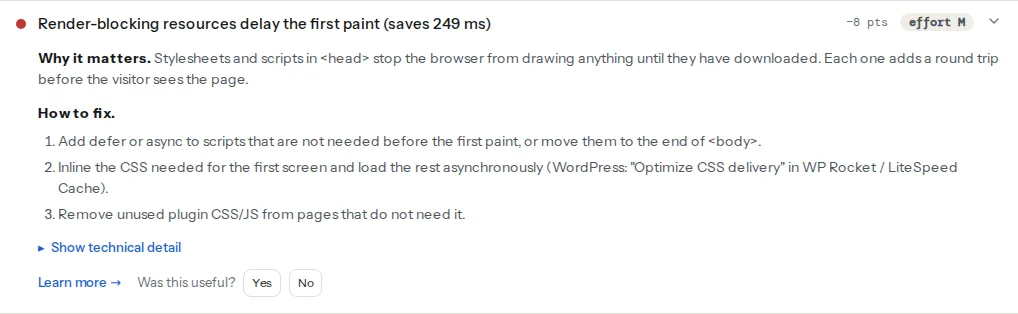
Open the technical detail to see the file list with each file's address. The request waterfall further down the Speed module colours render-blocking requests amber, so you can see them queued in front of everything else.
Two related findings usually appear next to it and share the same fixes:
The FCP and LCP findings show the effect. Fix the blocking files and those two numbers move.
Step by step
Work in this order. Each step is safe on its own, and you can re-run the test after each one.
1. Defer the scripts in <head>
Most scripts do not need to run before the first paint: sliders, menus, cookie banners, chat widgets, analytics. Adding defer tells the browser to download them in parallel and run them after the HTML has been read, in the order they appear.
<!-- Before: blocks the parser until each file arrives and runs -->
<script src="/js/jquery.min.js"></script>
<script src="/js/slider.js"></script>

<!-- After: downloads in parallel, runs in order after parsing -->
<script src="/js/jquery.min.js" defer></script>
<script src="/js/slider.js" defer></script>
When to use async instead of defer
defer | async | |
|---|---|---|
| Downloads | In parallel, without blocking | In parallel, without blocking |
| Runs | After the HTML is parsed, before DOMContentLoaded | As soon as it arrives, even mid-parse |
| Order | Keeps the order in the page | Whichever finishes first |
| Use for | Your own scripts, anything with dependencies | Independent scripts: analytics, tag managers, ads |
The rule of thumb: if a script needs another script (jQuery plugins need jQuery), use defer on both. If nothing depends on it and it depends on nothing, async is fine. type="module" scripts are deferred automatically. Inline scripts (without src) ignore both attributes, so a small inline script that calls a deferred library will fail; move that code into a file loaded with defer after the library.
MDN's script element reference has the full rules.
2. Or move scripts to the end of <body>
On older templates where you cannot add attributes easily, moving <script> tags just before </body> has a similar effect: the content above them is parsed and painted first.
  <footer>…</footer>
  <script src="/js/menu.js"></script>
</body>
defer in <head> is usually better because the browser discovers the file earlier, but either removes the block.
3. Inline the critical CSS, load the rest without blocking
"Critical CSS" is the small set of rules the first screen needs: header, navigation, hero, fonts, layout grid. Put those in a <style> block in <head> and load the full stylesheet so it does not block. Keep the inline part small; web.dev suggests staying under about 14 KB so it fits in the first round trip.
<head>
  <style>
    /* Critical rules for the first screen only */
    body{margin:0;font-family:system-ui,sans-serif}
    .site-header{display:flex;justify-content:space-between;padding:16px}
    .hero{min-height:60vh;display:grid;place-items:center}
  </style>

  <!-- Full stylesheet: loads as print CSS (non-blocking), then switches to all -->
  <link rel="stylesheet" href="/css/site.css" media="print" onload="this.media='all'">
  <noscript><link rel="stylesheet" href="/css/site.css"></noscript>
</head>
The media="print" trick works because the browser downloads print stylesheets at low priority and does not wait for them. When the file arrives, onload switches it to apply everywhere. The <noscript> line covers visitors without JavaScript. A variant uses rel="preload":
<link rel="preload" href="/css/site.css" as="style" onload="this.onload=null;this.rel='stylesheet'">
<noscript><link rel="stylesheet" href="/css/site.css"></noscript>
Both patterns use an inline onload handler. If your site sends a strict Content-Security-Policy without 'unsafe-inline' for scripts, the handler will not run and the stylesheet never applies; see Content-Security-Policy from report-only to enforced for nonces and hashes. Tools such as Critical or Penthouse generate the critical rules from a real page; web.dev's article on deferring non-critical CSS walks through one.
4. Split CSS by media query
A stylesheet whose media does not match the current device is downloaded but does not block rendering. Splitting print and wide-screen rules into their own files takes them off a phone's critical path:
<link rel="stylesheet" href="/css/base.css">
<link rel="stylesheet" href="/css/desktop.css" media="(min-width: 1024px)">
<link rel="stylesheet" href="/css/print.css" media="print">
5. Remove the CSS and JS the page does not use
The fastest file is the one that is not sent. The unused CSS finding lists stylesheets where most rules never match anything on the page. The usual sources are a theme or page builder that ships one large file for every possible layout, and plugins that load their assets on every page even though they are used on one (a contact form, a slider, a booking widget). Remove the files, or load them only on the pages that need them. In a build pipeline, PurgeCSS or your framework's CSS splitting does this automatically.
6. Fix the fonts
Web fonts are not render-blocking in Lighthouse's sense, but the stylesheet that declares them often is (Google Fonts' CSS is a stylesheet on another server), and without font-display the text stays invisible while the font loads. Self-hosting removes the extra connection and lets you set the behaviour yourself:
/* /css/site.css — self-hosted font files in /fonts/ */
@font-face {
  font-family: "Inter";
  src: url("/fonts/inter-var.woff2") format("woff2");
  font-weight: 100 900;
  font-display: swap;
}
Preload the one or two font files the first screen uses:
<link rel="preload" href="/fonts/inter-var.woff2" as="font" type="font/woff2" crossorigin>If you keep Google Fonts, add &display=swap to the stylesheet URL and connect early to both origins it uses.
7. Preconnect to the third-party origins you keep
Every new server costs a DNS lookup, a TCP connection and a TLS handshake before the first byte, often 100–300 ms on mobile. preconnect starts that work immediately:
<link rel="preconnect" href="https://fonts.googleapis.com">
<link rel="preconnect" href="https://fonts.gstatic.com" crossorigin>
Limit it to two or three origins that are needed early; each preconnect holds a connection open whether it is used or not.
Platform notes
WordPress
WordPress themes and plugins add files with wp_enqueue_style() and wp_enqueue_script(), and many enqueue on every page. That is why a site with 30 plugins typically has 15–25 blocking files in <head>. Three tools deal with it from the admin, without code:
- Asset CleanUp and Perfmatters (Script Manager) let you switch off a plugin's CSS and JS per page or per post type, for example the contact form plugin everywhere except the contact page.
- WP Rocket: File Optimization → "Optimize CSS delivery" with "Load CSS asynchronously" (generates critical CSS) or "Remove unused CSS"; "Load JavaScript deferred" and "Delay JavaScript execution" for scripts. LiteSpeed Cache has equivalents under Page Optimization.
Turn on one option at a time and click through the site after each, especially menus, sliders, forms and the checkout. What each WordPress plugin costs your page shows how to find the heaviest plugins first.
If you write the theme yourself, WordPress 6.3 and later can add defer for you:
// functions.php (child theme): load the theme script deferred, in the footer
add_action('wp_enqueue_scripts', function () {
    wp_enqueue_script(
        'theme-main',
        get_stylesheet_directory_uri() . '/js/main.js',
        [],
        '1.0',
        ['strategy' => 'defer', 'in_footer' => true]
    );
});
Shopify
Check layout/theme.liquid (Online Store → Themes → Edit code). Themes built with script_tag output a plain blocking tag; write the tag yourself with defer:
{%- comment -%} Before: {{ 'vendor.js' | asset_url | script_tag }} {%- endcomment -%}
<script src="{{ 'vendor.js' | asset_url }}" defer></script>
Apps are the other source. Current apps add their code as app embeds, which you switch off under Themes → Customize → App embeds. Older apps pasted code into theme.liquid or snippets, and that code often stays after the app is uninstalled; search the theme for the app's name. {{ content_for_header }} must stay; Shopify manages what it loads.
Verify
- Re-run the speed test (use "Re-run", because reports are cached for 12 hours). The render-blocking finding should list fewer files, or pass as "No render-blocking resources delay the first paint".
- FCP and LCP should drop by roughly the estimated savings. Compare two runs of the same device, not mobile against desktop.
- In the waterfall, the amber bars are gone from the start of the timeline.
- Click through the pages that use the changed scripts: menus open, sliders slide, forms submit, checkout works. Open the browser console and look for red errors.
Common mistakes
- Deferring the script that draws the first screen. If a slider or a JavaScript-rendered hero is above the fold, deferring its script leaves an empty box until it runs, and LCP gets worse. Keep that one early, or render the first slide in HTML.
asyncon scripts with dependencies. A jQuery plugin loaded withasyncmay run before jQuery and fail with "jQuery is not defined", but only sometimes, depending on which file arrives first. Usedeferfor both.- Inlining the whole stylesheet. Putting 150 KB of CSS in
<head>moves the problem into the HTML and stops the browser from caching it. Inline only the first screen's rules. - Removing jQuery because a plugin "does not need it". Many WordPress plugins and themes still call jQuery, sometimes only in an inline script. If something stops working after an optimisation, re-enable jQuery first.
- Stacking two optimisation plugins. WP Rocket plus Autoptimize plus the host's own optimiser each rewrite the same tags, and the result is unpredictable. Keep one.