font-display: swap tells the browser to draw text immediately in a fallback font and switch to your web font when it arrives, instead of hiding the text for up to 3 seconds. Add it to every @font-face rule, or add &display=swap to a Google Fonts URL, and your headings never flash blank. Swap alone still lets the page jump when the font lands, so this guide also covers the three steps that stop the jump: preloading, self-hosting with a subset, and a fallback tuned to the same size. Fonts are one of the three resource types in render-blocking resources: the CSS, JavaScript and fonts that delay your page; this is the font chapter in full, including when a system font stack is the better answer.
Quick answer
- Add
font-display: swapto every@font-face, or&display=swapto the Google Fonts stylesheet URL. Text shows at once. - Preload the one or two WOFF2 files used above the fold with
<link rel="preload" as="font" type="font/woff2" crossorigin>. No more than two. - Self-host the files. If you keep Google Fonts, add
<link rel="preconnect" href="https://fonts.gstatic.com" crossorigin>. - Subset to the characters you use: a Latin subset in WOFF2 is usually 15-40 KB per weight.
- Match the fallback's size with
size-adjust(plus the metric overrides where supported), so the swap changes letter shapes but not line breaks. - Or use a system font stack for body text: no download, no swap, no shift.
What font-display: swap does
While a web font downloads, the browser has to decide what to show. font-display sets that decision as two periods: a block period, when text using the font is invisible, and a swap period, when fallback text is shown and replaced if the web font arrives.
| Value | Blank text | Swaps when the font arrives | Layout shift risk |
|---|---|---|---|
auto / block | Up to about 3 s | Always | Yes, late |
swap | Almost none | Always, whenever it arrives | Yes, unless the fallback is tuned |
fallback | About 100 ms | Only if it arrives within about 3 s | Small |
optional | About 100 ms | Never; the fallback stays for this page view | None |
Without the descriptor, current browsers behave like block: an invisible headline for up to 3 s (a "flash of invisible text"), then a jump. swap removes the blank but keeps the jump. When the web font replaces the fallback, letters are wider or narrower, lines rewrap, and everything below moves. That movement counts towards Cumulative Layout Shift, where Google's threshold for good is 0.1.
For body and heading text, swap plus a tuned fallback (step 5) shows text at once and does not move it. optional is the zero-shift choice for a font you can live without on a first visit: the browser uses it only if it is ready almost immediately, usually from cache on a repeat visit. Icon fonts are the exception to swap: the fallback shows letters or boxes where icons should be, so use block for them, or better, inline SVG.
Why fonts are slow to arrive
Fonts are discovered late. The browser reads the HTML, downloads the stylesheet, parses it, and only then learns it needs brand-sans.woff2. With Google Fonts it is worse: the stylesheet comes from fonts.googleapis.com and the files from fonts.gstatic.com, two extra hostnames that each need a DNS lookup, a connection and a TLS handshake before the first byte. The Google Fonts stylesheet in <head> is also render-blocking: nothing paints until it has arrived.
The count matters more than the size of one file. Regular, bold, italic and bold italic for body, two heading weights and an icon font make seven files, and themes often load weights the design never uses.
How getReport checks it
The speed module runs Lighthouse on the page (mobile first) and reads the Chrome UX Report for real-visitor data. Four findings cover fonts:
The font-display finding comes from Lighthouse's font-display check: it lists each font file requested during the load whose @font-face rule has no font-display value, so you can find the rule. The CLS finding shows the lab value and, with enough Chrome visitors, the field value at the 75th percentile; a font swap shows up as a shift in the first second of the filmstrip. A Google Fonts stylesheet in <head>, or a theme stylesheet that @imports one, appears in the render-blocking list with the milliseconds it cost.
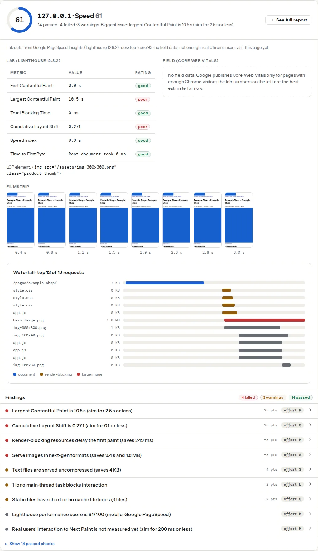
A page on a system font stack requests no font files, so both font findings have nothing to list.
How to load web fonts without layout shift
1. Count what loads today
Open the page in Chrome, open DevTools (F12), go to the Network panel, filter by Font and reload. Note how many files load, how big they are and which hosts they come from. Then decide which weights the first screen really uses; most sites need two, the body regular and one bold for headings.
2. Add font-display: swap
For a self-hosted font, the value goes in the @font-face rule:
/* In your main stylesheet */
@font-face {
  font-family: "Brand Sans";
  src: url("/fonts/brand-sans-regular.woff2") format("woff2");
  font-weight: 400;
  font-style: normal;
  font-display: swap;
}
For Google Fonts, it is a parameter on the stylesheet URL, and Google writes it into every @font-face it serves. A font-display rule in your own CSS does nothing for fonts Google's stylesheet defines.
<!-- In <head>; display=swap is the part that matters -->
<link rel="stylesheet"
      href="https://fonts.googleapis.com/css2?family=Inter:wght@400;700&display=swap">
3. Preload the fonts above the fold
A preload names the font file in the HTML, so the request starts alongside the CSS instead of after it. With swap, that often means the font arrives before the first paint and there is nothing to swap. It goes in <head> before the stylesheet:
<link rel="preload" href="/fonts/brand-sans-regular.woff2" as="font" type="font/woff2" crossorigin>
<link rel="preload" href="/fonts/brand-sans-bold.woff2" as="font" type="font/woff2" crossorigin>
Three rules. crossorigin is required even on your own domain: fonts are always fetched in CORS mode, and a preload without it does not match, so the file downloads twice. Preload only the one or two WOFF2 files the first screen uses, because every preload competes with the hero image. And the URL must be exactly the one in @font-face, or Chrome warns the preload was unused. Preload, preconnect, prefetch: which hint when covers the other hints.
4. Self-host Google Fonts
Self-hosting removes both Google origins, lets you preload and subset, and keeps visitor IP addresses from going to Google, which a Munich regional court found to breach the GDPR in a 2022 ruling. Google Fonts are open-licensed: download the family from fonts.google.com, convert and subset it (step 5), put the WOFF2 files under /fonts/, and write the @font-face rules from step 2. The @fontsource npm packages do the same with the subsets already split.
If you keep Google Fonts, warm up the file origin:
<link rel="preconnect" href="https://fonts.gstatic.com" crossorigin>
<link rel="stylesheet" href="https://fonts.googleapis.com/css2?family=Inter:wght@400;700&display=swap">
Give self-hosted fonts a long cache lifetime, since a font file never changes without a new name:
# nginx server block: fonts are immutable, cache for a year
location ~* \.(woff2|woff)$ {
    add_header Cache-Control "public, max-age=31536000, immutable";
}# Apache .htaccess, mod_headers enabled
<FilesMatch "\.(woff2|woff)$">
Header set Cache-Control "public, max-age=31536000, immutable"
</FilesMatch>5. Subset, then tune the fallback
A full font carries thousands of glyphs; an English or Western European site uses a few hundred. pyftsubset, from the open-source fontTools package, cuts the file and converts it to WOFF2 in one command:
pip install fonttools brotli
pyftsubset BrandSans-Regular.ttf \
  --output-file=brand-sans-regular.woff2 \
  --flavor=woff2 \
  --layout-features='*' \
  --unicodes="U+0000-00FF,U+0131,U+0152-0153,U+02BB-02BC,U+02C6,U+02DA,U+02DC,U+2000-206F,U+2074,U+20AC,U+2122,U+2191,U+2193,U+2212,U+2215,U+FEFF,U+FFFD"
That range is the "latin" subset Google Fonts itself uses. Add U+0100-024F for Central European languages (Croatian, Polish, Czech) and U+0400-04FF for Cyrillic, each as a separate file with a matching unicode-range in its @font-face, so a page without Cyrillic never downloads the Cyrillic file.
swap removes the blank text but not the jump. The jump goes away when the fallback takes up the same space as the web font. A second @font-face points at a local font and stretches it:
@font-face {
  font-family: "Brand Sans Fallback";
  src: local("Arial");
  size-adjust: 104%;
  ascent-override: 92%;
  descent-override: 24%;
  line-gap-override: 0%;
}

body {
  font-family: "Brand Sans", "Brand Sans Fallback", sans-serif;
}
The percentages depend on the pair of fonts. Tune size-adjust until a paragraph in the fallback wraps at the same words as in the web font, then set the overrides so the line height matches. Chrome, Edge and Firefox support all four descriptors; Safari supports size-adjust but, per MDN's compatibility data, not the three overrides, so on Safari only the width is matched. Next.js calculates these values for you in next/font, and the Fontaine and Capsize libraries do it for other stacks. The CLS guide shows how to measure the shift this removes.
System font stack vs web font: the trade-off
A system stack costs 0 bytes and 0 requests and shifts nothing:
body {
  font-family: system-ui, -apple-system, "Segoe UI", Roboto, "Helvetica Neue", "Noto Sans",
               "Liberation Sans", Arial, sans-serif;
}
The price is that the page is set in whatever the visitor's operating system uses:
| Platform | What system-ui resolves to |
|---|---|
| Windows 10 and 11 | Segoe UI |
| macOS and iOS | San Francisco |
| Android | Roboto |
| Linux | Whatever the desktop sets, often Ubuntu, Noto Sans or DejaVu Sans |
They are all good fonts, but not the same font. A design that depends on a particular letterform is not achievable with a stack; for a documentation site or a shop, most visitors never notice. Between the two ends there is a ladder, and the right choice is the lowest rung the brand can live with:
- System stack everywhere. Right for internal tools, documentation and most blogs.
- System stack for body text, one web font for headings. One weight in a Latin subset covers the headings, and the body, which is most of the page, never moves. The best brand-per-byte ratio for most marketing sites.
- One self-hosted variable font, subset, preloaded, with a tuned fallback. A variable font carries every weight in one file.
- Several families and weights from a third-party host. Only when the brand needs it and fonts are the biggest remaining item.
Before switching, measure what the choice is worth on your page. Run the speed test on the live page, switch a staging copy to the system stack and remove the font <link>, then run it again. If First Contentful Paint moved by under 100 ms and CLS did not change, fonts are not your problem; put them back and fix what the report lists first. If CLS dropped from red to green, you found the shift: keep the stack, or keep the font with a tuned fallback and measure a third time.
Platform notes
WordPress
Block themes (WordPress 6.5 and later) have a Font Library under Appearance → Editor → Styles → Typography. Fonts installed there are served from your own site with font-display: fallback written by core, which already avoids most of the shift. Classic themes set fonts in the Customizer and often load them from Google.
Elementor: Elementor → Settings → Advanced → Google Fonts Load sets the font-display value for every Google Font the builder loads; choose Swap. The Elementor performance guide and the Divi performance settings guide cover their font screens. For everything else, the OMGF plugin downloads the Google Fonts a page uses and serves them from your host with the display value you pick; Perfmatters has the same under Fonts. Afterwards, check that the theme is not still loading a second copy from Google.
Shopify
Theme settings → Typography picks from Shopify's font library, served from Shopify's own CDN, with system fonts in the same picker. Dawn-based themes write font-display: swap through the font_face filter ({{ settings.type_body_font | font_face: font_display: 'swap' }} in theme.liquid); older themes may lack the parameter, which is a one-line edit. A preload is <link rel="preload" as="font" href="{{ settings.type_body_font | font_url }}" type="font/woff2" crossorigin>.
How to verify
- Re-run the speed test. The font-display finding passes and no font stylesheet is left in the render-blocking list. If fonts caused the shift, the lab CLS drops.
- In DevTools → Network, filtered by Font: the number of files you decided on, from your own host, starting next to the CSS at the top of the waterfall.
- In DevTools → Rendering, turn on "Layout Shift Regions" and reload: no blue flash over the headings or body text.
- After 28 days, the Core Web Vitals checker shows the field CLS at the 75th percentile.
Common mistakes
- Preloading every weight. Six preloaded fonts delay the hero image and LCP gets worse. Preload the two used above the fold.
- Preload without
crossorigin. The font downloads twice, and the Network panel shows the duplicate. font-display: swapin your CSS for a Google font. Google's stylesheet defines the@font-face, so the value belongs in the URL.@importfor fonts inside CSS. It chains requests (HTML → CSS → imported CSS → font) and blocks rendering for all of them. Use a<link>in<head>, or self-host.- A web font for the logo or an icon font for twelve icons. Export the logo as SVG and use inline SVG icons; both are smaller than the font and never swap.
optionalon body text without knowing what it means. On a slow first visit, most visitors see the fallback and never the brand font.
Questions people ask
Does font-display: swap cause layout shift?
It can. Swap shows the fallback font first, and when the web font arrives the text is redrawn; if the two fonts have different widths or line heights, lines rewrap and the content below moves. Preload the font so it often arrives before the first paint, and give the fallback matching metrics with size-adjust so the swap changes letter shapes but not line breaks.
Should I use font-display: swap or optional?
Use swap for fonts the design needs, such as body and heading text, together with a tuned fallback. Use optional for fonts you can do without on a first visit: the browser uses the font only if it is ready almost immediately, so there is never a swap or a shift. Icon fonts need block, or better, replacing with SVG.
Should I self-host Google Fonts?
Yes, in most cases. Self-hosting removes two extra hostnames and their connection setup, lets you preload and subset the files, and keeps visitor IP addresses from being sent to Google, which matters under the GDPR. The files are open-licensed, so downloading and serving them is allowed. Give them a one-year cache lifetime and add the font-display value to your own @font-face rules.
Is a system font stack faster than Google Fonts?
Yes: a system stack downloads nothing, needs no extra connection and never swaps, so it cannot delay the first paint or cause a font layout shift. How much faster depends on the page. Measure it by switching a staging copy to the system stack and comparing First Contentful Paint and CLS in the speed test; if they barely move, keep the web font.