Layout shift is the page moving under the visitor: the paragraph jumps down as an image arrives, the "Buy" button slides away as a banner appears, a heading reflows when the web font loads. Cumulative Layout Shift (CLS) scores how much of that happens, and it is one of Google's three Core Web Vitals. The fix is almost always the same idea, reserve the space before the content arrives, and this guide shows how to find the element that moves and apply it to images, ads, embeds, banners and fonts.
Quick answer
| CLS | Rating |
|---|---|
| ≤ 0.1 | Good |
| 0.1–0.25 | Needs improvement |
| > 0.25 | Poor |
- Give every
<img>,<video>and<iframe>widthandheightattributes. CSS can still scale it. - Reserve a fixed slot (
min-heightoraspect-ratio) for ads, embeds and anything a script fills in later. - Show cookie notices and promo bars as an overlay (
position: fixed), never inserted above the content. - Load web fonts with
font-displayand a fallback font matched in size, so text does not reflow. - Animate with
transform, nottop,left,heightormargin. - Run the speed test before and after; the target is 0.1 or less.
Why CLS matters
A shift is not just ugly. It makes people lose their place while reading, and it makes them tap the wrong thing: the link that moved into the spot where "Add to cart" was a moment ago. On mobile, where one shift can move the whole screen, it is the difference between a page that feels solid and one that feels broken.
For Google, CLS is one of the Core Web Vitals in the page experience signal, judged on real Chrome visits at the 75th percentile. Unlike loading speed, it does not get better with faster hosting: a page on the fastest server in the world still jumps if an image has no dimensions. The good news is that it is usually the cheapest vital to fix. Most causes are one missing attribute or one line of CSS.
How CLS is scored
Each time a visible element moves without the visitor doing anything, the browser scores the shift: the share of the viewport affected multiplied by how far things moved (as a share of the viewport). A banner that pushes the whole screen down by a quarter of its height scores about 0.25 on its own.
Shifts are grouped into bursts (shifts less than 1 s apart, a burst lasting at most 5 s), and CLS is the worst burst of the visit. The cumulative layout shift learn page has the one-paragraph version. Two details matter when you hunt for the cause:
- Shifts right after a tap, click or key press do not count (within 500 ms). An accordion that opens when clicked is fine; one that opens by itself is not.
- Shifts count for the whole visit, not just the load. A lab test only loads the page, so an ad that appears after 8 s or a sticky bar that appears on scroll shows up in the field data but not in the lab.
How getReport checks it
The speed test reports CLS from the Lighthouse lab run, which covers the page load on a simulated phone, and from the Chrome UX Report when Google has enough real visits. The finding shows the score and the fix:
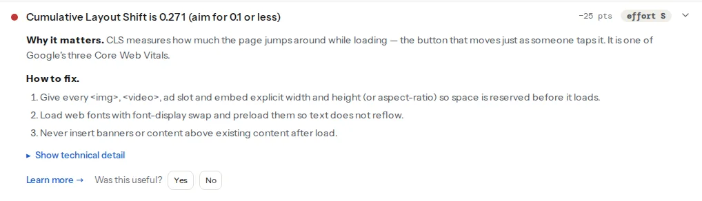
If the lab CLS is low but the field CLS is high, the shift happens after the load: a late ad, a banner on scroll, a font on a part of the page the lab did not reach. Look for those first.
Two more findings point at the most common causes directly. The HTML check reads every <img> and lists the ones that have no width or height attribute (SVGs are left out). The Lighthouse audit flags font files loaded without font-display:
The image size checker shows the same images in a table with their real pixel size and displayed size, which gives you the numbers for the attributes.
Step by step
1. Find the element that shifts
Before fixing anything, see what moves. In Chrome:
- Open DevTools, press Ctrl+Shift+P (Cmd+Shift+P on a Mac), type "Rendering" and open the Rendering tab.
- Tick Layout Shift Regions. Reload the page: every shifted area flashes blue.
- For detail, open the Performance panel, record a reload and look at the "Layout shifts" track. Clicking a shift shows which elements moved and by how much.
Throttle the network in DevTools (Network → Slow 4G) to see shifts the way a phone visitor does; on a fast office connection many of them happen before the first paint and are invisible.
The element that moved is usually not the cause. Text that jumps down was pushed by something above it that grew: find the thing that arrived late.
2. Add width and height to images and videos
Browsers use the width and height attributes to compute the aspect ratio before the file arrives, and reserve that much space. The values are the image's real pixel size (or anything with the same proportions); your CSS still controls the displayed size:
<!-- The browser knows the box is 16:9 before the file loads -->
<img src="/img/team.webp" alt="Our team in the workshop" width="1600" height="900">/* In your stylesheet: scale to the column, keep the ratio */
img, video {
max-width: 100%;
height: auto;
}height: auto together with the attributes is what makes this work. A theme that sets height: 100% or a fixed pixel height on images breaks it; check the computed styles in DevTools if an image with dimensions still shifts.
For <video>, the same attributes apply; add a poster image so the reserved box is not empty.
3. Use aspect-ratio for boxes without intrinsic size
Iframes, background-image blocks, and containers that a script fills (a map, a YouTube embed, a product carousel) have no file dimensions. Give them a ratio in CSS:
/* YouTube and most video embeds are 16:9 */
.video-embed iframe {
  width: 100%;
  height: auto;
  aspect-ratio: 16 / 9;
}

/* A map block that a script fills in later */
.store-map {
  aspect-ratio: 4 / 3;
}
aspect-ratio is supported in every current browser.
4. Reserve slots for ads, embeds and injected content
Ad slots, newsletter sign-ups, review widgets and "related products" rows are filled by scripts after the page has drawn. Reserve their height in advance, sized for the most common content:
/* A 300×250 ad slot: the space exists before the ad script runs */
.ad-slot-sidebar {
  min-width: 300px;
  min-height: 250px;
}

/* A review widget that usually renders about 420 px tall */
.reviews-widget {
  min-height: 420px;
}
If the ad network sometimes returns nothing, keep the empty slot (with a subtle "Advertisement" label) rather than collapsing it; collapsing is a shift too. Place ad slots away from the top of the content where possible, since a shift near the top moves more of the page.
5. Stop inserting content above what is already there
Cookie notices, "free shipping" bars, app banners and "you are offline" notices that appear at the top of the page push everything down. Either render them in the HTML from the start (so they are there on the first paint), or show them as an overlay that sits on top of the content:
/* An overlay does not move anything else on the page */
.cookie-notice {
  position: fixed;
  inset: auto 0 0 0;   /* bottom of the viewport */
  z-index: 1000;
}
The same applies to content loaded by JavaScript: add new items below the visible area, or behind a button the visitor presses (shifts within 500 ms of the tap do not count).
6. Load web fonts without reflow
When a web font arrives, text that was drawn in a fallback font is redrawn. If the two fonts have different widths or line heights, lines rewrap and everything below moves. Two parts to the fix:
Tell the browser what to do while the font loads. font-display: swap shows fallback text at once and swaps when the font arrives; that fixes invisible text, which is what the font-display finding is about. font-display: optional goes further: if the font is not ready almost immediately, the fallback is kept for that page view, so there is no swap and no shift.
/* In the @font-face rule of a self-hosted font */
@font-face {
  font-family: "Brand Sans";
  src: url("/fonts/brand-sans.woff2") format("woff2");
  font-weight: 400;
  font-display: swap;
}
Make the fallback the same size. The size-adjust, ascent-override and descent-override descriptors stretch a local fallback font to match the web font's metrics, so a swap changes the letter shapes but not the line breaks:
/* A fallback tuned to Brand Sans; the values come from comparing both fonts */
@font-face {
  font-family: "Brand Sans Fallback";
  src: local("Arial");
  size-adjust: 104%;
  ascent-override: 92%;
  descent-override: 24%;
}

body {
  font-family: "Brand Sans", "Brand Sans Fallback", sans-serif;
}
The percentages depend on your fonts; tools that generate fallback metrics exist for most frameworks (Next.js does it automatically with next/font). Preloading the one or two fonts used above the fold also helps, because the swap happens before the first paint. The font-display learn page has the short version.
7. Animate with transform
Animating top, left, width, height or margin moves other elements on every frame, and each frame is a layout shift. transform and opacity move only the element itself and never count:
/* Shifts the layout on every frame */
.promo-bar { transition: margin-top 0.3s; }

/* Same visual effect, no layout shift */
.promo-bar { transition: transform 0.3s; }
.promo-bar.is-hidden { transform: translateY(-100%); }
Platform notes
WordPress
- Images in posts get
widthandheightautomatically for images inserted through the editor (since WordPress 5.5). Images hard-coded in theme templates, page-builder widgets and old posts pasted as HTML often do not; those are the ones the images-missing-dimensions finding lists. - Lazy-load plugins that swap
srcfor a 1×1 placeholder GIF and remove the dimensions reserve no space, then shift when the real image arrives. Prefer WordPress core lazy loading, or check that the plugin keepswidthandheight. See Lazy loading images and iframes done right. - Cookie banner plugins that insert a bar at the top of the page are a classic CLS source. Choose the "bottom overlay" or "popup" layout in the plugin settings.
- Sliders often render all slides stacked, then collapse them when the script runs. Set a fixed height or
aspect-ratioon the slider container, or replace it with a single static image.
Shopify
Themes that use Shopify's image_tag Liquid filter output width and height automatically. App blocks (reviews, upsells, sticky add-to-cart bars) are the usual shifting elements; reserve min-height for them in the theme's CSS, or ask the app vendor whether it can render in a fixed-size slot.
Verify
- Re-run the speed test: the CLS finding should be at or below 0.1, and the images-missing-dimensions finding should read "Every image declares width and height".
- With Layout Shift Regions on, reload with Slow 4G throttling and scroll the whole page: nothing should flash blue except what you clicked.
- Field CLS follows over the next 28 days; check it in the speed test or in Search Console under Core Web Vitals.
Common mistakes
- Dimensions in the HTML,
height: 100%in the CSS. Symptom: the image still shifts. Fix: useheight: autoso the browser can apply the aspect ratio from the attributes. - Collapsing an empty ad slot. Symptom: CLS varies between visits. Fix: keep the reserved space even when no ad fills it.
- Only testing the lab. Symptom: lab CLS 0.02, field CLS 0.3. Fix: the shift happens after load; scroll the page with Layout Shift Regions on, and check sticky bars and late widgets.
- Hiding content with
display: noneuntil a script runs. Symptom: a block appears and pushes the page down a second after load. Fix: render it in place from the start, or reserve its height. - Fixing the element that moved instead of the one that caused it. Symptom: the footer "shifts" in DevTools, but the fix does nothing. Fix: look at what grew above it.