Every HTML element on a page is a small object the browser has to create, style, measure and keep in memory. A few hundred of them are nothing. Three thousand of them, each wrapped in three more, is a page that takes half a second to recalculate its styles when a menu opens and lays out slowly on every phone. Lighthouse calls the problem "an excessive DOM size", and most sites that have it got there through a page builder, a mega menu and a hidden mobile copy of everything. This guide explains what the number means, where the nodes come from, and how to get rid of the ones that do no work.
Quick answer
- Lighthouse warns above about 800 elements and fails above about 1,400; getReport's finding says to aim under 1,500. Depth over 32 levels or a parent with over 60 children are flagged separately.
- Count your own: paste
document.querySelectorAll('*').lengthinto the browser console. - The usual sources: page builders wrapping every widget in extra containers, mega menus rendered in full, hidden carousels, mobile and desktop versions of the same section both in the HTML, icon fonts as one span each, long comment threads, big footers.
- Fixes in order: switch on the builder's optimised output, delete duplicate hidden sections, paginate or lazy-render long lists, add
content-visibility: autoto below-the-fold sections, simplify menus. - Verify by re-running the speed test and re-counting in the console.
Why DOM size matters
The DOM is the browser's in-memory tree of the page. Its size sets the cost of four things that happen constantly, not just at load.
Style recalculation. When anything changes (a class toggles, a menu opens, a hover state applies), the browser works out which CSS rules match which elements. The work scales with elements times selectors; 3,000 elements against a page builder's 20,000-rule stylesheet is a lot of matching, and it happens on every change.
Layout. Positions and sizes are computed from the tree. A change near the top of a deep tree can force everything below it to be re-laid out. Deep nesting (a widget inside a column inside a row inside a container inside a section) makes each layout pass walk further.
Memory. Each element carries its computed style and layout box. On a budget phone with 3 GB of RAM and six tabs open, a 5,000-element page is the one the browser evicts.
Responsiveness. The three costs above land inside every interaction. Interaction to Next Paint measures the time from a tap to the next frame, and the last phase of that is style, layout and paint. On a huge DOM, a filter button that changes one class can take 300 ms to show its result even though the JavaScript ran in 5 ms. Large DOMs also tend to shift more during load, because there is more content arriving in more boxes.
Load time is affected, but less than people expect: the HTML for 3,000 elements compresses well. The cost is in what the browser does with it afterwards, over the whole visit.
How getReport checks it
The speed module reads Lighthouse's "Avoid an excessive DOM size" audit, which counts the elements in <body>, the deepest nesting and the parent with the most children after the page has loaded:
The main-thread finding breaks the browser's work down by category (script evaluation, style and layout, parsing, rendering); on a big-DOM page the "Style & Layout" line is unusually large relative to the script time, which is the signature to look for.
When the site runs WordPress with a page builder, the WordPress Doctor panel adds a third finding, measured in our own Chromium run: how much of the CSS and JavaScript on the page belongs to the builder, and how many of the DOM elements carry the builder's own classes (elementor-, et_pb_, brxe- and so on). It warns when the builder is over half the code and at least 100 KB, or over half the elements and at least 600 of them:
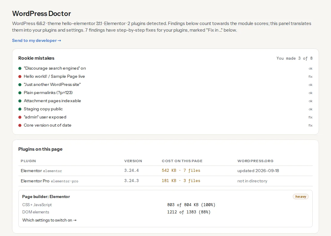
The card's two numbers point at two different fixes. A high code share is about assets: unused widgets, add-on packs, the builder's frontend framework on every page. A high element share is the markup: wrappers around every widget. The builder settings in the finding's fix address both.
Step by step
1. Count, and find where the count comes from
Open the page in Chrome, open DevTools (F12) and paste into the Console:
// Total elements
document.querySelectorAll('*').length;

// Elements per top-level section, largest first
[...document.body.children]
  .map(el => [el.tagName.toLowerCase() + (el.id ? '#' + el.id : '') + (el.className ? '.' + String(el.className).split(' ')[0] : ''), el.querySelectorAll('*').length])
  .sort((a, b) => b[1] - a[1]);

// The parent with the most children, and the deepest element
[...document.querySelectorAll('*')].sort((a, b) => b.children.length - a.children.length)[0];
[...document.querySelectorAll('*')].reduce((deep, el) => { let d = 0; for (let n = el; n; n = n.parentElement) d++; return d > deep.d ? { d, el } : deep; }, { d: 0, el: null });
The second snippet is the useful one: it tells you the header has 640 elements, the footer 380, and the "related products" carousel 900. Now you know which three things to open.
For the same view in the Elements panel, select <body> and collapse everything, then expand one section at a time; the panel shows how many children each node has when collapsed.
2. Switch on the builder's optimised output
Builders that predate flexbox wrap every widget in a stack of helper divs, and most have since added a setting that removes the wrappers for new markup. Elementor: Elementor → Settings → Performance → "Optimized DOM Output" (removes the elementor-inner, elementor-row and elementor-column-wrap wrappers), then Tools → Regenerate CSS & Data. Elementor's Flexbox Containers, the default for new layouts, use a single element where the old Section → Column pair used four; the editor can convert existing sections. For Divi, Bricks, Oxygen, WPBakery and Beaver Builder, the builder-weight finding names the settings screen and the options for each.
Expect the settings to cut 20–40 % of the elements on a builder-heavy page. What they cannot remove is a widget you added; step 3 is for those.
3. Delete the hidden duplicates
The most common waste is content rendered twice. A "desktop" section and a "mobile" section with the same content, one hidden by CSS at each breakpoint: both are in the DOM on every device. A mega menu with 200 links, rendered in full for every page even though it opens for one visitor in fifty. A hero slider with eight slides and the seven hidden ones each holding an image, a heading, two buttons and their wrappers. A tab component with all tabs' content present.
For each, ask whether the hidden content could arrive later or not at all: one responsive section instead of two; the menu's sub-panels rendered when the menu opens (or, more simply, fewer links); one hero image instead of a slider; the inactive tabs' content loaded on click. Every one of these is a decision, not a technical trick, and each removes hundreds of elements.
4. Paginate or lazy-render long lists
A category page listing 96 products, a blog archive with 60 posts, a comment thread with 400 comments: the list is the DOM. Paginate to 24 or 36 items with a "Load more" that fetches the next page, or keep the list and let the browser skip rendering the parts off screen:
/* In your stylesheet: sections below the fold are laid out only when near the viewport */
.product-grid,
.comments,
.site-footer {
  content-visibility: auto;
  contain-intrinsic-size: auto 800px;
}
content-visibility: auto tells the browser not to style or lay out the element's contents until it is close to the viewport; contain-intrinsic-size reserves an estimated height so the scrollbar does not jump. The elements are still in the DOM, so the count does not change, but the style and layout cost at load and on interaction does. It works in every current browser and is the cheapest single line for a long page. Apply it to sections that start below the first screen, never to the hero.
For truly long lists (thousands of rows in a table or feed), virtualisation (rendering only the visible rows and recycling them on scroll) is the real fix, and every front-end framework has a library for it.
5. Replace element-heavy patterns
Some patterns cost far more elements than they look:
- Icon fonts and inline SVG icons. Each icon is a
<span>or an<svg>with several<path>children. A footer with 40 social and payment icons can be 200 elements. An SVG sprite with<use>references makes each icon one element. - Tables for layout. A pricing table built from
<table>,<tr>,<td>and a<div>in each cell is five elements per value. A CSS grid uses one. - Breadcrumbs, ratings and badges in every product card. Multiply by 36 cards. Five stars as five
<span>s becomes one element with a background; a badge is one, not a wrapper around a wrapper. - Empty wrappers left by copy-paste. Search the Elements panel for
<div>elements with a single<div>child and nothing else.
6. Trim the head and the footer
The header and footer are on every page, so their elements are the cheapest to cut once and the most expensive to leave. A footer with four link columns of twenty links each, a newsletter form, a payment-icons row and a copyright line is easily 350 elements; most sites need a third of those links. In WordPress, Settings → Discussion → "Break comments into pages" caps the comment thread; WooCommerce → Settings → Products sets products per page.
Platform notes
WordPress
Beyond the builder settings, look at what plugins add to every page: a mega menu plugin renders the full menu tree, a related-posts plugin adds a grid, a social sharing plugin adds a bar with six icons at the top and bottom of every post. The WordPress plugin detector shows the code cost per plugin; the console snippet in step 1 shows the element cost per section. Together they usually point at the same two plugins.
Block themes are lighter than builders by default, but a page assembled from many nested Group and Columns blocks has the same problem in smaller form. The List View in the editor shows the nesting; flatten Groups that only exist to add a margin.
Shopify
Section-based themes render every section in templates/index.json, including ones hidden with a setting; remove sections rather than hiding them. Apps that inject widgets (reviews, upsells, recently viewed) add their markup to every product page; the theme editor's App embeds panel lists them.
Static sites and custom code
You control the template, so the fixes are edits. Add content-visibility: auto to the sections below the fold first (it is one line), then remove wrappers the CSS does not need; modern CSS (grid, gap, flexbox) rarely needs a div for spacing.
Verify
- Re-run the speed test. The dom-size finding shows the new count, ideally under 1,500 elements; the depth and widest-parent values in its technical line should also have dropped. Main-thread work's "Style & Layout" line is smaller.
- Re-count in the console:
document.querySelectorAll('*').length. The section snippet shows the header, footer and lists you changed. - On WordPress with a builder, the Page builder card in the WordPress Doctor panel shows a lower element share, and the chip changes from "heavy" to "ok" once both shares are under half.
- Open DevTools → Performance, record a click on the menu or a filter, and look at the "Recalculate Style" and "Layout" entries: their durations, and the "Elements affected" count in the summary, should be a fraction of the previous recording. The field INP in the Core Web Vitals checker follows after 28 days.
Common mistakes
- Hiding instead of removing.
display: noneremoves an element from layout but not from the DOM, and not from style recalculation. Hidden duplicates cost almost as much as visible ones. content-visibility: autoon the hero or the header. The first screen must render at once; skipping its layout delays the first paint and can move the LCP. Apply it below the fold only.- Converting the Elementor sections without regenerating CSS. Optimised DOM output changes the markup the builder's CSS targets; skip Tools → Regenerate CSS & Data and the layout breaks.
- Blaming the count on the content. A 3,000-word article is about 150 elements. Three thousand elements is structure, not words; look at the header, footer, menus and widgets first.
- Fixing the home page only. Category pages and product pages have the largest DOMs and most of the traffic. Run the check on one of each.
- Removing the builder's wrappers by hand in the theme. The builder regenerates them on the next edit. Use its settings, or rebuild the key pages with core blocks as the finding suggests.