A Core Web Vitals problem almost always has a date. A theme was updated, a chat widget went live, someone swapped the hero image for a 4 MB original, the host moved you to a busier server. A speed test run today shows the damage, not when it happened. Google publishes the week-by-week numbers for free; this guide shows how to read them, line a drop up with your change log, and know how long to wait before a fix shows.
Quick answer
- Run the Core Web Vitals history tool on your domain with Phone and Whole site selected: one chart per metric, up to 40 weekly points, against Google's good / needs improvement / poor bands.
- Each point is the 75th percentile (p75) of real Chrome visits over the 28 days ending on that date: three quarters of visits were at least that fast.
- Find the first week a line left the green band, then look at what changed on the site in the four weeks before that date.
- Confirm the cause with the lab-side Core Web Vitals checker on the template that changed, fix it, and re-check weekly. A fix takes about four weeks to show in full.
- No data at all means too few Chrome visitors to be in the dataset. Use the lab test instead; nothing is wrong with the site.
Why history matters
Google's page-experience signal uses field data: what real Chrome users experienced, aggregated over a rolling 28 days, at the 75th percentile. A lab test (Lighthouse, PageSpeed Insights, our speed test) loads the page once on a simulated phone. The two disagree by design. The lab tells you why a page is slow; the field tells you whether it is slow for the people who actually visit, on their phones and networks. Only the field number counts for ranking and for Search Console.
A single field reading has the same limitation as a single lab run: no context. An LCP of 3.1 s is a problem, but did it begin last week or has it been there since launch? The 40-week view answers that, and the answer tells you where to look. A line that has sat in the amber band all period points at the design: theme, image sizes, hosting. A line that was green for 30 weeks and jumped in week 31 points at one change, which is far cheaper to find than a site's worth of causes.
Search Console shows the same data, with less detail
The Core Web Vitals report in Search Console reads from the same Chrome UX Report. It groups similar URLs and counts how many are poor, need improvement or good, which finds the template with the problem, but it gives no per-metric line against a calendar and no distribution behind the p75. The history tool is the calendar view; Search Console is the URL-group view. Use both.
How getReport checks it
The tool takes a URL, a device choice (Phone, Desktop or All devices) and a scope: Whole site asks for the origin, This page for that one URL. It calls Google's Chrome UX Report History API, which returns up to 40 weekly collection periods. Nothing is measured by us; the numbers come from Chrome users who opted in to sharing anonymous usage data, and Google updates them weekly, usually on a Tuesday.
For each of LCP, INP, CLS, FCP and TTFB you get a small chart: the weekly p75 as a line, the good / needs improvement / poor bands behind it (LCP 2.5 s and 4 s, INP 200 ms and 500 ms, CLS 0.1 and 0.25, FCP 1.8 s and 3 s, TTFB 800 ms and 1,800 ms), the latest value with a colour chip, and the change since the first week. Under each chart a bar shows the share of visits in the latest window that were good, needs improvement and poor. Above everything, a "latest:" chip gives the worst of the three Core metrics, which is how Google judges a page: all three must be good.
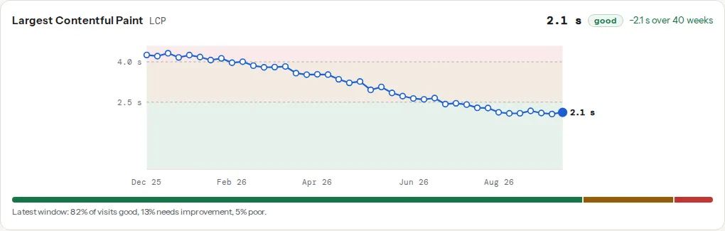
This is the shape you want: the line drops in a slope rather than a cliff (the 28-day window smooths every change over four points) and settles in the green band, and the share bar shows the tail of slow visits has shrunk too.
The four checks below are the same numbers as they appear in a normal getReport report, which shows only the latest window:
p75, plainly
The 75th percentile is the value that 75 % of visits came in under. If your LCP p75 is 2.4 s, three quarters of your visitors saw the main content within 2.4 s and one quarter waited longer. Google uses p75 rather than the average because averages hide the slow tail: one visitor on 3G in a lift does not move it, but a quarter of visitors on cheap phones does. "Good" means most visits are good, not all.
What the share bar adds
Two sites can have the same p75 and different problems. One has 76 % good visits and 24 % poor: a hard split, usually a device or geography story. The other has 76 % good, 20 % needs improvement and 4 % poor: a soft tail, a site a little heavy for everyone. The p75 is identical; the bar tells you whether you need a small general improvement or a fix for one group of visitors.
Origin or page
Whole site shows the origin record: every page on https://yourdomain.com combined. This page shows one URL, and only exists for URLs with enough traffic of their own, usually the home page and a few landing pages. When the page has no record, the tool falls back to the origin and says so under the heading. The origin is dominated by whatever gets the most visits.
Phone and desktop
Start with Phone. Mobile numbers are almost always worse (slower CPUs and networks, small viewports that make the hero image the LCP element) and Google reports the two separately. Green on desktop and amber on phone is typically a large image or heavy JavaScript that a laptop shrugs off.
Step by step
1. Run the origin, on phone
Paste the domain, keep Phone and Whole site, and press "Show history". Note the date range under the heading: 40 windows is roughly nine months; a newer site shows fewer points.
2. Find the first week a Core metric left green
Read LCP, INP and CLS in turn (FCP and TTFB are diagnostics, not part of the signal). For each, find the first point in the amber band after a run of green ones. Hover a point for its date and value, or open "The numbers, week by week" under the charts and read down the column to the row that crosses the threshold.
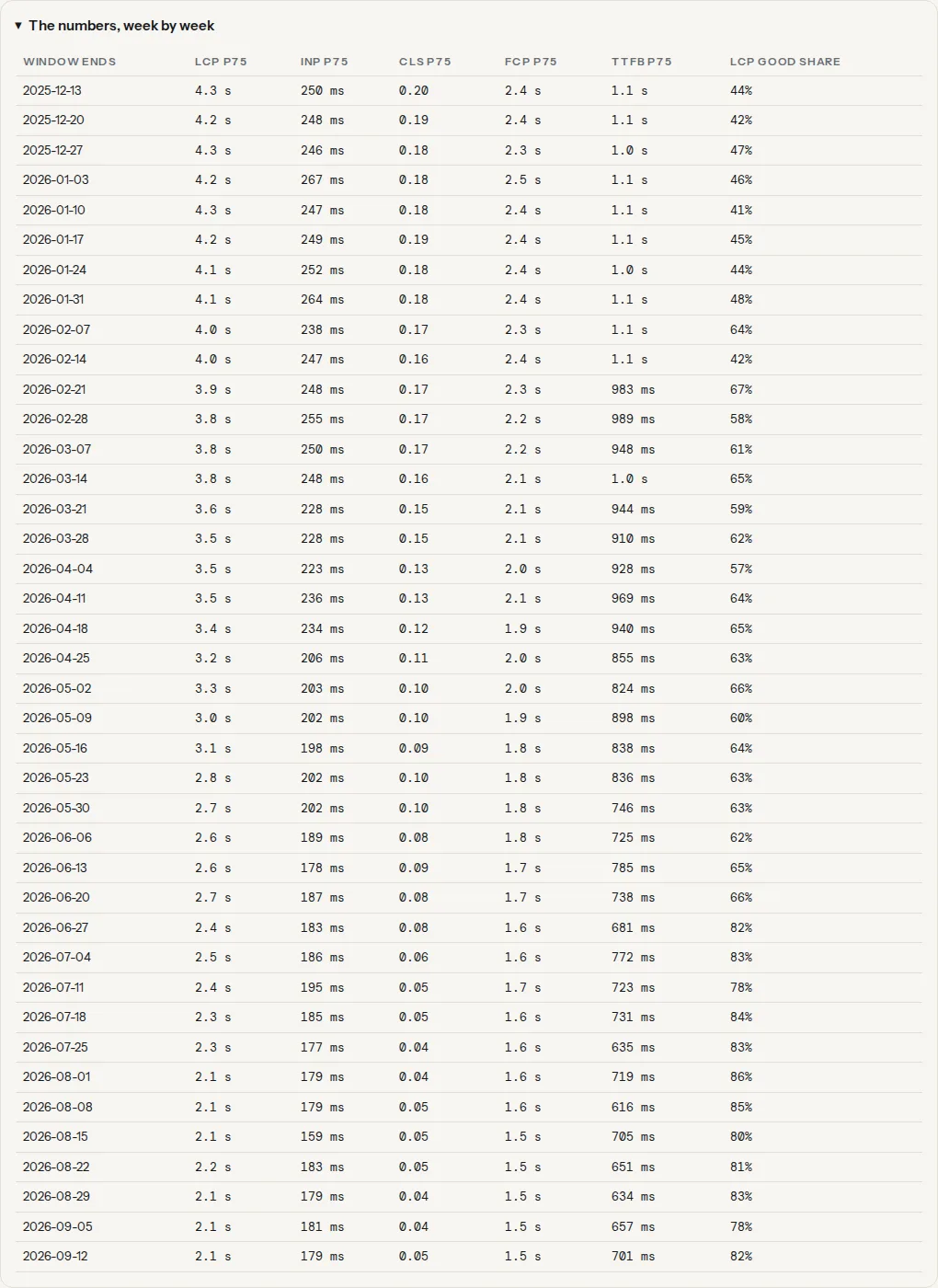
Write down two dates: the last window that was clearly good and the first that was clearly worse. Because each window is 28 days, the cause landed somewhere between four weeks before the first bad window and its end date. A slope over four points is one change being averaged in; a longer slope is several changes, or traffic shifting to slower devices.
3. Match the dates to your change log
List everything that changed in that four-week span:
- WordPress: the host's activity log or backup timestamps, the plugin and theme changelogs (the "Development" tab on the plugin's wordpress.org page), or an activity-log plugin. Dashboard → Updates shows what is pending, not what was done.
- Hosting and CDN: the deploy log, the CDN change history, support tickets. A PHP version change, a server move or a cache rule change moves TTFB first.
- Marketing: the tag manager's version history and the dates a chat widget, A/B test, cookie banner or ad network went live: the usual INP suspects.
- Content: a new hero image, video or font, a redesigned listing.
Teams with the site in a repository can list the commits in the window directly:
# Every commit between the last good week and the first bad one
git log --since="2026-06-01" --until="2026-06-15" --oneline
Read the list for anything touching templates, images, third-party scripts or the build; the commit that added a tag manager container or swapped an image usually shows in the subject line.
4. Confirm with the lab tool on the affected template
Run the Core Web Vitals checker on a page built from the template that changed. The lab run names the LCP element, lists the render-blocking and long-running scripts, and shows the layout shifts with the elements that moved. If the field chart says LCP went from 2.2 s to 3.4 s the week a new banner shipped, and the lab run says the LCP element is that banner's 1.8 MB image, you have your cause. If nothing matches, widen the window or check whether the traffic mix changed.
5. Fix it
Each metric has its own guide: fixing Largest Contentful Paint for images, fonts and render-blocking CSS; fixing Interaction to Next Paint for long JavaScript tasks and third-party scripts; fixing Cumulative Layout Shift for images without dimensions, late fonts, ads and embeds. When TTFB moved with everything else, start with the server: see what a slow server looks like. If the cause is one update, rolling it back and asking the vendor is often faster than optimising around it.
6. Re-check weekly and know when to expect the full effect
The dataset refreshes weekly, and every new point still contains up to three weeks of the old, slow visits. A fix shipped today shows as a small improvement in the next point, a bigger one the week after, and its full effect only when the whole 28-day window is post-fix: about four weeks later.
Reading a dip that recovers
Not every crossing is a regression. A line that goes amber for three or four points and comes back on its own usually means the visitors changed, not the site: a campaign that brought traffic from cheaper phones or a distant country, or a CDN or host incident of a few days averaged over four windows. The share bar helps: a spike in "poor" with "needs improvement" unchanged is a segment of slow visits, not a site that got slower for everyone. If the dip starts with a campaign, note it and move on.
Tip
Run the tool with Phone and again with Desktop. A drop on both is a change to the site; a drop on phone only is a mobile-specific change (a sticky banner, a mobile menu script) or a change in who is visiting.
Platform notes
WordPress
Automatic updates mean core, plugins and themes can change without anyone clicking. The host's backup history gives dated snapshots; comparing the plugin list between two backups shows what moved. Test a rollback on staging first, and check the changelog for a later version that already fixes the problem. The WordPress plugin cost guide shows what each active plugin adds to a page.
Shopify
There is no deploy log, but the theme library keeps published versions with dates and each app shows its install date. A Core Web Vitals drop on a Shopify store is most often an app that added a script to every page.
Static sites and custom builds
Tag deploys (git tag v2026.06.12) or keep the CI run history, and the git command in step 3 does the rest. Include the CDN's changelog: a cache rule change moves TTFB without any code change.
Verify
- The first bad window's date sits within four weeks after a change you can name; if nothing changed, suspect the traffic mix.
- The lab run on the affected template shows the problem the field metric describes (the element, the script, the shift).
- Four weeks after the fix, the latest point is back in the green band and the "latest:" chip reads good.
- Search Console → Core Web Vitals shows the affected URL group moving towards good on the same timescale.
Common mistakes
- Comparing lab numbers to field numbers. A better PageSpeed score does not have to move the chart: the lab uses one simulated device, the field uses your real visitors. Use the lab to find causes and the field to judge results.
- Expecting the chart to move the week after a fix. The window is 28 days; the first point after a fix is three quarters old data. Wait four weeks.
- Reading page-level conclusions from origin data. When the tool says "This page has no data of its own, so the whole site is shown", the chart is every page combined and cannot prove that one page changed.
- Ignoring INP because the site feels fast on a laptop. INP is where phone and desktop differ most: a tap that responds in 80 ms on a MacBook can take 400 ms on a mid-range Android phone running the same scripts. Check the phone chart.
- Trusting the TTFB you see while logged in. Cache plugins serve cached pages to anonymous visitors and bypass the cache for logged-in users, so the admin sees the slow, uncached page and visitors the fast one, or the reverse when the cache is misconfigured. The field TTFB is the visitors' number.
Note
If the tool answers "No Chrome UX Report data for this site", nothing is broken: the site has too few Chrome visitors for Google to publish a record. Measure with the lab speed test instead, and for real-user numbers on a small site add a real-user monitoring script from your analytics or CDN provider.