The minimum touch target size under WCAG 2.2 is 24 × 24 CSS pixels: every link and button must be at least that big, or have enough space around it that a 24 px circle centred on it does not touch its neighbours. That is a floor. For controls people tap often, 44 × 44 px (Apple's guideline and WCAG's AAA level) or 48 × 48 px (Google's) is comfortable. This guide explains the rule and its exceptions, what the old "clickable elements too close together" warning meant, how getReport measures targets, and the CSS that fixes them without changing how the page looks. It is part of our guide to making a website mobile friendly.
Quick answer
- WCAG 2.2, 2.5.8 Target Size (Minimum), level AA: each pointer target is at least 24 × 24 CSS px, or spaced so a 24 px circle on each does not overlap another target or another target's circle.
- Exceptions: links inside a sentence, controls whose size the browser sets, targets whose size is essential (a map pin), and targets with an equivalent control elsewhere on the page.
- Comfortable, not required: 44 × 44 (WCAG 2.5.5, level AAA, and Apple) or 48 × 48 (Google's Material guidelines).
- Fix with padding or
min-width/min-heighton the link or button, not a bigger icon, andgapbetween neighbours. - Check with the accessibility checker; the finding lists each undersized element by selector.
Why touch target size matters
Small targets cause mis-taps. A visitor aims at "Remove from basket" and hits "Increase quantity", or taps page 2 of the results and gets page 3. With a mouse, the pointer is a single pixel; with a finger, the contact area is several millimetres wide and lands a little off where the person aims. Google's Material guidelines translate 48 × 48 dp into about 9 mm on screen for that reason. People with tremor, arthritis or limited dexterity miss more often, and so does everyone on a moving train.
The fix rarely changes the design. A 16 px icon can stay 16 px; it is the clickable box around it that grows.
The rule: WCAG 2.2 success criterion 2.5.8
2.5.8 Target Size (Minimum) arrived with WCAG 2.2 in October 2023 at level AA, the level most laws and policies point to. It asks for 24 × 24 CSS px, with five ways to pass:
| Exception | Meaning | Example |
|---|---|---|
| Spacing | A 24 px circle centred on the undersized target overlaps no other target and no other undersized target's circle | 16 px toolbar icons with 8 px gaps (24 px between centres) |
| Equivalent | The same function is available through a control on the same page that meets the size | A small "×" plus a full-size "Close" button |
| Inline | The target sits in a sentence, or its size is set by the line height of surrounding text | A link in a paragraph, a footnote marker |
| User agent control | The browser draws the control and you did not change its size | Native checkboxes, radio buttons |
| Essential | The size or position carries information, or is legally required | Pins on a map, points on a chart |
A design preference is not an exception, and neither is "the icon gets bigger on hover". A list of links on separate lines is not inline: each link is its own target and needs 24 px of height, which a line-height of 1.5 at 16 px already gives.
The older criterion 2.5.5 Target Size (Enhanced) asks for 44 × 44 CSS px at level AAA, with fewer exceptions. Apple's Human Interface Guidelines ask for 44 × 44 points and Google's Material guidelines for 48 × 48 dp; on the web one CSS pixel roughly matches a point or a dp. Aim for 44 to 48 on anything a phone user taps often; 24 is the floor.
What "clickable elements too close together" meant
"Clickable elements too close together" was an error in Google Search Console's Mobile Usability report, and Lighthouse had a matching SEO audit, "Tap targets are not sized appropriately", built on Google's 48 px guideline. Both are gone. Google retired the Mobile Usability report and the Mobile-Friendly Test on 1 December 2023, and Lighthouse 12 (April 2024) replaced the SEO audit with the accessibility audit target-size, which uses axe-core's implementation of WCAG 2.5.8.
If an old audit, an agency report or a plugin still shows the message, the fix is the same as below: bigger boxes and more space between neighbours. Ranking was never tied to this one warning; the reason to fix it is visitors who tap the wrong thing.
How getReport checks it
The accessibility checker renders the page in Chromium, at 412 px wide for a mobile report and 1350 px for desktop, runs axe-core with the WCAG 2.2 AA rules, and collects the target-size rule's results into one finding:
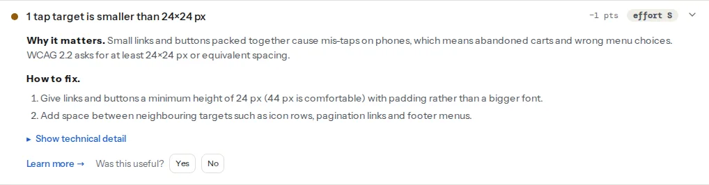
axe measures the rendered box of each interactive control and applies the spacing test to anything under 24 × 24 px. Links inside running text are skipped, and so are targets fully covered by another element. Because it measures the rendered page, padding counts and a bigger icon image alone does not.
axe rates target-size violations as serious, so the same elements also count towards this group. Fixing them clears both.
Small targets and unnamed targets are often the same elements: an <a> around a 16 px SVG with no text. Add the padding and the name (visually hidden text or aria-label) in one edit per component.
The mobile-friendly test gives a quicker count at five widths from 360 to 1440 px. It counts links, buttons and fields under 24 × 24 px in the first three screens, skipping links inside paragraphs and list items and applying the spacing exception: a small target with a clear 24 px circle around its centre is not counted.
Fix it, step by step
1. Group the selectors by component
The finding lists selectors such as .social-links a, .pagination .page-numbers or .quantity .plus. Five social icons are one fix; twelve pagination links are one fix. The count looks alarming; the number of CSS rules to write is usually three or four.
2. Grow the clickable area, not the icon
/* Icon buttons and icon links: 16px icon, 44px target */
.icon-button,
.social-links a {
  display: inline-flex;
  align-items: center;
  justify-content: center;
  min-width: 44px;
  min-height: 44px;
}

.icon-button svg,
.social-links svg {
  width: 16px;
  height: 16px;
}
For text links in menus and footers, the padding goes on the <a>, not the <li>:
/* Footer and menu links: the link itself gets the padding */
.footer-menu a,
.main-menu a {
  display: inline-block;
  padding: 10px 12px;   /* 10 + line-height 24 + 10 = 44px tall */
}
display: inline-block matters: vertical padding on a plain inline element paints but takes no space, so padded links overlap the lines above and below.
3. Space small targets apart
Where targets must stay small, such as colour swatches or a calendar grid, use the spacing exception: at least 24 px between the centres of neighbouring targets. gap does it without touching the targets:
/* 16px swatch + 12px gap = 28px between centres */
.swatches { display: flex; gap: 12px; }
.swatches button { width: 16px; height: 16px; }
4. Make checkboxes and radios part of their label
A native checkbox is exempt, but visitors still have to hit it. Wrapping it in its <label> makes the whole text a target:
<label class="check">
  <input type="checkbox" name="newsletter">
  Send me the newsletter
</label>.check { display: flex; align-items: center; gap: 8px; min-height: 24px; }5. Fix the usual offenders
- Close buttons on modals, banners and notices: a 14 px "×" in the corner. Give it a 44 × 44 box and keep the glyph small.
- Row actions in tables: 16 px edit and delete icons 4 px apart. Use the icon-button rule from step 2.
- Quantity steppers (−, number, +): each button needs 24 px in both directions without overlap; 44 px is better.
- Pagination: give each link a 40 × 40 px box with centred text, or a
gapof 16 px.
6. Enlarge for touch only, if you must
If the desktop design cannot change, the pointer media query adds size on devices whose main input is a finger:
/* Coarse pointer = touch screen; fine = mouse or trackpad */
@media (pointer: coarse) {
  .icon-button, .pagination a, .table-actions a {
    min-width: 44px;
    min-height: 44px;
  }
}
The 24 px minimum applies to every pointer, mouse included, so keep the base rule at 24 or more.
Platform notes
- WordPress menus: in block themes, add the menu rule from step 2 in the Site Editor under Styles → Additional CSS; classic themes take it in Appearance → Customize → Additional CSS.
- WordPress social icons: the core Social Icons block has a size setting; pick Large or Huge, or pad
.wp-block-social-link a. - Elementor: the Icon Size control scales the glyph. Use the widget's padding controls so the link box grows instead.
- WooCommerce: the default quantity field is a native number input and exempt; themes that add − and + buttons often make them 20 px. Target
.quantity .plus, .quantity .minusin the child theme. Pagination uses.page-numbers. - Shopify: add the rules in the theme's custom CSS setting. Apps that inject review stars, wishlist hearts and size-chart links commonly add 16 px targets; look for their selectors in the finding.
Verify
- Re-run the accessibility checker: the finding reads "Tap targets are at least 24×24 px".
- In Chrome DevTools' device toolbar (Ctrl/Cmd+Shift+M), hover each fixed control and read its box size: 24 or more on both sides, ideally 44.
- Tap the pagination, icon rows and quantity buttons on a real phone with your thumb, quickly. Mis-taps should be gone.
Common mistakes
- Making the icon bigger instead of the box. The design changes and the target barely grows.
- Padding on the
<li>instead of the<a>. The list item is not the target. - Negative margins that make targets overlap. Use
gapand let them touch instead. - Removing the control to clear the finding. A banner that can no longer be dismissed is a bigger problem than a small "×".
Questions people ask
Is 24 px or 48 px the right touch target size?
Both, for different purposes. 24 × 24 CSS px is the legal-grade minimum in WCAG 2.2 criterion 2.5.8 (level AA), which accessibility laws and audits check. 48 × 48 is Google's comfort guideline and 44 × 44 Apple's and WCAG's AAA level. Meet 24 everywhere, and use 44 to 48 for primary buttons, menu items and anything tapped often on phones.
What does "clickable elements too close together" mean?
It was a Google Search Console Mobile Usability error saying links or buttons on a page were so small or close that a finger could hit the wrong one. Google retired that report on 1 December 2023, but the problem still counts: accessibility audits now test it as WCAG 2.2 target size. Fix it by adding padding to small links and buttons, and space between neighbours.
Do text links inside a paragraph need to be 24 px tall?
No. Links inside a sentence are exempt from WCAG 2.5.8, because their size is set by the text around them and bigger targets would break reading. The exemption does not cover links on their own lines, such as menus, footers and lists of related articles: each of those is a separate target and needs 24 px of height, or enough spacing.
Does target size apply on desktop as well as on phones?
Yes. WCAG 2.5.8 covers every pointer, including a mouse or trackpad, so a 16 px icon link with no spacing fails on desktop too. The problem is worse on touch screens, which is why many sites add a @media (pointer: coarse) rule that enlarges targets to 44 px on phones and tablets while keeping the desktop layout at 24 px or more.
How much space should there be between buttons on mobile?
Enough that each small button's centre is at least 24 px from the next one's, which is WCAG's spacing exception. With 44 px buttons, a gap of 8 px is common and comfortable. Undersized targets need more: 16 px icons need at least 8 px between them. The CSS gap property on the parent sets this in one place.