The viewport meta tag is one line in the <head>, and there is exactly one right way to write it. Two extra words on that line, user-scalable=no or maximum-scale=1, turn off pinch-zoom for everyone on Android and in many in-app browsers. This guide gives the correct tag, explains why the zoom-blocking variants exist and why they are wrong, fixes the real problem they were added for (iOS zooming into form fields), and shows how to check that the page still works at 200 % and 400 %.
Quick answer
- The correct tag, in
<head>, once:<meta name="viewport" content="width=device-width, initial-scale=1">. - Remove
user-scalable=no,user-scalable=0and anymaximum-scalebelow 5. They block zoom; they do not fix anything. - iOS zooming into a text field when tapped? Give inputs
font-size: 16px. That is the fix, not the viewport tag. - The page must still work at 200 % text size (WCAG 1.4.4) and at 320 CSS px wide, which is 400 % zoom on a 1280 px screen (WCAG 1.4.10), without sideways scrolling.
- Run the accessibility checker: the zoom finding shows the viewport content the browser rendered, and the SEO audit tells you if the tag is missing altogether.
Why zoom matters
Text on a phone is small. The default 16 px on a 6-inch screen is comfortable for a 25-year-old with perfect eyesight in good light; for people with low vision, for anyone over 45 reading without glasses, in sunlight, on a train, it is not. Pinch-zoom is how they cope, and it works on every page by default. Disabling it takes that away for a design reason ("the layout looks wrong when zoomed") or by accident (a snippet copied from a tutorial about iOS form fields).
Who is affected depends on the platform. Safari on iOS has ignored user-scalable=no and maximum-scale for pinch gestures since iOS 10, so iPhone users can zoom regardless. Chrome on Android honours the tag unless the user has found the "force enable zoom" switch in its accessibility settings, which most have not. WebViews inside apps (a link opened from Instagram, Facebook or a company app) generally honour it too. So the tag silently locks out a large share of visitors on the platform where cheap phones with small screens are most common.
WCAG 2.2 has two criteria here, both level AA. 1.4.4 Resize Text says text must be resizable to 200 % without loss of content or function. 1.4.10 Reflow says content must present without scrolling in two directions at 320 CSS px width, which is what a 1280 px desktop window becomes at 400 % zoom. Disabling zoom fails the first outright; a fixed-width layout fails the second.
How getReport checks it
The report renders the page in Chromium and reads the viewport meta tag as the browser saw it (after any JavaScript that rewrites it). It also runs axe-core, whose meta-viewport rule fails on the same conditions. The result is one finding with the exact content value, so there is no guessing which of several tags won:
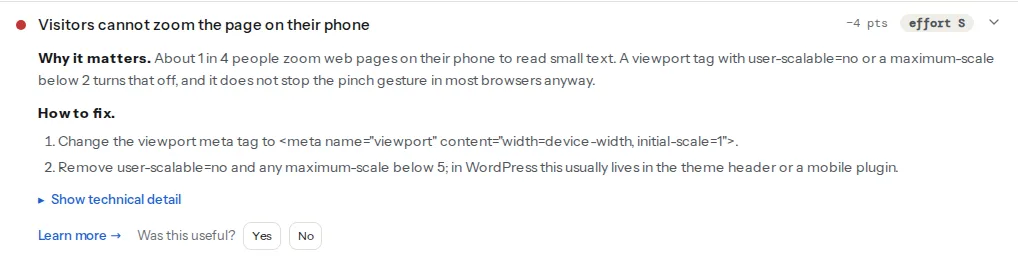
The finding fails when the content contains user-scalable=no (or =0) or a maximum-scale below 2, which matches the axe rule. A maximum-scale between 2 and 5 passes this finding but still trips axe's best-practice rule meta-viewport-large, which lands in the minor violations group. The fix text asks you to remove anything below 5 for that reason. A page with no viewport tag at all passes here (nothing blocks zoom) and fails the SEO finding instead:
That one comes from the SEO module because a missing tag is a mobile-first indexing problem before it is an accessibility one: the phone renders the page at about 980 px and shrinks it, the text becomes unreadable, and Google's mobile crawler sees exactly that. The mobile viewport learn page has the short version.
Zoom is not the only thing the serious group holds, but a page that disables zoom usually has neighbours: small text with low contrast, tap targets under 24 px, fixed-position bars that cover content when zoomed. Open the technical detail for the rule ids and selectors.
Step by step
1. Find the tag
View the page source (Ctrl+U or Cmd+Option+U) and search for name="viewport". There should be one. If there are two, the browser uses the last one it parses, which is usually the plugin's, not the theme's. If there is none in the source but the report shows one, a script added it; search the built JavaScript for viewport.
2. Replace it with the one correct value
<!-- In <head>, before any stylesheet -->
<meta name="viewport" content="width=device-width, initial-scale=1">
width=device-width tells the browser to lay the page out at the screen's CSS width instead of the 980 px desktop default; initial-scale=1 sets the starting zoom to 100 %. Nothing else is needed. minimum-scale, maximum-scale, user-scalable and shrink-to-fit all either restrict the user or address problems that no longer exist. viewport-fit=cover is the one legitimate extra, for pages that draw under the notch on iPhones; it does not affect zoom.
3. Fix the iOS input zoom properly
The reason most maximum-scale=1 tags exist: on iOS, Safari zooms in when a visitor taps a form field whose text is smaller than 16 px, so the text becomes legible while typing, and it does not always zoom back out. The internet's most-copied answer is to forbid zoom. The correct answer is to make the field's text 16 px, which is also simply more readable:
/* Safari stops zooming into fields once their text is 16px or larger */
input, select, textarea {
  font-size: 16px;
}
If the design insists on smaller text in fields on desktop, use a media query so the 16 px applies on small screens only. Every other reason for restricting zoom (a map widget that pans instead of zooms, a canvas game) is solved by touch-action: none on that one element, not on the whole page.
4. Test at 200 % and 400 %
Two different things are being tested, and browsers separate them:
- Text size (WCAG 1.4.4): in Chrome, Settings → Appearance → Customise fonts, drag Font size to 32 (200 % of the 16 px default; the "Very large" preset is only 24 px). In Firefox, Settings → Fonts, set the default size to 32. Text set in
remoremgrows; text set inpxstays at 16 px in Chrome's default setting and shrinks the point of the test. This is the argument forremon everything the visitor reads. - Page zoom (WCAG 1.4.10): Ctrl/Cmd and plus, up to 400 % in a 1280 px wide window. At 400 % the page should look like a phone layout: one column, no horizontal scrollbar, no content cut off, nothing important hidden behind a fixed header.
Things that break at 400 %: fixed-width containers (width: 1140px instead of max-width), tables without overflow-x: auto on a wrapper, position: fixed headers that eat half the screen, text in vw units that never wraps, images with a hard width attribute and no max-width: 100%. Each is a small CSS change:
/* Containers shrink with the viewport instead of forcing a scrollbar */
.container { max-width: 1140px; width: 100%; }

/* Images never overflow their box */
img, video, iframe { max-width: 100%; height: auto; }

/* Wide tables scroll inside their own box instead of the whole page */
.table-wrap { overflow-x: auto; }
5. Leave text-size-adjust alone, or set it to 100 %
iOS and Android inflate text on pages that are not mobile-optimised, and -webkit-text-size-adjust controls that. Reset stylesheets set it to 100% so text does not jump when the phone rotates to landscape, which is fine. text-size-adjust: none is the harmful value: it switches off the browser's text adjustment entirely. Keep it at 100%.
html { -webkit-text-size-adjust: 100%; text-size-adjust: 100%; }6. Re-run and check on a phone
Run the accessibility checker again; the zoom finding should read "Visitors can zoom the page on their phone" with the new content quoted. Then open the page on an Android phone and pinch. If it still does not zoom, something else is adding the old tag (step 1) or a script is calling preventDefault() on touch events.
Platform notes
WordPress
Where the tag comes from, in order of likelihood:
- The theme's
header.php(classic themes): the line is near the top of<head>. Change it in a child theme, not in the parent, or the next theme update puts it back. - Block themes print the correct tag automatically through
wp_head, so a bad one on a block theme comes from a plugin or from the site's custom code snippets. - Mobile and "app-like" plugins (AMP alternatives, PWA plugins, mobile menu plugins) and some page builders' "prevent zoom on mobile" options. Search the plugin folder from the server:
grep -rl "user-scalable" wp-content/names the file. - A snippet in
functions.phpadded to stop iOS input zoom. Replace it with the 16 px rule from step 3 in Appearance → Customize → Additional CSS.
WordPress form plugins (Contact Form 7, WPForms, Gravity Forms) default to text sizes inherited from the theme, so the 16 px rule on input, select, textarea fixes all of them at once.
Shopify
Shopify Theme Store themes ship the correct tag; a blocking one usually arrives through an app's injected script or an edit to theme.liquid. Search theme.liquid for viewport and restore the standard value.
Static sites and custom builds
The tag lives in the layout template. Framework defaults (Next.js, Nuxt, Astro, Hugo themes) are correct; check the template for a maximum-scale someone added later.
Verify
- The accessibility checker's zoom finding passes and quotes
width=device-width, initial-scale=1. - The SEO audit's viewport finding passes (the tag is present, once).
- axe's minor group does not list
meta-viewport-large. - Pinch on an Android phone zooms the page; tapping a text field on an iPhone no longer jumps in.
- At 400 % zoom in a 1280 px window there is no horizontal scrollbar and every control is still reachable.
Common mistakes
- Adding
maximum-scale=1to stop iOS zooming into inputs. iOS ignores it for pinch anyway, so it only punishes Android users, and the field still zooms. Set the input text to 16 px. - Two viewport tags. The theme prints one, a plugin prints another with
user-scalable=no; the last one wins. Find and remove the second. - Fixed pixel widths on containers. They pass the zoom check and fail reflow at 400 %. Use
max-widthand let the container shrink. - Fonts in
pxeverywhere. The page zooms but does not respond to the browser's text-size setting. Put sizes inremand let the root font size stay at the browser default. touch-action: noneonbody. Added for a swipe gallery, it disables pinch and scroll for the whole page. Scope it to the gallery element only.- Testing zoom only on an iPhone. It always works there. Test on Android, where the tag is enforced.