A modal takes over the page: nothing behind it should be reachable until it is dismissed. Done well, a keyboard user opens it, tabs through it, presses Escape and lands back on the button they started from. Done badly, focus stays on the hidden page behind the overlay, Tab wanders through invisible links, and Escape does nothing, so the visitor is stuck. This guide lists the rules, shows how the native <dialog> element covers most of them, and gives a complete, tested implementation for the rest.
Quick answer
- Use
<dialog>and open it withshowModal(): focus trap, inert background, Escape and the backdrop come free. - Still yours: return focus to the trigger on close, label the dialog with
aria-labelledby, add a visible close button with a name, lock body scroll. - Never open a dialog with focus on a destructive control ("Delete") or on the first text field of a long form; focus the heading or the dialog itself.
- Every modal needs a way out: Escape, a close button, and a "Cancel" for anything that asks a question.
- Cookie banners are modals too. One that traps focus without a reject button fails the accessibility rules and the consent rules at once.
- Non-modal things (tooltips, menus, popovers) follow different rules; do not trap focus in them.
Why modals matter
A modal is the one component where a small mistake locks a person out of the whole page. Sighted mouse users click the overlay or the X and never notice. A keyboard user who cannot reach the close button, or whose Escape key is ignored, has to reload. A screen reader user whose focus was never moved into the dialog hears nothing happen when they click "Open", then reads through the background page while a dialog sits on top of it unannounced.
Modals are also the most common component on the web, because cookie banners are modals, and they sit on the first page a visitor sees. WCAG 2.2 covers the behaviour under 2.1.2 No Keyboard Trap, 2.4.3 Focus Order, 2.4.7 Focus Visible, 4.1.2 Name, Role, Value and, for the target size of that small X, 2.5.8.
How getReport checks it
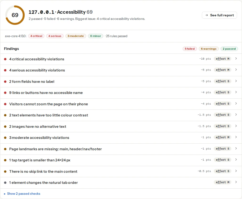
Be precise about what an automated check can and cannot see here. The accessibility checker renders the page in Chromium, waits for it to settle, and runs axe-core on the page as loaded. It does not click your "Sign up" button, so a dialog that opens on click is not in the DOM when axe runs, or is in the DOM hidden, where axe skips it. What the checker does see:
- A dialog that is open on load (a cookie banner, a newsletter popup that fires immediately), including its buttons' names and roles.
- The markup of dialogs that are present but hidden with
display: noneor thehiddenattribute: axe ignores hidden content, so nothing is reported either way. - Positive
tabindexvalues anywhere on the page, which is what the tab-order finding is about.
This finding is built from axe's tabindex rule, which flags elements with tabindex greater than zero (see tab order). It is informational and worth zero points, and it is not a test of a focus trap; the report does not press Tab and cannot tell whether your modal traps focus correctly. Hand-rolled modals often add tabindex="1" to the close button to "make it first", which is exactly what this finding catches. Use tabindex="0" (focusable in document order) or tabindex="-1" (focusable by script only).
The close button is the usual offender: an <a href="#"> or a <button> containing only an SVG cross has no accessible name and is announced as "button". A cookie banner's X and a lightbox's arrows appear here when the banner is open on load.
The requirements
Whatever the implementation, a modal dialog must do all of these:
- Focus moves into the dialog on open. To the first sensible control, the heading, or the dialog itself.
- Focus stays inside while it is open. Tab from the last control wraps to the first; Shift+Tab from the first wraps to the last.
- Focus returns to the trigger on close. The visitor continues from where they were.
- Escape closes it, unless closing would lose work, in which case Escape asks.
- A visible close button with a name. "Close" in text or
aria-label, at least 24 × 24 px. - A label.
aria-labelledbypointing at the dialog's heading, so the screen reader announces "Delete account, dialog". - The background is inert. Not reachable by Tab, not read by screen readers, not clickable.
- No scroll behind. The page under the overlay does not scroll when the dialog content is short.
- Initial focus is safe. Not on "Delete", not on "Accept all".
Step by step
1. Use the native dialog element
<dialog> with showModal() is supported in every current browser and does items 2, 4 and 7 in the list for you, plus the backdrop and the top layer (no z-index fights). This is the complete pattern:
<button type="button" id="open-plan">Change plan</button>

<dialog id="plan-dialog" aria-labelledby="plan-title">
  <form method="dialog">
    <h2 id="plan-title" tabindex="-1">Change your plan</h2>
    <p>Switching to Team takes effect at the next billing date.</p>
    <div class="actions">
      <button type="button" value="cancel" class="close">Cancel</button>
      <button type="submit" value="confirm">Switch to Team</button>
    </div>
  </form>
</dialog>const dialog = document.getElementById('plan-dialog');
const opener = document.getElementById('open-plan');
let lastFocus = null;
function openDialog() {
lastFocus = document.activeElement;
dialog.showModal();
document.body.style.overflow = 'hidden'; // scroll lock
dialog.querySelector('#plan-title').focus(); // safe initial focus
}
function closeDialog() {
dialog.close();
}
dialog.addEventListener('close', () => {
document.body.style.overflow = '';
if (lastFocus && document.contains(lastFocus)) lastFocus.focus(); // focus return
});
opener.addEventListener('click', openDialog);
dialog.querySelector('.close').addEventListener('click', closeDialog);
// Close when the backdrop (outside the form) is clicked
dialog.addEventListener('click', (event) => {
if (event.target === dialog) closeDialog();
});dialog {
max-width: 32rem;
padding: 1.5rem;
border: 0;
border-radius: 12px;
}
dialog::backdrop {
background: rgb(0 0 0 / 0.5);
}
dialog h2:focus {
outline: none; /* the heading is a focus target, not a control */
}What the browser does on showModal(): puts the dialog in the top layer, makes everything else inert (unreachable by Tab, hidden from screen readers, unclickable), draws ::backdrop, and closes on Escape by firing cancel then close. Browsers also return focus to the previously focused element on close, as the HTML specification asks, but the explicit lastFocus handling above covers the cases where the trigger was re-rendered or the dialog was opened from script rather than a click.
What stays yours, and why the code above has each line:
- The label.
aria-labelledbyon the<dialog>. Without it the screen reader says "dialog" and nothing else. - Initial focus. By default
showModal()focuses the first focusable element, or the element withautofocus. For a confirmation, that is often the destructive button; focusing the heading (withtabindex="-1") is safer and reads the title first. - Scroll lock. The page behind still scrolls.
overflow: hiddenonbodywhile open fixes it; remove it onclose. - The close button. Escape is invisible; a visible button with text or
aria-label="Close"is required. - Backdrop click. Not built in. The click listener above handles it; skip it for dialogs with forms, where a stray click would lose input.
The closedby attribute (closedby="any" for light dismiss, closedby="none" to require a button) is newer and shipping in Chromium-based browsers; treat it as an enhancement and keep the click handler.
2. Animate it without breaking it
Opening and closing transitions need @starting-style and discrete transitions, since display flips from none to block:
dialog {
  opacity: 0;
  transform: translateY(8px);
  transition: opacity 0.2s, transform 0.2s, display 0.2s allow-discrete, overlay 0.2s allow-discrete;
}
dialog[open] {
  opacity: 1;
  transform: none;
}
@starting-style {
  dialog[open] {
    opacity: 0;
    transform: translateY(8px);
  }
}
@media (prefers-reduced-motion: reduce) {
  dialog { transition: none; }
}
3. The hand-rolled version, only if you must
If a framework or CMS gives you a <div> dialog you cannot replace, three things make it behave. role="dialog" and aria-modal="true" tell screen readers what it is; the inert attribute on everything else keeps the background out of reach; and a small focus trap handles Tab wrapping:
function openDivDialog(dialog, opener) {
  // Make everything except the dialog inert
  [...document.body.children].forEach((el) => {
    if (el !== dialog) el.setAttribute('inert', '');
  });
  dialog.hidden = false;
  const focusable = dialog.querySelectorAll(
    'a[href], button:not([disabled]), input:not([disabled]), select, textarea, [tabindex]:not([tabindex="-1"])'
  );
  const first = focusable[0];
  const last = focusable[focusable.length - 1];
  (dialog.querySelector('h2') || first).focus();

  function onKey(event) {
    if (event.key === 'Escape') return close();
    if (event.key !== 'Tab') return;
    if (event.shiftKey && document.activeElement === first) { event.preventDefault(); last.focus(); }
    else if (!event.shiftKey && document.activeElement === last) { event.preventDefault(); first.focus(); }
  }
  function close() {
    dialog.hidden = true;
    document.removeEventListener('keydown', onKey);
    [...document.body.children].forEach((el) => el.removeAttribute('inert'));
    opener.focus();
  }
  document.addEventListener('keydown', onKey);
  dialog.querySelector('.close').addEventListener('click', close, { once: true });
}<div id="div-dialog" role="dialog" aria-modal="true" aria-labelledby="dd-title" hidden>
<h2 id="dd-title" tabindex="-1">Newsletter</h2>
…
<button type="button" class="close" aria-label="Close">×</button>
</div>inert is supported in all current browsers. Without it, the focus trap alone still lets screen reader users read the background with the virtual cursor; aria-modal="true" helps but is not honoured everywhere.
4. Cookie banners and consent modals
The consent banner is the modal every visitor meets, and it is the one the checker sees, because it is open on load. Two failures are common. The banner sits at the bottom of the DOM, so a keyboard user tabs through the whole page before reaching "Accept"; or it is a full-screen modal that traps focus and offers only "Accept all", so the only way out is to consent. The cookie scanner records whether the banner offers a reject option on the first layer; a banner that traps focus and has no reject button fails an accessibility rule and a consent rule at the same time.
Put the banner first in the DOM or move focus to it on load, give it role="dialog" and a label, provide "Reject all" beside "Accept all" with the same visual weight, and make sure Escape or a close button leaves the visitor with no consent given rather than with consent assumed. Cookies before consent covers what the banner must gate.
5. Non-modal dialogs: different rules
Tooltips, dropdown menus, date pickers and "share" popovers are not modal. They must not trap focus or make the page inert; they close on Escape and when focus leaves them. The popover attribute gives you the top layer and light dismiss for these without any of the modal behaviour:
<button type="button" popovertarget="share-menu">Share</button>
<div id="share-menu" popover>
  <a href="…">Copy link</a>
  <a href="…">Email</a>
</div>
Use <dialog> for anything that needs an answer before the page continues, popover for anything the visitor can ignore.
6. Mobile
Bottom sheets are dialogs with a different position; every rule above applies, plus two. The close control needs the WCAG 2.2 minimum of 24 × 24 px, and 44 px is comfortable for a thumb; a 16 px X in the corner is the classic target-size finding. Keep the sheet's controls above the phone's home indicator with padding-bottom: env(safe-area-inset-bottom). And test that a sheet taller than the viewport scrolls inside itself, not behind.
Platform notes
WordPress. Popup plugins and Elementor Pro's popups render their own markup, and most still use a <div> with role="dialog" rather than <dialog>. Inspect the popup in DevTools: check for aria-modal, an aria-labelledby and a named close button, and test Escape and Tab. If the plugin's close button is an icon with no name, most plugins let you add text to it in the popup's settings.
Shopify. The Dawn theme's modal-dialog custom element (used for product image zoom and similar) sets role="dialog" and aria-modal="true", traps focus with the theme's script and returns it on close; keep those attributes when customising. Cart drawers in Dawn are dialogs too.
Component libraries. Bootstrap's Modal, MUI's Dialog, Radix Dialog and Headless UI Dialog handle focus, Escape and inert behaviour when used as documented. The parts you still provide: the title element they label the dialog with, the close button's text, and the trigger being a real <button>.
Verify
- Keyboard only: open the dialog with Enter, Tab through it (focus never leaves), press Escape, and confirm focus is back on the trigger with a visible outline.
- Screen reader: on open you hear the dialog's name and "dialog"; the virtual cursor cannot reach the page behind; on close you hear the trigger again.
- The accessibility checker reports no unnamed links or buttons and no positive tabindex; any dialog open on load has a named close button.
- DevTools → Elements: the open
<dialog>is in the top layer and every sibling of it in<body>is inert (native) or hasinert(hand-rolled).
Common mistakes
- Focus lost on close. The dialog closes and focus falls to
<body>, so the next Tab starts from the top of the page. Fix: storedocument.activeElementon open and focus it on close. - Tab escapes to the browser UI. A hand-rolled trap that does not wrap lets Tab leave the last control and land in the address bar. Fix: the wrap logic above, or
showModal(). - Escape closes the wrong layer. A select menu or a nested popover inside the dialog, and Escape closes the whole dialog. Fix: stop propagation in the inner component, or handle
cancelon the dialog and checkevent.target. - A modal inside a form. A
<dialog>nested in the page's<form>submits that form when its own button is pressed. Fix: move the dialog outside the form or useform="…"andmethod="dialog"on the dialog's own form. - Initial focus on the danger button. The dialog opens, the visitor's finger is still on Enter, the account is deleted. Fix: focus the heading; put "Cancel" before the destructive action.