Press one key in a screen reader and it reads you every link on the page as a list: "Home, Products, Read more, Read more, Read more, Read more, link, link, Contact". The four "Read more" links go to four different articles and the two links called "link" are the cart and the search. That list is how many blind visitors navigate, and it is also roughly what a search engine learns from your anchor text. This guide explains how a link or button gets its name, the handful of patterns that fix the common failures, and where to change the text in WordPress. Most sites are done in an hour, because the same template produces every broken link.
Quick answer
- Every link and button needs a name that makes sense on its own: "Add to cart", not "click here"; "Read more about winter tyres", not "Read more".
- The name comes, in order, from
aria-labelledby,aria-label, the visible text (including thealtof an image inside), and last of alltitle. Icon-only controls have none of these unless you add one. - Fix icon buttons with visually hidden text or
aria-label; fix "Read more" with hidden text that names the target; fix cards by making the heading the link. - Keep the visible words inside the accessible name (WCAG 2.5.3), so voice-control users can say what they see.
- Run the accessibility checker: the link names finding lists every element with an empty name.
Why link names matter
The links list
Screen readers (NVDA and JAWS on Windows, VoiceOver on Mac and iPhone, TalkBack on Android) offer a list of all links on the page, sorted by position or alphabetically. Users open it to get an overview and to jump straight to the link they want, the same way a sighted person scans a page for the blue underlined words. In that list there is no surrounding paragraph, no card image, no heading above. "Read more" twelve times is twelve identical entries, and "link" with no text is an entry that cannot be described at all.
Tabbing through the page is the same experience in slow motion: each stop announces the element's role and name. A cart button that announces as "button" gives no clue whether pressing it will buy something.
Voice control and search engines
People who use voice control (Dragon, Voice Control on Mac and iOS, Voice Access on Android) click things by saying their visible label: "click Add to cart". If the accessible name does not contain those words, for example because a designer set aria-label="Purchase" on a button that shows "Add to cart", the command fails. That is WCAG 2.5.3, Label in Name.
Search engines read anchor text as a description of the target page. A hundred internal links called "Read more" tell Google nothing about the hundred articles behind them; "How to waterproof leather boots" tells it a lot. Fixing link names is the rare change that is good for accessibility and SEO at once.
The rules
WCAG 2.4.4 (Link Purpose, In Context) requires that the purpose of each link can be determined from the link text alone or from the text together with its programmatically determined context. 4.1.2 (Name, Role, Value) requires every control to have a name at all. Both are level A, the minimum, and both are in scope for the European Accessibility Act.
How getReport checks it
The report renders the page in Chromium and runs axe-core. Two axe rules feed the link names finding: link-name (a link with an empty accessible name) and button-name (a button with an empty accessible name). A link called "Read more" has a name, so axe does not flag it; this finding is about elements with no name at all, which are the ones that read as "link" or "button". The generic ones are your job in step 3.
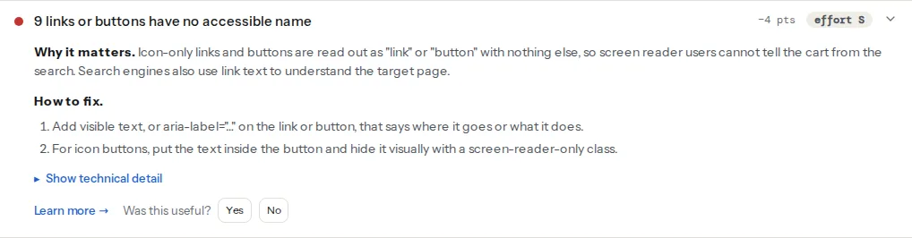
Empty links are usually image links whose image has no alt, so the image finding often appears next to this one. A linked logo with alt="" is a link with no name:
Both rules are classed as serious by axe, so a page with several of them also shows the serious violations summary. Open its technical detail for the rule ids and selectors:
Step by step
1. Understand where the name comes from
Browsers compute an accessible name for every link and button, following the Accessible Name and Description Computation specification. The steps that matter, in order of priority:
aria-labelledbypointing at another element: that element's text becomes the name.aria-label: its value is the name.- The content: the text inside the element, including the
altof any<img>inside it, and the names of nested elements. Hidden text (visually hidden, notdisplay: none) counts. Text inside a child witharia-hidden="true"does not. title: used only if everything above is empty. Tooltips are invisible on touch screens, sotitleis a fallback, not a solution.
An <i class="icon-search"></i> has no text, so a button containing only that has no name. An SVG icon contributes nothing unless it has a <title> and a role="img". An image with alt="" contributes nothing on purpose.
2. Fix the empty ones first
These are what the finding lists. Three patterns cover almost all of them.
Icon-only button. Put the name inside the button as visually hidden text (preferred, because it also works when CSS fails and it translates with the page), or use aria-label:
<button type="button" class="search-toggle">
  <svg aria-hidden="true" focusable="false" width="24" height="24"><use href="#icon-search"></use></svg>
  <span class="visually-hidden">Search</span>
</button>

<!-- the same with aria-label -->
<button type="button" class="search-toggle" aria-label="Search">
  <svg aria-hidden="true" focusable="false" width="24" height="24"><use href="#icon-search"></use></svg>
</button>
The class that hides text visually without removing it from the accessibility tree:
.visually-hidden {
  position: absolute;
  width: 1px;
  height: 1px;
  margin: -1px;
  padding: 0;
  overflow: hidden;
  clip: rect(0 0 0 0);
  clip-path: inset(50%);
  white-space: nowrap;
  border: 0;
}
Image link. The image's alt is the link's name, so it should say where the link goes, not what the picture looks like. A logo that links home: alt="Example Shop home". A product photo that links to the product, inside a card that also has a text link to the same product: alt="" on the image and let the text link do the work, or merge the two into one link (step 4).
Social icons. Each icon link gets the network's name, and the icon is hidden from assistive technology:
<ul class="social">
  <li><a href="https://www.instagram.com/exampleshop/">
    <svg aria-hidden="true" focusable="false">…</svg>
    <span class="visually-hidden">Instagram</span>
  </a></li>
  <li><a href="https://www.youtube.com/@exampleshop">
    <svg aria-hidden="true" focusable="false">…</svg>
    <span class="visually-hidden">YouTube</span>
  </a></li>
</ul>
3. Then the generic ones
"Read more", "Learn more", "Click here", "Details", "Here". They pass the automated check and fail people. Two fixes; the first is better.
Say the target in the text. "Read more" becomes "Read the winter tyre guide". Blog listings and product grids are templates, so the fix is one line in the template with the post title inserted.
Keep the short text on screen, add the target for screen readers. When the design must show only "Read more":
<a href="/blog/winter-tyres/">
  Read more<span class="visually-hidden"> about choosing winter tyres</span>
</a>
The visible words come first and stay inside the name, so voice control still matches "click read more". Avoid aria-label="Winter tyres" on a link that shows "Read more": the visible text is no longer part of the name, and 2.5.3 fails.
4. Cards: one link, and the heading is it
A blog card usually has three links to the same post: the image, the title and a "Read more" button. Screen reader users hear all three; the first has no name (image with empty alt), the last is generic. The cleaner pattern is one link, on the heading, stretched over the whole card with CSS, and no link on the image or the button:
<article class="card">
  <img src="/img/winter-tyres.jpg" alt="" width="640" height="400">
  <h3><a href="/blog/winter-tyres/">Choosing winter tyres: a 10-minute guide</a></h3>
  <p>When to switch, what the markings mean and how to store the summer set.</p>
</article>.card { position: relative; }
.card h3 a::after {
content: "";
position: absolute;
inset: 0;
}The pseudo-element makes the whole card clickable, the link's name is the heading, and the links list shows one meaningful entry per card. If the card has other interactive elements (a "save" button), give those position: relative and a higher z-index so they stay clickable.
5. Buttons that say what they do
"Submit" and "OK" are the button equivalent of "click here". "Send message", "Add to cart", "Apply filters" tell the user what happens. For buttons that change state, add aria-expanded (menus) or aria-pressed (toggles) so the state is announced alongside the name:
<button type="button" aria-expanded="false" aria-controls="main-menu">
  <svg aria-hidden="true" focusable="false">…</svg>
  <span class="visually-hidden">Menu</span>
</button>
The name stays "Menu"; the state ("collapsed"/"expanded") comes from the attribute. Do not put the state in the name ("Open menu" that becomes "Close menu"), because voice control users who saw "Menu" cannot guess the current word.
6. Check with a screen reader
After the fixes, open the links list: NVDA Insert+F7 on Windows, VoiceOver rotor (VO+U, then arrow to Links) on Mac. Every entry should make sense alone, and none should be "link" or repeat twelve times. The ten-minute routine is in Testing with a screen reader.
Platform notes
WordPress
"Continue reading" in classic themes. The text comes from two filters. In a child theme's functions.php:
<?php
// Excerpt "read more" link: include the post title for screen readers
add_filter('excerpt_more', function () {
    return sprintf(
        ' <a class="more-link" href="%s">Read more<span class="screen-reader-text"> about %s</span></a>',
        esc_url(get_permalink()),
        esc_html(get_the_title())
    );
});

// The <!--more--> tag in post content
add_filter('the_content_more_link', function ($link) {
    return str_replace(
        '</a>',
        '<span class="screen-reader-text"> about ' . esc_html(get_the_title()) . '</span></a>',
        $link
    );
});
Every bundled theme since Twenty Twelve ships a .screen-reader-text class that does what .visually-hidden does above.
Block themes. The Read More block has an editable label in the block settings; the Query Loop's post template shows the title as a link by default, which is already a good name. Remove the Read More block from the loop if the title is linked, or keep it and edit its text.
Elementor and other builders. Icon widgets with a link and Button widgets with the text field emptied produce nameless links. Use the Button widget with text (hide the text with a custom class if the design insists), or check the widget's advanced settings for a link title or aria-label field. The Social Icons widget already adds hidden network names. Re-run the report after the change; the finding shows the exact selectors.
Shopify
Cart and search icons are in the theme's header section (sections/header.liquid or the Dawn equivalents); most recent themes already include a visually-hidden span with translatable text. If the report lists them, edit the section and add the span. Product cards in Dawn link from the title, which is the pattern in step 4.
Verify
- The accessibility checker shows "Every link and button has an accessible name" and no serious violations for
link-nameorbutton-name. - The screen reader links list has no entry called "link" and no repeated generic text.
- Voice control: say "click" followed by a button's visible label and the right thing happens.
- Search Console → Links → Top linking text (after a few weeks) no longer lists "Read more" at the top.
Common mistakes
aria-labelthat differs from the visible text. Symptom: voice control users cannot click the button. Fix: keep the visible words at the start of the name, or put the extra words in visually hidden text.display: noneorvisibility: hiddenfor the "hidden" text. Symptom: the finding still lists the element. Fix: the.visually-hiddenclass above; those two properties remove text from the accessibility tree.titleas the only name. Symptom: works in one screen reader, silent in another, nothing on touch. Fix: text oraria-label.- Icon font with a Unicode glyph as the name. Symptom: the button is announced as "black magnifying glass" or a private-use character. Fix:
aria-hidden="true"on the icon and real text beside it. - Three links per card. Symptom: the links list has every article three times, twice without a useful name. Fix: one link on the heading, stretched with CSS.
- Fixing the page instead of the template. Symptom: the finding returns on every other page. Fix: change the loop or component once.