Every site makes a font decision, usually by default: the theme ships Google Fonts and nobody asks what they cost. The honest answer is that a web font costs something measurable on every first visit (bytes, a blocking stylesheet, a text swap) and a system font costs something you cannot measure in a speed test (the page looks different on a Mac, a Windows laptop and an Android phone). This guide puts numbers on the first side, names the second side plainly, ranks the options in between, and gives a twenty-minute experiment that tells you what the choice is worth on your page rather than in general.
Quick answer
- A typical Google Fonts setup (two families, three weights) costs 100–300 KB across six files, one extra origin with its own DNS and TLS handshake, and a render-blocking stylesheet. A self-hosted, subset variable font costs 30–60 KB in one file and no extra origin.
- A system stack costs 0 bytes and 0 requests and shifts nothing. The price is that headings render as Segoe UI on Windows, San Francisco on Apple devices and Roboto on Android.
- Middle ground, in order of preference: system stack for body text plus one web font for headings; one self-hosted variable font with a Latin subset and a metric-matched fallback; anything else is the full treatment.
- If the report's slow parts are the server or the hero image, fonts are noise. Fix the big thing first.
- Never use an icon font, never use a web font for the logo, never
@importa font in CSS.
Why fonts matter, and when they do not
The browser cannot draw text until it knows which font to use, and it does not know it needs brand-sans.woff2 until it has downloaded and parsed the stylesheet that names it. With Google Fonts that stylesheet lives on fonts.googleapis.com and the files on fonts.gstatic.com: two hostnames, two DNS lookups, two TLS handshakes, all before the first heading can be drawn in its intended font. That chain sits directly on the path to First Contentful Paint when the stylesheet blocks rendering, and on Cumulative Layout Shift when the font arrives after the fallback has already been drawn and the lines rewrap.
The bytes are the smallest part of the cost. A Latin subset of one weight in WOFF2 is 15–40 KB; the trouble is multiplication. Regular, bold, italic and bold-italic for body, two weights for headings, and an icon font make seven files, and themes routinely load weights the design never uses. Six files at 30 KB is 180 KB the visitor downloads before the page settles, on every first visit and after every cache expiry.
None of that matters when something else is ten times bigger. A page with a 1.2 s Time to First Byte and a 900 KB hero JPEG has a font problem worth 100 ms and two problems worth seconds. The measurement recipe below tells you which case you are in; the reading a website speed test guide explains where each second goes.
How getReport checks it
The speed module runs Lighthouse against the page and reads the Chrome UX Report for real-visitor values. Fonts show up in four findings. The metric findings come first:
Then the diagnostics. The render-blocking list names every stylesheet and script the browser had to finish before painting; a Google Fonts <link> in <head> appears there with the estimated milliseconds it cost, and so does a theme stylesheet that carries @import url(https://fonts.googleapis.com/…):
And the font-specific one, which lists each font file requested during the load whose @font-face rule has no font-display:
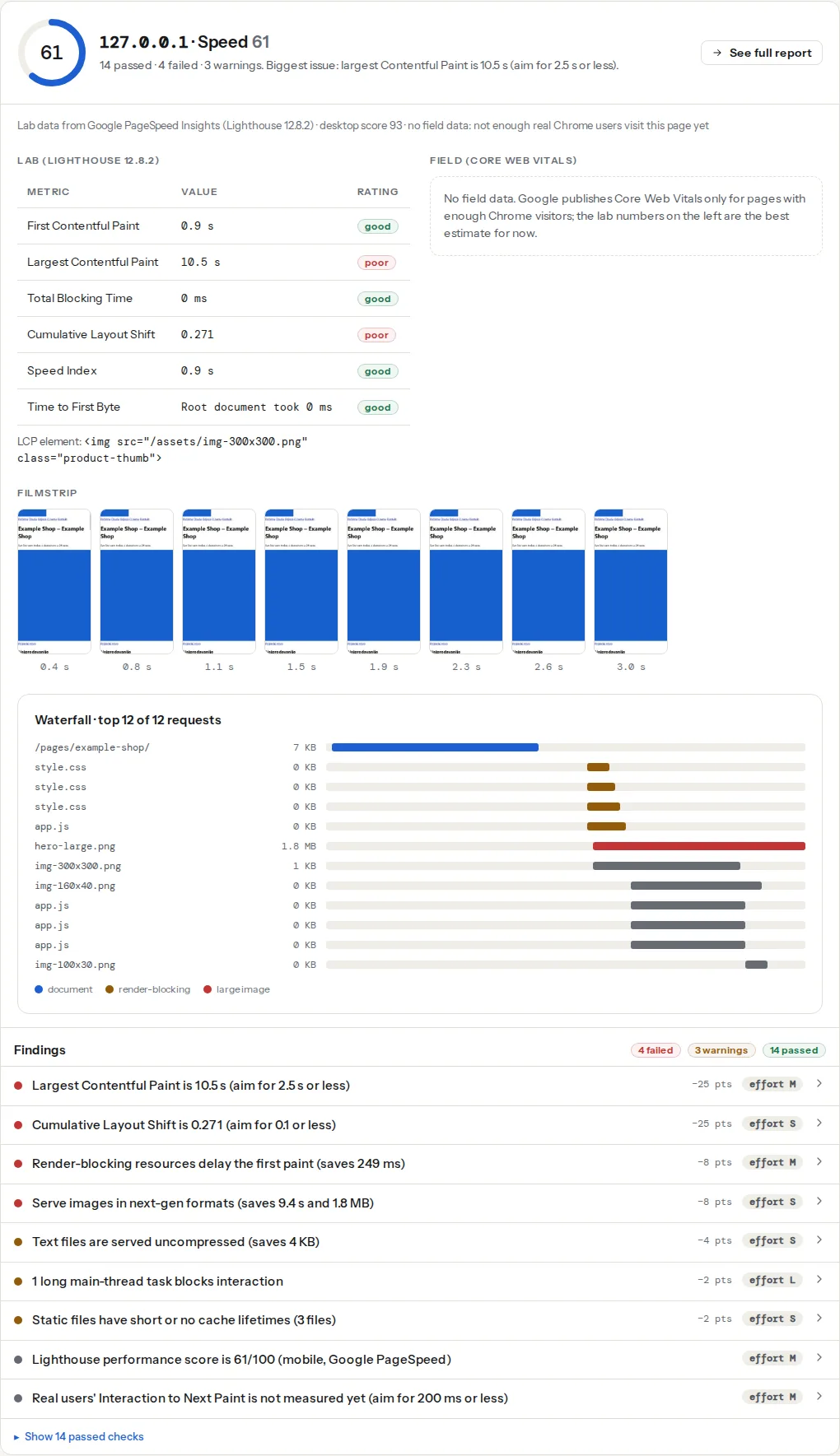
A page on a system font stack requests no font files, so there is nothing for the font-display finding to list and no font stylesheet in the render-blocking list. The report does not reward that with a badge; it simply has less to say, which is the point.
Step by step
1. Know the two costs before you compare
What a web font costs. Count the font requests in the Network panel of DevTools (filter: Font) on a cold load. Add them up. Typical ranges: 100–300 KB for two families and three weights from Google Fonts with its automatic Latin subsetting; 300–600 KB for a theme that self-hosts full files with every script and weight; 30–60 KB for one variable font subset to Latin. Then look at where the files come from: every hostname that is not your own adds a connection setup of 100–300 ms on a phone before the first byte of the font arrives.
The behaviour while the font downloads is the other cost. Without font-display, Chrome and Firefox hide the text for up to 3 s and then swap it in. With font-display: swap, text shows immediately in the fallback font and then changes, which moves every line that the two fonts size differently; that is the CLS cost, and a headline that rewraps and pushes a hero down can fail the 0.1 threshold by itself.
What a system stack costs. The page is set in whatever the visitor's operating system uses for its interface. In practice that means:
| Platform | What system-ui resolves to |
|---|---|
| Windows 10 and 11 | Segoe UI |
| macOS and iOS | San Francisco (SF Pro) |
| Android | Roboto |
| Ubuntu | Ubuntu |
| Other Linux | Whatever the desktop sets, often DejaVu Sans or Noto Sans |
They are all good fonts, and not the same font, so a design that depends on a particular letterform (a geometric sans, a serif headline, a display face for the logo) is not achievable with a stack. Line lengths differ by a few percent between them, so a layout tuned to the pixel on one machine wraps differently on another. For a brand whose identity lives in its typeface, that is a real loss; for a documentation site or a shop, most visitors never notice.
The stacks people actually use:
/* Modern: let the OS decide, with the Tailwind/Bootstrap-style fallbacks and emoji */
body {
  font-family: system-ui, -apple-system, "Segoe UI", Roboto, "Helvetica Neue", "Noto Sans",
               "Liberation Sans", Arial, sans-serif,
               "Apple Color Emoji", "Segoe UI Emoji", "Segoe UI Symbol", "Noto Color Emoji";
}

/* Monospace for code */
code, pre {
  font-family: ui-monospace, SFMono-Regular, Menlo, Consolas, "Liberation Mono", monospace;
}
system-ui alone works in every current browser; the explicit names behind it cover older ones and give you control over the order.
2. Rank the middle options
Between "all web fonts" and "no web fonts" there is a ladder. Each step down saves bytes and requests; each step up buys design control. Pick the lowest rung that the brand can live with.
- System stack everywhere. Zero cost. Right for internal tools, documentation, most blogs and brochure sites that are not selling design.
- System stack for body, one web font for headings. Headings are few, so one weight of one family in a Latin subset (15–40 KB) covers them, and body text, which is most of the page, shifts nothing. This is the best ratio of brand to bytes for most marketing sites.
- One self-hosted variable font, subset, with a metric-matched fallback. A variable font carries every weight in one file (30–60 KB for a Latin subset), served from your own hostname, preloaded, with
size-adjuston the fallback so the swap does not rewrap lines. That gets a brand font close to the cost of option 2 for the whole page. The mechanics (subsetting, preload,font-display,size-adjust) are in web fonts without layout shift; do them all, or you pay the full price for a partial result. - Two families, several weights, from a third-party host. The default theme setup. Right only when the brand needs it and the rest of the page is already fast enough that fonts are the biggest remaining item.
Two rungs that do not belong on the ladder at all: icon fonts (an entire font file, often 50–100 KB, to draw twelve icons that inline SVG draws for a few hundred bytes each and with no swap), and a web font for the logo (the logo is an SVG; a font file to render four letters costs more than the image).
If an icon font must stay for now, give it font-display: optional: the browser uses it only when it is already cached, so nothing is invisible and nothing jumps on a first visit. The icons are missing on that first visit, which is why the real fix is SVG.
3. Measure it on your page, not in general
The argument ends when you run the experiment. It takes twenty minutes on a staging copy.
- Run the speed test on the production page. Write down FCP, LCP, CLS, the render-blocking list and the font-display list.
- On a staging copy, switch the body and headings to the system stack from step 1. In most themes that is one setting (see Platform notes); in custom CSS it is one
font-familyrule and removing the Google Fonts<link>. - Run the speed test on the staging URL. Compare.
What you should expect to move: FCP by the cost of the blocking stylesheet and the extra origin (50–400 ms on the mobile run, more when the theme used @import); CLS by whatever the font swap contributed; the render-blocking finding loses one entry; the font-display finding disappears. What you should not expect to move: LCP when the largest element is an image (the image was the problem), TTFB (fonts have nothing to do with the server), and Speed Index by more than the FCP change.
If FCP moved by under 100 ms and CLS did not change, fonts are not your problem; put the web font back and spend the time on whatever the report lists first. If CLS dropped from red to green, you have found the shift; you can keep the system stack, or keep the font and apply the size-adjust fallback from the web fonts guide and measure a third time.
4. Implement the option you picked
System stack. Remove every font <link> and @import, set the font-family rules above, and delete the @font-face blocks.
System body, one web font for headings. Self-host the one weight, subset to Latin, and load it with font-display: swap and a preload:
<!-- in <head> -->
<link rel="preload" href="/fonts/brand-display-latin.woff2" as="font" type="font/woff2" crossorigin>
<style>
  @font-face {
    font-family: "Brand Display";
    src: url("/fonts/brand-display-latin.woff2") format("woff2");
    font-weight: 700;
    font-display: swap;
    unicode-range: U+0000-00FF, U+0131, U+0152-0153, U+02BB-02BC, U+02C6, U+02DA, U+02DC, U+2000-206F, U+2074, U+20AC, U+2122, U+2191, U+2193, U+2212, U+2215, U+FEFF, U+FFFD;
  }
  h1, h2, h3 { font-family: "Brand Display", system-ui, sans-serif; }
</style>
The unicode-range is the standard Latin range Google Fonts uses; a subsetting tool (pyftsubset, or the download from Google Fonts' own CSS with a text= or subset parameter) produces the file.
One variable font. Same pattern with font-weight: 100 900 in the @font-face and the metric overrides on a named fallback; the web fonts guide has the full block.
5. Keep the render path clean
Whatever you load, load it right. The stylesheet that declares the fonts must be inline or on your own host, never @imported (an @import is a second blocking round trip that starts only after the first stylesheet arrives). If a third-party host stays, add <link rel="preconnect" href="https://fonts.gstatic.com" crossorigin> so the connection is ready when the CSS names the file. On a text-heavy page the LCP element is often the headline, which cannot paint until its font arrives or font-display releases it: one more reason to preload the heading font.
Platform notes
WordPress
Block themes set fonts under Appearance → Editor → Styles → Typography, where the bundled fonts can be removed and a system stack picked. Classic themes vary: most have a Typography section in the customizer with a "system" or "default" entry in the font list. Page builders load Google Fonts themselves: Elementor controls the display= parameter under Elementor → Settings → Advanced → Google Fonts Load (set it to Swap or Optional), and both Elementor and Divi have settings for which Google Fonts load and whether to self-host them; the Elementor performance guide and the Divi performance settings guide walk through each screen. Caching plugins can preload fonts and add display=swap to Google Fonts URLs; check that the theme does not also do it.
Shopify
The theme editor's typography settings pick from Shopify's font library, which is served from Shopify's own CDN alongside the rest of the theme; there is no third-party origin to preconnect to, and system fonts are offered in the same picker. Switching to them is one dropdown per role (headings, body).
Squarespace and Wix
The font list is fixed to what the platform offers, and the platform decides how the files load. If the list includes a font visitors already have installed (Arial, Georgia), choosing it avoids the download; you cannot change font-display or self-host.
Static sites and custom code
You own the whole chain. Self-host under /fonts/, set Cache-Control: max-age=31536000, immutable on the folder, subset at build, and never let a component library pull in its own font stylesheet.
Verify
- The speed test on the changed page shows the font-display finding gone (or passing) and no font stylesheet in the render-blocking list.
- FCP and CLS are equal or better than the "before" report; LCP is unchanged unless the LCP element is a headline.
- DevTools → Network, filter Font: the number of font files matches the number you decided on (0, 1 or 2), all from your own hostname.
- Every heading and body text looks intended on Windows, macOS and Android; a colleague's phone is enough.
Common mistakes
- Loading a family for one heading. Symptom: three font files for the site title. Set the title as SVG or as the system stack; a font for one line is the worst bytes-per-glyph ratio on the page.
- Loading every weight. Symptom: seven font requests, four of them for weights no rule uses. Grep the CSS for
font-weightvalues and load only those. - The logo as a web font. Symptom: the logo flashes from Arial to the brand face on every first visit. Export it once as SVG; it is smaller than the font.
@importin the stylesheet. Symptom: a Google Fonts entry deep in the render-blocking list with a long estimated cost. Move it to a<link>in<head>or, better, self-host.- Testing on your own laptop. Symptom: "it looks fine" where the fonts are cached and the connection is fast. Judge from the mobile speed test.