# Web fonts without layout shift: font-display, preload and subsetting
> Stop headings from flashing blank or jumping when a web font arrives. Pick the right font-display value, preload the two fonts above the fold, subset them and tune the fallback metrics.
Updated 2026-09-25 · Speed & Core Web Vitals · HTML version: https://getreport.app/guides/web-fonts-without-layout-shift
A web font costs twice. First the bytes: four weights of a brand font are easily 400 KB, fetched late because the browser only finds them after the CSS has arrived. Then the swap: text is drawn in a fallback font, the web font lands, every line is redrawn a little wider or taller, and the page moves under the visitor. This guide gets you fonts that show text immediately and stay put, in about an hour: the right `font-display`, one preload, a subset that is a tenth of the size, and a fallback that matches the metrics.
## Quick answer
- Add `font-display: swap` to every `@font-face` (or `&display=swap` to the Google Fonts URL). Text shows at once instead of staying blank for up to 3 s.
- Preload the one or two WOFF2 files used above the fold with `, ad slot and embed explicit width and height (or aspect-ratio) so space is reserved before it loads.
> 2. Preload the main web font and use font-display optional, or swap with a size-adjusted fallback font, so text does not reflow.
> 3. Never insert banners or content above existing content after load.
> **Check: No render-blocking resources delay the first paint.** Stylesheets and scripts in stop the browser from drawing anything until they have downloaded. Each one adds a round trip before the visitor sees the page.
>
> 1. Add defer or async to scripts that are not needed before the first paint, or move them to the end of .
> 2. Inline the CSS needed for the first screen and load the rest asynchronously (WordPress: "Optimize CSS delivery" in WP Rocket / LiteSpeed Cache).
> 3. Remove unused plugin CSS/JS from pages that do not need it.
The font-display finding comes from Lighthouse's audit of the same name: it lists each `@font-face` whose font was requested during the load and that has no `font-display` value, with the file name so you can find the rule. The CLS finding shows the lab value from the Lighthouse run and, when the site has enough Chrome visitors, the field value at the 75th percentile; a font swap shows up as a shift in the first second of the filmstrip. A Google Fonts stylesheet in `` also appears in the render-blocking list, because the browser cannot paint until that CSS file has arrived from `fonts.googleapis.com`.
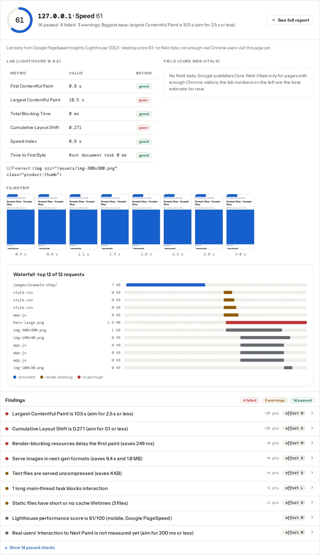
The finding cards do not tell you which `font-display` value to use or how big the swap is; the rest of this guide does.
## Step by step
### 1. Count what loads today
Open the page in Chrome, open DevTools (F12), switch to the Network panel, filter by "Font" and reload. You want three numbers: how many font files load, how big they are, and where they come from. A typical unoptimised site loads six to ten files (regular, bold, italic, a heading font, an icon font) totalling 300–600 KB from two origins. Write the list down; the rest of the steps shrink it.
Decide which weights the first screen really uses. Most sites need two: the body regular and one bold for headings. Everything else can load later or go.
### 2. Choose the font-display value
`font-display` tells the browser what to do while the font downloads. There are two periods: the *block* period (text is invisible) and the *swap* period (fallback text is shown, and the web font replaces it if it arrives in time).
| Value | Blank text | Swaps when the font arrives | Layout shift risk |
| --- | --- | --- | --- |
| `auto` / `block` | Up to about 3 s | Always | Yes, late |
| `swap` | Almost none | Always, whenever it arrives | Yes, unless the fallback is tuned |
| `fallback` | About 100 ms | Only if it arrives within about 3 s | Small |
| `optional` | About 100 ms | Never; the fallback stays for this page view | None |
For body and heading text, `swap` plus a tuned fallback (step 6) is the combination that shows text at once and does not move it. `optional` is the zero-shift choice for a font you can live without on the first visit: the browser uses it only if it is ready almost immediately (from cache on a repeat visit, usually), otherwise it keeps the fallback and downloads the font quietly for next time. Icon fonts are the exception: with `swap` the fallback shows letters or boxes where icons should be, so use `block` for those, or better, replace them with inline SVG.
For a self-hosted font, the value goes in the `@font-face` rule in your stylesheet:
```css
/* In your main stylesheet */
@font-face {
font-family: "Brand Sans";
src: url("/fonts/brand-sans-regular.woff2") format("woff2");
font-weight: 400;
font-style: normal;
font-display: swap;
}
```
For Google Fonts, the value is a parameter on the stylesheet URL; Google writes it into every `@font-face` it serves:
```html
Header set Cache-Control "public, max-age=31536000, immutable"
```
### 5. Subset to the characters you use
A full font carries thousands of glyphs; an English or Western European site uses about 250 of them. `pyftsubset`, from the open-source fontTools package, cuts the file down and converts to WOFF2 in one command:
```bash
pip install fonttools brotli
pyftsubset BrandSans-Regular.ttf \
--output-file=brand-sans-regular.woff2 \
--flavor=woff2 \
--layout-features='*' \
--unicodes="U+0000-00FF,U+0131,U+0152-0153,U+02BB-02BC,U+02C6,U+02DA,U+02DC,U+2000-206F,U+2074,U+20AC,U+2122,U+2191,U+2193,U+2212,U+2215,U+FEFF,U+FFFD"
```
That range is the "latin" subset Google Fonts itself uses: ASCII, Latin-1 accents, typographic punctuation, the euro sign. Add `U+0100-024F` for Central European languages (Croatian, Polish, Czech), `U+0400-04FF` for Cyrillic. The typical result is 15–40 KB per weight.
If you would rather have a tool scan the pages for the characters actually used, `glyphhanger` does that and calls `pyftsubset` for you:
```bash
npm install -g glyphhanger
glyphhanger https://example.com/ --subset=BrandSans-Regular.ttf --formats=woff2
```
Then tell the browser which characters each file covers, so a page without Cyrillic never downloads the Cyrillic file:
```css
@font-face {
font-family: "Brand Sans";
src: url("/fonts/brand-sans-regular-latin.woff2") format("woff2");
font-weight: 400;
font-display: swap;
unicode-range: U+0000-00FF, U+0131, U+0152-0153, U+2000-206F, U+20AC;
}
@font-face {
font-family: "Brand Sans";
src: url("/fonts/brand-sans-regular-cyrillic.woff2") format("woff2");
font-weight: 400;
font-display: swap;
unicode-range: U+0400-04FF;
}
```
### 6. Make the fallback the same size
`swap` removes the blank text but not the jump. The jump goes away when the fallback font takes up the same space as the web font, and CSS can force that: a second `@font-face` that points at a local font and stretches it with `size-adjust` (glyph width), `ascent-override`, `descent-override` and `line-gap-override` (vertical metrics):
```css
@font-face {
font-family: "Brand Sans Fallback";
src: local("Arial");
size-adjust: 104%;
ascent-override: 92%;
descent-override: 24%;
line-gap-override: 0%;
}
body {
font-family: "Brand Sans", "Brand Sans Fallback", sans-serif;
}
```
The percentages depend on the pair of fonts. Start with `size-adjust` and tune it until a paragraph in the fallback wraps at the same words as in the web font (comment the web font out in DevTools and compare), then set the overrides so the line height matches. Frameworks generate these numbers: Next.js does it automatically with `next/font`, and the Fontaine and Capsize libraries do it for other stacks. The [CLS guide](https://getreport.app/guides/fix-cumulative-layout-shift) shows how to find the exact shift this removes.
### 7. Or use a system font stack
No download, no swap, no shift, and text that looks native on every device:
```css
body {
font-family: system-ui, -apple-system, "Segoe UI", Roboto, "Helvetica Neue", Arial, sans-serif;
}
```
Many sites keep the brand font for headings only, with `optional`, and use the system stack for body text. That is one small file instead of four, and the body never moves.
## Platform notes
### WordPress
Block themes (WordPress 6.5 and later) have a Font Library under Appearance → Editor → Styles → Typography. Fonts uploaded there are served from your own uploads folder with `font-display: fallback` written by core, which already avoids most of the shift. Classic themes load fonts from their own settings (usually Customizer → Typography) and often from Google Fonts by default.
Elementor: Elementor → Settings → Advanced → "Google Fonts Load" sets the `font-display` value for every Google Font the builder loads; choose Swap. Elementor Pro's Custom Fonts screen accepts your own WOFF2 files, which then load from your server. Divi: Divi → Theme Options → General → Performance → "Improve Google Fonts Loading" and "Limit Google Fonts Support For Legacy Browsers" cut the number of files requested.
For everything else, the OMGF plugin ("Optimize My Google Fonts") downloads the Google Fonts a page uses, serves them from your host with the display value you pick, and can preload the ones you choose. Perfmatters has the same under Fonts → Local Google Fonts. Check Appearance → Customize afterwards for a second copy of the font the theme still loads from Google.
### Shopify
Theme settings → Typography picks from Shopify's font library, served from the Shopify CDN. Themes built on Dawn write `font-display: swap` into the `font_face` filter (`{{ settings.type_body_font | font_face: font_display: 'swap' }}` in `theme.liquid`); older themes may lack the parameter, and it is a one-line edit in the theme code editor. The `preload_tag` filter (`{{ settings.type_body_font | font_url | preload_tag: as: 'font' }}`) adds the preload.
### Static sites and custom code
Self-host, subset at build time (a `pyftsubset` step in the build script) and let the framework write the preloads and fallback metrics: `next/font` for Next.js, `@fontsource` packages with `unicode-range` splits already done for Astro, Eleventy and plain HTML.
## Verify
- Re-run the [speed test](https://getreport.app/tools/speed-test). The font-display finding reads "Web fonts show text while loading" and the Google Fonts stylesheet has left the render-blocking list. Watch the CLS value; if fonts were the cause, it drops to below 0.05 in the lab run.
- In DevTools → Network, filtered by Font: two files, both under 50 KB, starting at the top of the waterfall next to the CSS rather than after it.
- In DevTools → Performance, record a reload with "Layout Shifts" visible in the timeline: no shift entry in the first second whose affected node is the heading or body text. The Rendering panel's "Layout Shift Regions" option paints each shift blue on the page as it happens, which is the fastest way to see whether text still moves.
- Field data catches up after 28 days: the [Core Web Vitals checker](https://getreport.app/tools/core-web-vitals) shows the CrUX CLS at the 75th percentile.
## Common mistakes
- **Preloading every weight.** Six preloaded fonts delay the hero image, and the LCP gets worse. Preload the two used above the fold; the rest load on demand.
- **Preload without `crossorigin`.** The font downloads twice, once for the preload and once for the CSS. The DevTools Network panel shows the duplicate.
- **`font-display: swap` in your CSS, but the font comes from Google.** Google's stylesheet defines the `@font-face`, so the value has to be in the URL (`&display=swap`); a rule in your own CSS does nothing for it.
- **`swap` on an icon font.** Until the font arrives, icons show as letters or boxes. Use `block` for icon fonts or, better, inline SVG icons that need no font at all.
- **Loading fonts with `@import` inside the CSS.** That chains three requests (HTML → CSS → imported CSS → font) and blocks rendering for all of them. Use a `