# Responsive images: srcset and sizes explained with real numbers
> Stop sending a 2000-pixel photo to a 400-pixel slot. How the browser picks from srcset, why sizes is required, and a three-breakpoint example with the real pixel counts, on any CMS.
Updated 2026-09-25 · Speed & Core Web Vitals · HTML version: https://getreport.app/guides/responsive-images-srcset-and-sizes
A product thumbnail is shown at 300 pixels wide. The file behind it is 1600 pixels wide, because that is what the designer exported and what the CMS served. The visitor downloads 28 times more image than the screen can show, on every thumbnail, on every page. `srcset` and `sizes` fix this: you provide a few sizes of each image, the browser picks the smallest one that looks sharp on its screen. This guide explains how that choice is made, with the actual numbers, and how to write the attributes so the choice is the right one.
## Quick answer
- Export each image at three or four widths (for example 400, 800, 1200 and 1600 px) and list them in `srcset` with `w` descriptors.
- Add `sizes` that says how wide the slot is at each breakpoint, in CSS pixels: `sizes="(max-width: 600px) 100vw, (max-width: 1200px) 50vw, 600px"`. Without it, the browser assumes the image is full width.
- Keep `width` and `height` on the `` with the image's real proportions, so the space is reserved before it loads.
- The hero image gets `fetchpriority="high"` and no `loading="lazy"`; everything below the fold gets `loading="lazy"`.
- A phone with a 3× screen needs 3 physical pixels per CSS pixel: a 400 CSS px slot wants a 1200 px image. That is why the biggest candidate is bigger than any desktop slot.
- WordPress, Shopify and most frameworks write `srcset` for you; you usually only need to fix `sizes`.
## Why responsive images matter
Two different sizes are in play for every image. The *intrinsic* size is the pixels in the file: 1600×1067. The *rendered* size is the box on the screen: 300×200 CSS pixels. When the file is much bigger than the box, the browser downloads the bytes, decodes them all, then throws most of them away while scaling down. On a product grid of 24 thumbnails that is easily 4 MB downloaded for 150 KB of pixels actually shown.
The screen adds a twist. CSS pixels are not device pixels. A current phone has a device pixel ratio (DPR) of 2 or 3, so a 400 CSS px slot is 800 or 1200 physical pixels wide, and an 800 px image looks slightly soft on the 3× screen. A laptop with a 2× display wants 1200 px for a 600 px slot; an office monitor at 1× wants 600. No single file is right for all of them: too small looks blurry on phones, too big wastes bytes on desktops. `srcset` lets you offer the set and lets each device take what it needs.
The cost lands on the [Largest Contentful Paint](https://getreport.app/learn/largest-contentful-paint) when the oversized image is the hero, and on total page weight everywhere else. It also shows up in mobile data bills, which is why Lighthouse counts the wasted bytes as a speed opportunity.
## How getReport checks it
> **Free tool:** [Image size checker](https://getreport.app/tools/image-size-checker): List every image on a page with its file size, format, real pixel dimensions and the size it is displayed at. Find the 2 MB hero, the 1600-pixel thumbnail and the images with no width and height.
The image size checker runs a full report and puts the images table first. The practices module requests every `` source on the page (the `src`, or for lazy-load markup the `data-src` or the first `srcset` candidate), reads the first 64 KB to get the real pixel dimensions, and compares them with the `width` attribute in the HTML. The speed module adds Lighthouse's "Properly size images" audit, which compares what the emulated phone actually downloaded with the size it rendered at:
> **Check: Every sized image is served close to its displayed size.** Sending a 1600-pixel photo for a 300-pixel slot downloads about 28 times more pixels than needed. The browser scales it down and the visitor pays for the difference.
>
> 1. Resize the listed images to the largest size they are shown at (twice that for high-density screens).
> 2. Use srcset with several sizes so phones get a smaller file than desktops.
> **Check: Images are sized for how they are displayed.** Sending a 2000 px photo to a 400 px slot wastes most of the bytes. Responsive images let the browser pick the right size for each screen.
>
> 1. Add srcset and sizes to so phones get small versions; most CMSs generate the sizes for you.
> 2. Resize the originals to the largest size you actually display.
> **Check: Every image declares width and height.** Without width and height the browser cannot reserve space, so the text jumps when each image arrives. That is the most common cause of a poor Cumulative Layout Shift score.
>
> 1. Add width and height attributes with the image's real proportions; CSS can still scale it.
> 2. In WordPress, recent versions add them automatically for images inserted through the editor; hard-coded theme images need them by hand.
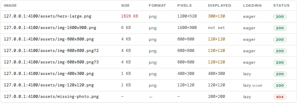
The two findings measure slightly different things, and it helps to know which is which. The oversized-dimensions check is strict and simple: the file behind `src` is more than 2× wider than the `width` attribute. It does not evaluate `srcset`, so an image with a good `srcset` but a 1600 px `src` still appears there; the fix is to make `src` a sensible mid-size candidate. Lighthouse's audit runs a real phone viewport, picks from `srcset` the way a phone would, and reports the bytes wasted by the candidate actually chosen; that is the number that reflects what visitors download. When only the second finding remains, `sizes` is usually wrong.
## Step by step
### 1. Measure the slot, not the file
For each image the table flags, find how wide it is displayed at three viewport widths: a phone (360–430 CSS px), a tablet (768–1024), a desktop (1280 and above). In Chrome DevTools, hover the `` in the Elements panel: the tooltip shows "Rendered size" and "Intrinsic size" side by side, and "Current source" tells you which candidate the browser chose. Resize the window and hover again.
For the example below, a product image sits in a grid: full width on phones, half width on tablets, and a fixed 600 px column on desktop.
### 2. Export the candidates
The largest candidate covers the biggest slot at the highest DPR you care about: a 600 px slot at 2× is 1200 px, a 430 px phone at 3× is 1290 px. A 1600 px file covers both with headroom. Below that, steps of roughly 1.5–2× keep the set small: 400, 800, 1200, 1600. Export them from the original, or let a tool do it:
```bash
# sharp-cli: four widths from one original
npx sharp-cli --input shoe.jpg --output shoe-400.webp resize 400
npx sharp-cli --input shoe.jpg --output shoe-800.webp resize 800
npx sharp-cli --input shoe.jpg --output shoe-1200.webp resize 1200
npx sharp-cli --input shoe.jpg --output shoe-1600.webp resize 1600
```
Use WebP or AVIF for the candidates; the format saving comes on top of the size saving ([Modern image formats](https://getreport.app/guides/modern-image-formats-webp-avif)).
### 3. Write `srcset` with width descriptors
`srcset` lists each file with its real pixel width and a `w`:
```html
```
The `w` number must be the file's actual width; the browser trusts it and never checks. `src` is the fallback for very old browsers and, for our checker, the file compared with the `width` attribute, so make it the middle candidate rather than the largest.
### 4. Write `sizes`, because the browser cannot guess
Here is the part that most templates get wrong. The browser picks the candidate while it is still parsing the HTML, before the CSS has loaded, so it does not know how wide the image will be laid out. `sizes` is you telling it in advance. Each entry is a media condition and a width in CSS pixels or viewport units; the first condition that matches wins; the last entry has no condition and is the default:
```text
(max-width: 600px) 100vw phones: the image spans the viewport
(max-width: 1200px) 50vw tablets: half the viewport
600px desktops: a fixed 600 px column
```
Without `sizes`, the browser assumes `100vw`: full viewport width. On a 1440 px desktop with a 2× screen it then wants 2880 px for a 600 px slot and picks the largest candidate, which is exactly the waste you were trying to remove.
### 5. Check the arithmetic
The browser computes the slot width from `sizes`, multiplies by DPR, and takes the smallest candidate at least that wide (falling back to the largest if none is):
| Device | Viewport | `sizes` result | DPR | Wants | Picks |
| --- | --- | --- | --- | --- | --- |
| Phone | 390 px | 100vw = 390 px | 3 | 1170 px | `1200w` |
| Older phone | 360 px | 100vw = 360 px | 2 | 720 px | `800w` |
| Tablet | 1024 px | 50vw = 512 px | 2 | 1024 px | `1200w` |
| Laptop | 1440 px | 600 px | 2 | 1200 px | `1200w` |
| Desktop monitor | 1920 px | 600 px | 1 | 600 px | `800w` |
The 1× desktop, which used to get the 1600 px file, now gets 800 px: about a quarter of the bytes. The 3× phone gets a sharp 1200 px file instead of a soft 800. Nobody gets 1600 unless a 3× device shows the image wider than 533 CSS px, and the file is there if one does.
Browsers may also pick a smaller candidate than the arithmetic says when the connection is slow or a larger candidate is already in cache; that is allowed and fine.
### 6. Reserve the space with `width` and `height`
`width="800" height="533"` on the `` does not fix the display size; CSS still does that (`max-width: 100%; height: auto` is the usual rule). What the attributes give the browser is the aspect ratio, 3:2, so it reserves a box of the right shape before the file arrives. Without them the text below jumps down when the image loads, which is the most common cause of a poor [Cumulative Layout Shift](https://getreport.app/learn/cumulative-layout-shift). Use the proportions of any candidate; they all share the ratio.
### 7. Treat the hero differently
The largest image above the fold is the LCP element, and two attributes that help everywhere else hurt it. `loading="lazy"` delays it until layout is done, which is the opposite of what you want; leave it off. Add `fetchpriority="high"` so the browser fetches it before the stylesheets' fonts and the below-the-fold images:
```html
```
A full-width hero on a 2× laptop at 1440 px wants 2880 px, so the set goes higher than for a grid image. Cap it where the file gets silly: a 2400 px WebP at quality 80 is around 300 KB for a typical photo, and the 1× monitor still only takes 1600.
### 8. Art direction with `` when the crop changes
`srcset` serves the same picture at different sizes. When the phone should get a different crop (a tight square of the product instead of the wide lifestyle shot), use `` with a `media` condition per source; each source has its own `srcset` and `sizes`:
```html
```
Unlike `type` sources, a `media` source is chosen whenever its condition matches, so the order is: most specific first, and the `` is the default.
## Platform notes
### WordPress
WordPress has generated `srcset` and `sizes` for images inserted through the editor since version 4.4. Each upload gets the registered sizes (150, 300, 768, 1024, 1536 and 2048 px by default, plus any the theme adds with `add_image_size()`), and uploads wider than 2560 px are scaled down to that limit (`big_image_size_threshold`, since 5.3). Since 6.3 core also adds `fetchpriority="high"` to the image it judges to be the LCP and leaves lazy loading off the first images in the content.
What core cannot know is the slot width, so its default `sizes` is `(max-width: {width}px) 100vw, {width}px`, where `{width}` is the size you inserted. In a two-column grid that overstates the slot and phones download twice what they need. Themes fix it with the `wp_calculate_image_sizes` filter; for a grid of half-width cards, in `functions.php` or a small plugin:
```php
// Tell the browser product-grid images are half the viewport on tablets and 400 px on desktop
add_filter('wp_calculate_image_sizes', function ($sizes, $size, $image_src, $image_meta, $attachment_id) {
if (is_post_type_archive('product') || is_tax('product_cat')) {
return '(max-width: 600px) 100vw, (max-width: 1200px) 50vw, 400px';
}
return $sizes;
}, 10, 5);
```
Two more things to check. Images hard-coded in the theme (``) get no `srcset` at all; use `wp_get_attachment_image()` with a media library image instead. And if you added sizes after uploading, existing images do not have them; the Regenerate Thumbnails plugin creates the missing files.
Elementor's Image widget has an "Image Resolution" setting (Thumbnail, Medium, Large, Full or a custom size): choosing "Full" is what puts a 2560 px file in a 300 px card. Set it to the size closest to the slot; Elementor still writes `srcset` from the registered sizes.
### Shopify
Liquid's `image_tag` filter writes `srcset` from the widths you list and takes `sizes` as a parameter:
```liquid
{{ product.featured_image
| image_url: width: 1600
| image_tag: widths: '400, 800, 1200, 1600',
sizes: '(max-width: 600px) 100vw, (max-width: 1200px) 50vw, 600px',
loading: 'lazy' }}
```
The CDN generates each width on request. Dawn-based themes already do this for product cards; check the `sizes` values in `card-product.liquid` against your actual grid.
### Static sites and frameworks
Astro's `` and ``, Next.js `next/image` and Eleventy's image plugin all generate the candidates at build time and write `srcset`. Every one of them takes a `sizes` prop, and every one of them defaults to `100vw` when you leave it out. The prop is the fix.
## Verify
- Re-run the [image size checker](https://getreport.app/tools/image-size-checker). The oversized-dimensions finding reads "Every sized image is served close to its displayed size", and Lighthouse's image-sizing finding reads "Images are sized for how they are displayed".
- In Chrome DevTools, set the device toolbar to a phone (for example a 390 px viewport at DPR 3), reload, and hover an `` in the Elements panel. "Current source" should name the 1200 px candidate, and "Intrinsic size" should be close to "Rendered size" times 3.
- Switch to a 1920 px desktop at DPR 1 and hover again: the 800 px candidate.
- In the Network panel, filtered by "Img", the total transferred for the page on the phone profile drops, typically by half on a product grid.
## Common mistakes
- **`srcset` without `sizes`.** The browser assumes full width and picks the biggest candidate on desktops. The report's Lighthouse finding stays red while the oversized-dimensions finding passes. Add `sizes`.
- **`sizes` copied from another layout.** A `sizes` that says `100vw` on a three-column grid downloads three times the pixels. Measure the slot in DevTools at each breakpoint.
- **A `w` descriptor that lies.** A file renamed `-1200` but actually 600 px wide looks blurry on phones, because the browser believes the number. Generate the candidates from the original with a tool, never by renaming.
- **Lazy loading the hero.** `loading="lazy"` on the LCP image adds hundreds of milliseconds. Only images below the fold get it; the hero gets `fetchpriority="high"`.
- **`width` and `height` from the wrong candidate.** They only need the right ratio, but `width="1600" height="533"` on a 3:2 image reserves the wrong box and shifts the layout twice. Use one candidate's real dimensions.
- **Uploading the 6000 px camera file and relying on `srcset`.** Core scales to 2560 px, and every candidate is generated, but the original still sits in the media library and gets linked by "Full size" settings. Resize to 2400 px before upload.
 ```
The `w` number must be the file's actual width; the browser trusts it and never checks. `src` is the fallback for very old browsers and, for our checker, the file compared with the `width` attribute, so make it the middle candidate rather than the largest.
### 4. Write `sizes`, because the browser cannot guess
Here is the part that most templates get wrong. The browser picks the candidate while it is still parsing the HTML, before the CSS has loaded, so it does not know how wide the image will be laid out. `sizes` is you telling it in advance. Each entry is a media condition and a width in CSS pixels or viewport units; the first condition that matches wins; the last entry has no condition and is the default:
```text
(max-width: 600px) 100vw phones: the image spans the viewport
(max-width: 1200px) 50vw tablets: half the viewport
600px desktops: a fixed 600 px column
```
Without `sizes`, the browser assumes `100vw`: full viewport width. On a 1440 px desktop with a 2× screen it then wants 2880 px for a 600 px slot and picks the largest candidate, which is exactly the waste you were trying to remove.
### 5. Check the arithmetic
The browser computes the slot width from `sizes`, multiplies by DPR, and takes the smallest candidate at least that wide (falling back to the largest if none is):
| Device | Viewport | `sizes` result | DPR | Wants | Picks |
| --- | --- | --- | --- | --- | --- |
| Phone | 390 px | 100vw = 390 px | 3 | 1170 px | `1200w` |
| Older phone | 360 px | 100vw = 360 px | 2 | 720 px | `800w` |
| Tablet | 1024 px | 50vw = 512 px | 2 | 1024 px | `1200w` |
| Laptop | 1440 px | 600 px | 2 | 1200 px | `1200w` |
| Desktop monitor | 1920 px | 600 px | 1 | 600 px | `800w` |
The 1× desktop, which used to get the 1600 px file, now gets 800 px: about a quarter of the bytes. The 3× phone gets a sharp 1200 px file instead of a soft 800. Nobody gets 1600 unless a 3× device shows the image wider than 533 CSS px, and the file is there if one does.
Browsers may also pick a smaller candidate than the arithmetic says when the connection is slow or a larger candidate is already in cache; that is allowed and fine.
### 6. Reserve the space with `width` and `height`
`width="800" height="533"` on the `
```
The `w` number must be the file's actual width; the browser trusts it and never checks. `src` is the fallback for very old browsers and, for our checker, the file compared with the `width` attribute, so make it the middle candidate rather than the largest.
### 4. Write `sizes`, because the browser cannot guess
Here is the part that most templates get wrong. The browser picks the candidate while it is still parsing the HTML, before the CSS has loaded, so it does not know how wide the image will be laid out. `sizes` is you telling it in advance. Each entry is a media condition and a width in CSS pixels or viewport units; the first condition that matches wins; the last entry has no condition and is the default:
```text
(max-width: 600px) 100vw phones: the image spans the viewport
(max-width: 1200px) 50vw tablets: half the viewport
600px desktops: a fixed 600 px column
```
Without `sizes`, the browser assumes `100vw`: full viewport width. On a 1440 px desktop with a 2× screen it then wants 2880 px for a 600 px slot and picks the largest candidate, which is exactly the waste you were trying to remove.
### 5. Check the arithmetic
The browser computes the slot width from `sizes`, multiplies by DPR, and takes the smallest candidate at least that wide (falling back to the largest if none is):
| Device | Viewport | `sizes` result | DPR | Wants | Picks |
| --- | --- | --- | --- | --- | --- |
| Phone | 390 px | 100vw = 390 px | 3 | 1170 px | `1200w` |
| Older phone | 360 px | 100vw = 360 px | 2 | 720 px | `800w` |
| Tablet | 1024 px | 50vw = 512 px | 2 | 1024 px | `1200w` |
| Laptop | 1440 px | 600 px | 2 | 1200 px | `1200w` |
| Desktop monitor | 1920 px | 600 px | 1 | 600 px | `800w` |
The 1× desktop, which used to get the 1600 px file, now gets 800 px: about a quarter of the bytes. The 3× phone gets a sharp 1200 px file instead of a soft 800. Nobody gets 1600 unless a 3× device shows the image wider than 533 CSS px, and the file is there if one does.
Browsers may also pick a smaller candidate than the arithmetic says when the connection is slow or a larger candidate is already in cache; that is allowed and fine.
### 6. Reserve the space with `width` and `height`
`width="800" height="533"` on the ` ```
A full-width hero on a 2× laptop at 1440 px wants 2880 px, so the set goes higher than for a grid image. Cap it where the file gets silly: a 2400 px WebP at quality 80 is around 300 KB for a typical photo, and the 1× monitor still only takes 1600.
### 8. Art direction with `
```
A full-width hero on a 2× laptop at 1440 px wants 2880 px, so the set goes higher than for a grid image. Cap it where the file gets silly: a 2400 px WebP at quality 80 is around 300 KB for a typical photo, and the 1× monitor still only takes 1600.
### 8. Art direction with `