# Mobile vs desktop scores: why mobile is always lower and what to do
> The same page scores 95 on desktop and 55 on mobile because the mobile test simulates a slow phone on a slow network. What is simulated, why Google uses the mobile number, and what to fix first.
Updated 2026-09-25 · Speed & Core Web Vitals · HTML version: https://getreport.app/guides/mobile-vs-desktop-scores
Run any page through a speed test and the desktop score is higher than the mobile one, usually by 20 to 40 points. The page is the same; the test is not. The mobile run simulates a mid-range phone on a slow mobile connection, and every byte of JavaScript and every oversized image costs several times more there than on a laptop. That gap is not a quirk of the tool: it is the gap between your visitors on phones and your visitors at desks, and Google ranks with the phone side. This guide explains exactly what the mobile test simulates, why the same page loses 40 points, and the three things that close most of the gap.
## Quick answer
| | Mobile run | Desktop run |
| --- | --- | --- |
| Viewport | 412 px wide, phone user agent | 1,350 px wide |
| CPU | Slowed 4× (a mid-range Android phone) | Not slowed |
| Network | 1.6 Mbps down, 150 ms round trip (slow 4G) | 10 Mbps, 40 ms round trip |
| Which one Google uses | Yes: mobile-first indexing and the mobile page experience signal | Only for desktop search results |
- JavaScript is the biggest difference: parse and execute time scales with the CPU, so 400 KB of scripts that costs 300 ms on a laptop costs over a second on the simulated phone.
- Images sized for desktop are the second: a 1,600 px hero on a 412 px screen is four times the bytes for nothing.
- Fonts and third-party scripts are the third; each round trip is 150 ms instead of 40 ms.
- Test on mobile first; treat the desktop score as a sanity check. Run the [speed test](https://getreport.app/tools/speed-test) with the Mobile toggle (the default).
## Why the mobile number is the one that counts
Google indexes and ranks with the mobile version of a page ([mobile-first indexing](https://developers.google.com/search/docs/crawling-indexing/mobile-first-indexing)): Googlebot crawls as a smartphone, and the Core Web Vitals used in the page experience signal for mobile search results are the ones from phone visitors. Since most sites get more than half of their visits from phones, the mobile number also describes the experience most of your visitors have. A desktop score of 95 is good news for the minority at a desk and says nothing about the rest.
The mobile lab run is deliberately pessimistic. Lighthouse simulates a mid-range Android phone with the CPU slowed four times, on a "slow 4G" network profile: 1.6 Mbps download and 150 ms of latency on every round trip. Real phones range from much slower to much faster than that; the profile sits around the middle of the global distribution, and the 75th-percentile field numbers that Google actually uses (see [Field data vs lab data](https://getreport.app/guides/field-data-vs-lab-data)) are often close to it. If your visitors are mostly on new iPhones in a city with fast 5G, your field numbers will beat the lab. If they are on €150 Android phones on a crowded network, the lab is a fair picture.
### Why the same page loses 40 points
The [score](https://getreport.app/learn/lighthouse-performance-score) is a weighted sum of five lab metrics, and four of them scale with the device:
- **CPU-bound work**: parsing, compiling and running JavaScript, style calculation, layout. A 4× slower CPU makes all of it 4× slower. [Total Blocking Time](https://getreport.app/learn/total-blocking-time) is 30 % of the score and is almost entirely this; a page with 200 ms of TBT on desktop has around 800 ms on mobile, which alone drops the score by 20 points.
- **Bytes**: at 1.6 Mbps, 1 MB takes five seconds to arrive; at 10 Mbps, under one. LCP (25 % of the score) is usually the hero image, so its size decides the gap.
- **Round trips**: every file on a new host, every redirect, every stylesheet that references a font is at least one round trip, 150 ms against 40 ms. A chain of four is 600 ms against 160 ms.
- **The viewport**: on a 412 px screen the hero image or headline fills most of the visible area, so it is the LCP element and the Speed Index depends on it. On a 1,350 px desktop the same image is a third of the screen and the header, navigation and text fill in first.
CLS is the exception. It is often *worse* on desktop, where a wider layout gives late-loading elements more room to push content around, and it is the one metric where the desktop run can be the honest one.
## How getReport checks it
> **Free tool:** [Website speed test](https://getreport.app/tools/speed-test): Lighthouse lab results and real-user Core Web Vitals for any page, mobile and desktop, with a filmstrip, a request waterfall and a fix for every slow part. Free, no signup.
The report asks Google's PageSpeed Insights for both a mobile and a desktop Lighthouse run of the page. The device toggle next to the URL field (Mobile is the default) decides which run is scored and shown in the speed panel, and the report header says which one you are looking at. The line above the lab table notes the other device's score, so the gap is visible without a second report:
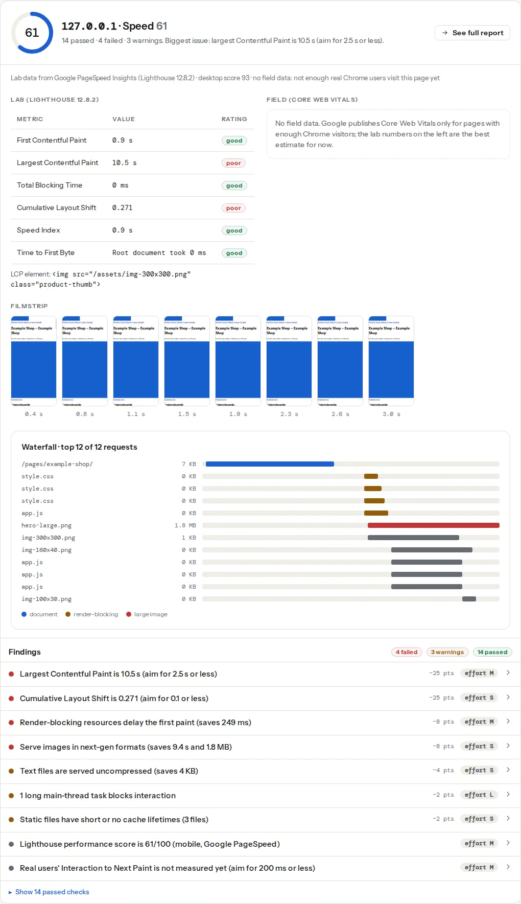
> **Check: Lighthouse performance score.** This is the number Google's own tools show for your page. It combines five of the lab metrics below (all except TTFB), weighted the way Lighthouse weights them. 90 and above is green.
>
> 1. Work through the failed metrics and opportunities below in order of points; the score follows.
> **Check: Largest Contentful Paint.** LCP is when the biggest thing on screen — usually the hero image or headline — finishes loading. Visitors judge "is this site slow?" on it, and Google uses it for ranking.
>
> 1. Find the LCP element (named in your report) and make it lighter, earlier or both — a compressed WebP/AVIF, sized to the screen, without lazy loading.
> 2. Preload it with or add fetchpriority="high" on the .
> 3. Cut what comes before it — render-blocking CSS/JS and slow server responses push LCP back.
> **Check: Total Blocking Time.** TBT adds up every moment the page was too busy running JavaScript to respond to a tap. It is the lab stand-in for INP and the heaviest-weighted Lighthouse metric.
>
> 1. Remove or defer JavaScript that is not needed for the first screen (defer, async, or load on interaction).
> 2. Split long tasks (> 50 ms) into smaller chunks; move heavy work to a web worker.
> 3. Audit third-party tags — chat widgets, tag managers and A/B tools are the usual culprits.
The Core Web Vitals field bars are phone data unless you switch to desktop, and Search Console reports the two separately. When you compare a lab run with field bars, keep the device the same on both sides.
## Step by step
### 1. Run both and read the gap, not the scores
Run the page once with Mobile and once with Desktop (the toggle on the form; the second run is a separate report you can keep side by side). Then compare metric by metric rather than score by score:
- Mobile TBT far above desktop TBT: JavaScript. Step 3.
- Mobile LCP far above desktop LCP while TTFB is similar: image bytes or a late-discovered hero. Step 2.
- Both TTFBs high: the server; the device does not matter. See [TTFB: what a slow server looks like](https://getreport.app/guides/ttfb-what-a-slow-server-looks-like).
- Mobile FCP high while the desktop FCP is fine: render-blocking files and fonts, each paying 150 ms per round trip. Step 4.
A gap of 20 points with all metrics in the same order is normal and means the page is simply heavy everywhere. A gap of 50 points with mobile TBT over 1 s means one script is doing the damage.
### 2. Give the phone a phone-sized LCP image
The LCP element line under the lab table names it. If it is an image, check its file size in the waterfall: a hero over 200 KB on the mobile run is the first fix. Serve a set of sizes and let the browser pick, and mark the hero as high priority:
```html
```
A 412 px phone at 2× pixel density picks the 800 px file, around 60–90 KB as WebP, instead of a 1,600 px desktop file at 300 KB. On the lab's 1.6 Mbps connection that difference alone is over a second of LCP. If the theme sets the hero as a CSS background, the phone gets the desktop file regardless; [How to fix Largest Contentful Paint](https://getreport.app/guides/fix-largest-contentful-paint) covers turning it into an `` or preloading a smaller one.
### 3. Cut the JavaScript the phone has to run
TBT is the heaviest-weighted metric and the most CPU-sensitive. The `main-thread-work`, `long-tasks` and `third-party-weight` findings list the scripts by the time they cost; on the mobile run those numbers are the ones to read. In order of effort:
1. **Remove what nobody uses.** A chat widget nobody opens, an A/B testing tool from a finished test, a second analytics tag, a slider library on a page with one image.
2. **Delay third parties until interaction or until the page is idle.** A click-to-load facade for YouTube embeds and chat; tag managers configured to fire non-essential tags after `DOMContentLoaded` or on scroll.
3. **Defer your own scripts.** `defer` on everything not needed for the first paint, so parsing does not block rendering and the work is spread.
```html
```
4. **Ship less.** Modern build tools split code per page; a shop does not need the checkout's payment scripts on the home page. The `unused-js` finding estimates how much of each file the page never ran.
Every 100 KB of JavaScript removed is roughly 100–300 ms of TBT back on the mobile run. Desktop barely notices, which is exactly why the gap exists.
### 4. Trim the round trips
At 150 ms each, round trips add up faster than bytes on mobile. Self-host fonts instead of loading them from a third-party host (one DNS lookup, connection and TLS handshake fewer), `preconnect` to the one or two origins you keep, make sure `http://` and `www.` redirect in a single hop, and inline the small amount of CSS the first screen needs so the first paint does not wait for a stylesheet. [Preload, preconnect, prefetch](https://getreport.app/guides/preload-preconnect-prefetch-which-hint-when) shows which hint applies where.
### 5. Re-run on mobile and keep the desktop run as a check
After each change, run the mobile test again. Expect the score to move in steps: the hero image typically buys 10–15 points, JavaScript another 10–25, fonts and round trips 5–10. The desktop run should improve too; if it does not move at all while mobile improves, the change only affected bytes and CPU, which is what you wanted. If desktop *gets worse*, something you deferred is now delaying the desktop layout (a script that positions elements); check CLS on both.
### 6. When the desktop number matters more
Some sites really are desktop sites: an internal dashboard, a B2B configurator, a design tool that does not work on a phone. Your analytics decide, not the tool. If 90 % of visits are desktop, the desktop run is the honest picture of your visitors' experience and the desktop field data in Search Console is what Google shows for desktop results. Test on Desktop, but still glance at the mobile run: Googlebot's smartphone crawler still has to render the page to index it, and a mobile score of 20 with a blank first screen can mean the crawler sees less than you think.
## Platform notes
### WordPress
The mobile gap on WordPress sites is almost always plugin and page-builder JavaScript plus a desktop-sized hero from the theme. WordPress generates `srcset` for content images automatically since 4.4, but many themes print the hero outside the content without it, and page builders load their whole script bundle on every page. A caching plugin's "Delay JavaScript execution" (WP Rocket) or "Load JS deferred" plus "Delay" (LiteSpeed Cache) addresses the TBT side in one setting; test the site afterwards, because forms and sliders sometimes depend on the scripts that were delayed. Perfmatters' Script Manager and Asset CleanUp let you unload a plugin's scripts on pages that do not use it.
### Shopify
Apps are the JavaScript: every installed app can inject scripts into every page, and uninstalling ones you stopped using is the largest single mobile gain on most stores. Check Online Store → Themes → Customize → App embeds and turn off what you do not need. Shopify's image URLs take a width parameter, and the Dawn-based themes emit `srcset` correctly; older themes may request a 2,048 px hero on every device.
### Static sites and JavaScript apps
A client-rendered app shows the largest mobile gap of all, because the whole bundle must download and run before anything appears and the CPU is 4× slower for that. Server rendering or static generation for the entry pages moves the first screen into the HTML; code splitting keeps the bundle for that page small. Frameworks' image components (`next/image`, Astro's ``) handle the `srcset` side.
## Verify
- The mobile run scores within 15–20 points of the desktop run, with LCP under 2.5 s and TBT under 200 ms on mobile.
- The hero image in the mobile waterfall is the phone-sized file (its URL shows the 800 px variant) and under 100 KB.
- The `third-party-weight` finding shows under 250 ms of blocking on the mobile run.
- The field bars for phones (in the report, and in Search Console's mobile Core Web Vitals report) move into the good band over the following four weeks.
- Run the mobile test three times; TBT should agree within about 100 ms. Wide swings point at a third-party script whose size changes per load.
## Common mistakes
- **Optimising with the desktop toggle on.** Symptom: desktop 98, mobile still 50, Search Console still red. Keep the default Mobile toggle; use desktop for comparison only.
- **Serving one 1,600 px hero to every device.** Symptom: mobile LCP three seconds behind desktop with the same TTFB. `srcset` and `sizes`, or the framework's image component.
- **Measuring on your own phone on office Wi-Fi.** Symptom: "it feels fast to me". A flagship phone on Wi-Fi is closer to the desktop run than to the mobile one. Use the throttled test or DevTools with 4× CPU throttling.
- **Deferring everything, including the script that renders the menu.** Symptom: mobile score up, layout broken until the scripts run. Defer by role: what the first screen needs stays; the rest waits.
- **Blaming the theme for a JavaScript problem.** Symptom: a new theme, the same mobile score. The plugins and third-party tags came along. Read the `main-thread-work` list; the theme is rarely at the top.
 ```
A 412 px phone at 2× pixel density picks the 800 px file, around 60–90 KB as WebP, instead of a 1,600 px desktop file at 300 KB. On the lab's 1.6 Mbps connection that difference alone is over a second of LCP. If the theme sets the hero as a CSS background, the phone gets the desktop file regardless; [How to fix Largest Contentful Paint](https://getreport.app/guides/fix-largest-contentful-paint) covers turning it into an `
```
A 412 px phone at 2× pixel density picks the 800 px file, around 60–90 KB as WebP, instead of a 1,600 px desktop file at 300 KB. On the lab's 1.6 Mbps connection that difference alone is over a second of LCP. If the theme sets the hero as a CSS background, the phone gets the desktop file regardless; [How to fix Largest Contentful Paint](https://getreport.app/guides/fix-largest-contentful-paint) covers turning it into an `